

- •About the Author
- •About the Technical Editor
- •Credits
- •Is This Book for You?
- •Software Versions
- •Conventions This Book Uses
- •What the Icons Mean
- •How This Book Is Organized
- •How to Use This Book
- •What’s on the Companion CD
- •What Is Excel Good For?
- •What’s New in Excel 2010?
- •Moving around a Worksheet
- •Introducing the Ribbon
- •Using Shortcut Menus
- •Customizing Your Quick Access Toolbar
- •Working with Dialog Boxes
- •Using the Task Pane
- •Creating Your First Excel Worksheet
- •Entering Text and Values into Your Worksheets
- •Entering Dates and Times into Your Worksheets
- •Modifying Cell Contents
- •Applying Number Formatting
- •Controlling the Worksheet View
- •Working with Rows and Columns
- •Understanding Cells and Ranges
- •Copying or Moving Ranges
- •Using Names to Work with Ranges
- •Adding Comments to Cells
- •What Is a Table?
- •Creating a Table
- •Changing the Look of a Table
- •Working with Tables
- •Getting to Know the Formatting Tools
- •Changing Text Alignment
- •Using Colors and Shading
- •Adding Borders and Lines
- •Adding a Background Image to a Worksheet
- •Using Named Styles for Easier Formatting
- •Understanding Document Themes
- •Creating a New Workbook
- •Opening an Existing Workbook
- •Saving a Workbook
- •Using AutoRecover
- •Specifying a Password
- •Organizing Your Files
- •Other Workbook Info Options
- •Closing Workbooks
- •Safeguarding Your Work
- •Excel File Compatibility
- •Exploring Excel Templates
- •Understanding Custom Excel Templates
- •Printing with One Click
- •Changing Your Page View
- •Adjusting Common Page Setup Settings
- •Adding a Header or Footer to Your Reports
- •Copying Page Setup Settings across Sheets
- •Preventing Certain Cells from Being Printed
- •Preventing Objects from Being Printed
- •Creating Custom Views of Your Worksheet
- •Understanding Formula Basics
- •Entering Formulas into Your Worksheets
- •Editing Formulas
- •Using Cell References in Formulas
- •Using Formulas in Tables
- •Correcting Common Formula Errors
- •Using Advanced Naming Techniques
- •Tips for Working with Formulas
- •A Few Words about Text
- •Text Functions
- •Advanced Text Formulas
- •Date-Related Worksheet Functions
- •Time-Related Functions
- •Basic Counting Formulas
- •Advanced Counting Formulas
- •Summing Formulas
- •Conditional Sums Using a Single Criterion
- •Conditional Sums Using Multiple Criteria
- •Introducing Lookup Formulas
- •Functions Relevant to Lookups
- •Basic Lookup Formulas
- •Specialized Lookup Formulas
- •The Time Value of Money
- •Loan Calculations
- •Investment Calculations
- •Depreciation Calculations
- •Understanding Array Formulas
- •Understanding the Dimensions of an Array
- •Naming Array Constants
- •Working with Array Formulas
- •Using Multicell Array Formulas
- •Using Single-Cell Array Formulas
- •Working with Multicell Array Formulas
- •What Is a Chart?
- •Understanding How Excel Handles Charts
- •Creating a Chart
- •Working with Charts
- •Understanding Chart Types
- •Learning More
- •Selecting Chart Elements
- •User Interface Choices for Modifying Chart Elements
- •Modifying the Chart Area
- •Modifying the Plot Area
- •Working with Chart Titles
- •Working with a Legend
- •Working with Gridlines
- •Modifying the Axes
- •Working with Data Series
- •Creating Chart Templates
- •Learning Some Chart-Making Tricks
- •About Conditional Formatting
- •Specifying Conditional Formatting
- •Conditional Formats That Use Graphics
- •Creating Formula-Based Rules
- •Working with Conditional Formats
- •Sparkline Types
- •Creating Sparklines
- •Customizing Sparklines
- •Specifying a Date Axis
- •Auto-Updating Sparklines
- •Displaying a Sparkline for a Dynamic Range
- •Using Shapes
- •Using SmartArt
- •Using WordArt
- •Working with Other Graphic Types
- •Using the Equation Editor
- •Customizing the Ribbon
- •About Number Formatting
- •Creating a Custom Number Format
- •Custom Number Format Examples
- •About Data Validation
- •Specifying Validation Criteria
- •Types of Validation Criteria You Can Apply
- •Creating a Drop-Down List
- •Using Formulas for Data Validation Rules
- •Understanding Cell References
- •Data Validation Formula Examples
- •Introducing Worksheet Outlines
- •Creating an Outline
- •Working with Outlines
- •Linking Workbooks
- •Creating External Reference Formulas
- •Working with External Reference Formulas
- •Consolidating Worksheets
- •Understanding the Different Web Formats
- •Opening an HTML File
- •Working with Hyperlinks
- •Using Web Queries
- •Other Internet-Related Features
- •Copying and Pasting
- •Copying from Excel to Word
- •Embedding Objects in a Worksheet
- •Using Excel on a Network
- •Understanding File Reservations
- •Sharing Workbooks
- •Tracking Workbook Changes
- •Types of Protection
- •Protecting a Worksheet
- •Protecting a Workbook
- •VB Project Protection
- •Related Topics
- •Using Excel Auditing Tools
- •Searching and Replacing
- •Spell Checking Your Worksheets
- •Using AutoCorrect
- •Understanding External Database Files
- •Importing Access Tables
- •Retrieving Data with Query: An Example
- •Working with Data Returned by Query
- •Using Query without the Wizard
- •Learning More about Query
- •About Pivot Tables
- •Creating a Pivot Table
- •More Pivot Table Examples
- •Learning More
- •Working with Non-Numeric Data
- •Grouping Pivot Table Items
- •Creating a Frequency Distribution
- •Filtering Pivot Tables with Slicers
- •Referencing Cells within a Pivot Table
- •Creating Pivot Charts
- •Another Pivot Table Example
- •Producing a Report with a Pivot Table
- •A What-If Example
- •Types of What-If Analyses
- •Manual What-If Analysis
- •Creating Data Tables
- •Using Scenario Manager
- •What-If Analysis, in Reverse
- •Single-Cell Goal Seeking
- •Introducing Solver
- •Solver Examples
- •Installing the Analysis ToolPak Add-in
- •Using the Analysis Tools
- •Introducing the Analysis ToolPak Tools
- •Introducing VBA Macros
- •Displaying the Developer Tab
- •About Macro Security
- •Saving Workbooks That Contain Macros
- •Two Types of VBA Macros
- •Creating VBA Macros
- •Learning More
- •Overview of VBA Functions
- •An Introductory Example
- •About Function Procedures
- •Executing Function Procedures
- •Function Procedure Arguments
- •Debugging Custom Functions
- •Inserting Custom Functions
- •Learning More
- •Why Create UserForms?
- •UserForm Alternatives
- •Creating UserForms: An Overview
- •A UserForm Example
- •Another UserForm Example
- •More on Creating UserForms
- •Learning More
- •Why Use Controls on a Worksheet?
- •Using Controls
- •Reviewing the Available ActiveX Controls
- •Understanding Events
- •Entering Event-Handler VBA Code
- •Using Workbook-Level Events
- •Working with Worksheet Events
- •Using Non-Object Events
- •Working with Ranges
- •Working with Workbooks
- •Working with Charts
- •VBA Speed Tips
- •What Is an Add-In?
- •Working with Add-Ins
- •Why Create Add-Ins?
- •Creating Add-Ins
- •An Add-In Example
- •System Requirements
- •Using the CD
- •What’s on the CD
- •Troubleshooting
- •The Excel Help System
- •Microsoft Technical Support
- •Internet Newsgroups
- •Internet Web sites
- •End-User License Agreement
Chapter 19: Learning Advanced Charting
Don’t Be Afraid to Experiment (But on a Copy)
I’ll let you in on a secret: The key to mastering charts in Excel is experimentation, otherwise known as trial and error. Excel’s charting options can be overwhelming, even to experienced users. This book doesn’t even pretend to cover all the charting features and options. Your job, as a potential charting guru, is to dig deep and try out the various options in your charts. With a bit of creativity, you can create original-looking charts.
After you create a basic chart, make a copy of the chart for your experimentation. That way, if you mess it up, you can always revert to the original and start again. To make a copy of an embedded chart, click the chart and press Ctrl+C. Then activate a cell and press Ctrl+V. To make a copy of a chart sheet, press Ctrl while you click the sheet tab and then drag it to a new location among the other tabs.
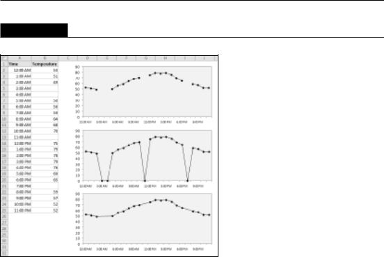
FIGURE 19.18
Overriding the Excel time-based category axis.
Working with Data Series
Every chart consists of one or more data series. This data translates into chart columns, bars, lines, pie slices, and so on. This section discusses some common operations that involve a chart’s data series.
When you select a data series in a chart, Excel does the following:
•Displays the series name in the Chart Elements control (located in the Chart Tools Layout Current Selection group and also in the Chart Tools Format Current Selection group)
•Displays the Series formula in the Formula bar
•Highlights the cells used for the selected series by outlining them in color
455

Part III: Creating Charts and Graphics
You can make changes to a data series by using options on the Ribbon or from the Format Data Series dialog box. This dialog box varies, depending on the type of data series you’re working on (column, line, pie, and so on).
Caution
The easiest way to display the Format Data Series dialog box is to double-click the chart series. Be careful, however: If a data series is already selected, double-clicking brings up the Format Data Point dialog box. Changes that you make affect only one point in the data series. To edit the entire series, make sure that a chart element other than the data series is selected before you double-click the data series. n
Deleting a data series
To delete a data series in a chart, select the data series and press Delete. The data series disappears from the chart. The data in the worksheet, of course, remains intact.
Note
You can delete all data series from a chart. If you do so, the chart appears empty. It retains its settings, however. Therefore, you can add a data series to an empty chart, and it again looks like a chart. n
Adding a new data series to a chart
If you want to add another data series to an existing chart, re-create the chart and include the new data series. However, adding the data to the existing chart is usually easier, and your chart retains any customization that you’ve made.
Figure 19.19 shows a column chart that has two data series (Jan and Feb). The March figures just became available and were entered into the worksheet in row 4. Now the chart needs to be updated to include the new data series.
Excel provides two ways to add a new data series to a chart:
•Activate the chart and choose Chart Tools Design Data Select Data. In the Select Data Source dialog box, click the Add button, and Excel displays the Edit Series dialog box. Specify the Series Name (as a cell reference or text) and the range that contains the Series Values.
•Select the range to add and press Ctrl+C to copy it to the Clipboard. Then activate the chart and press Ctrl+V to paste the data into the chart.
Note
In previous versions of Excel, you could add a new data series by selecting a range of data and “dragging” it into an embedded chart. That feature was removed, beginning with Excel 2007. n
456

Chapter 19: Learning Advanced Charting
FIGURE 19.19
This chart needs a new data series.
Tip
If the chart was originally made from data in a table (created via Insert Tables Table), the chart is updated automatically when you add new data to the table. If you have a chart that is updated frequently with new data, you can save time and effort by creating the chart from data in a table. n
Changing data used by a series
You may find that you need to modify the range that defines a data series. For example, say you need to add new data points or remove old ones from the data set. The following sections describe several ways to change the range used by a data series.
Changing the data range by dragging the range outline
If you have an embedded chart, the easiest way to change the data range for a data series is to drag the range outline. When you select a series in a chart, Excel outlines the data range used by that series (see Figure 19.20). You can drag the small dot in the lower-right corner of the range outline to extend or contract the data series.
You can also click and drag one of the sides of the outline to move the outline to a different range of cells.
In some cases, you’ll also need to adjust the range that contains the category labels as well. The labels are also outlined, and you can drag the outline to expand or contract the range of labels used in the chart.
457

Part III: Creating Charts and Graphics
If your chart is on a chart sheet, you need to use one of the two methods described next.
FIGURE 19.20
Changing a chart’s data series by dragging the range outline.
Using the Edit Series dialog box
Another way to update the chart to reflect a different data range is to use the Edit Series dialog box. A quick way to display this dialog box is to right-click the series in the chart and then choose Select Data from the shortcut menu. Excel displays the Select Source Data dialog box. Select the data series in the list, and click Edit to display the Edit Series dialog box, shown in Figure 19.21.
You can change the entire data range used by the chart by adjusting the range references in the Chart Data Range field. Or, select a Series from the list and click Edit to modify the selected series.
FIGURE 19.21
The Edit Series dialog box.
458

Chapter 19: Learning Advanced Charting
Editing the Series formula
Every data series in a chart has an associated Series formula, which appears in the Formula bar when you select a data series in a chart. If you understand how a Series formula is constructed, you can edit the range references in the Series formula directly to change the data used by the chart.
Note
The Series formula is not a real formula: In other words, you can’t use it in a cell, and you can’t use worksheet functions within the Series formula. You can, however, edit the arguments in the Series formula. n
A Series formula has the following syntax:
=SERIES(series_name, category_labels, values, order, sizes)
The arguments that you can use in the Series formula include
•series_name: (Optional). A reference to the cell that contains the series name used in the legend. If the chart has only one series, the name argument is used as the title. This argument can also consist of text in quotation marks. If omitted, Excel creates a default series name (for example, Series 1).
•category_labels: (Optional). A reference to the range that contains the labels for the category axis. If omitted, Excel uses consecutive integers beginning with 1. For XY charts, this argument specifies the X values. A noncontiguous range reference is also valid. The ranges’ addresses are separated by commas and enclosed in parentheses. The argument could also consist of an array of comma-separated values (or text in quotation marks) enclosed in curly brackets.
•values: (Required). A reference to the range that contains the values for the series. For XY charts, this argument specifies the Y values. A noncontiguous range reference is also valid. The ranges addresses are separated by a comma and enclosed in parentheses. The argument could also consist of an array of comma-separated values enclosed in curly brackets.
•order: (Required). An integer that specifies the plotting order of the series. This argument is relevant only if the chart has more than one series. Using a reference to a cell is not allowed.
•sizes: (Only for bubble charts). A reference to the range that contains the values for the size of the bubbles in a bubble chart. A noncontiguous range reference is also valid. The ranges addresses are separated by commas and enclosed in parentheses. The argument can also consist of an array of values enclosed in curly brackets.
Range references in a Series formula are always absolute (contain two dollar signs), and they always include the sheet name. For example
=SERIES(Sheet1!$B$1,,Sheet1!$B$2:$B$7,1)
459

Part III: Creating Charts and Graphics
Tip
You can substitute range names for the range references. If you do so, Excel changes the reference in the Series formula to include the workbook name. For example if you use a range named MyData (in a workbook named budget.xlsx), the Series formula looks like this:
=SERIES(Sheet1!$B$1,,budget.xlsx!MyData,1)
Displaying data labels in a chart
Sometimes, you may want your chart to display the actual numerical values for each data point. You specify data labels by choosing Chart Tools Layout Labels Data Labels. This dropdown control contains several data label positioning options.
Figure 19.22 shows three minimalist charts with data labels.
FIGURE 19.22
These charts use data labels.
To change the type of information that appears in data labels, select the data labels in the chart and press Ctrl+F1. Then use the Label Options tab of the Format Data Labels dialog box to customize the data labels. For example, you can include the series name and the category name along with the value.
The data labels are linked to the worksheet, so if your data changes, the labels also change. If you want to override the data label with other text, select the label and enter the new text.
460

Chapter 19: Learning Advanced Charting
Tip
Often, the data labels aren’t positioned properly — for example, a label may be obscured by another data point. If you select an individual data label, you can drag the label to a better location. To select an individual data label, click once to select them all and then click the single data label. n
As you work with data labels, you discover that the Excel data labels feature leaves a bit to be desired. For example, it would be nice to be able to specify an arbitrary range of text to be used for the data labels. This capability would be particularly useful in XY charts in which you want to identify each data point with a particular text item. Despite what must amount to thousands of requests, Microsoft still hasn’t added this feature to Excel. You need to add data labels and then manually edit each label.
Handling missing data
Sometimes, data that you’re charting may be missing one or more data points. As shown in Figure 19.23, Excel offers three ways to handle the missing data:
•Gaps: Missing data is simply ignored, and the data series will have a gap. This is the default.
•Zero: Missing data is treated as zero.
•Connect Data Points with Line: Missing data is interpolated, calculated by using data on either side of the missing point(s). This option is available for line charts, area charts, and XY charts only.
To specify how to deal with missing data for a chart, choose Chart Tools Design Data Select Data. In the Select Data Source dialog box, click the Hidden and Empty Cells button. Excel displays its Hidden and Empty Cell Settings dialog box. Make your choice in the dialog box. The option that you choose applies to the entire chart, and you can’t set a different option for different series in the same chart.
Tip
Normally, a chart doesn’t display data that’s in a hidden row or column. You can use the Hidden and Empty Cell Settings dialog box to force a chart to use hidden data, though. n
Adding error bars
Some chart types support error bars. Error bars often are used to indicate “plus or minus” information that reflects uncertainty in the data. Error bars are appropriate for area, bar, column, line, and XY charts only.
461
Part III: Creating Charts and Graphics
FIGURE 19.23
Three options for dealing with missing data.
To add error bars, select a data series and then choose Chart Tools Layout Analysis Error Bars. This drop-down control has several options. You can then fine-tune the error bar settings from the Format Error Bars dialog box. The types of error bars are
•Fixed value: The error bars are fixed by an amount that you specify.
•Percentage: The error bars are a percentage of each value.
•Standard Deviation(s): The error bars are in the number of standard deviation units that you specify. (Excel calculates the standard deviation of the data series.)
•Standard Error: The error bars are one standard error unit. (Excel calculates the standard error of the data series.)
•Custom: You set the error bar units for the upper or lower error bars. You can enter either a value or a range reference that holds the error values that you want to plot as error bars.
The chart shown in Figure 19.24 displays error bars based on percentage.
Tip
A data series in an XY chart can have error bars for both the X values and Y values. n
462

Chapter 19: Learning Advanced Charting
FIGURE 19.24
This line chart series displays error bars based on percentage.
Adding a trendline
When you’re plotting data over time, you may want to plot a trendline that describes the data. A trendline points out general trends in your data. In some cases, you can forecast future data with trendlines. A single series can have more than one trendline.
To add a trendline, select the data series and choose Chart Tools Layout Analysis Trendline. This drop-down control contains options for the type of trendline. The type of trendline that you choose depends on your data. Linear trends are most common, but some data can be described more effectively with another type.
Figure 19.25 shows an XY chart with a linear trendline and the (optional) equation for the trendline. The trendline describes the “best fit” of the height and weight data.
For more control over a trendline, right-click it and choose Format Trendline to open the Format Trendline dialog box. One option, Moving Average, is useful for smoothing out data that has a lot of variation (that is, “noisy” data).
The Moving Average option enables you to specify the number of data points to include in each average. For example, if you select 5, Excel averages every five data points. Figure 19.26 shows a chart that uses a moving average trendline.
463

Part III: Creating Charts and Graphics
FIGURE 19.25
An XY chart with a linear trendline.
FIGURE 19.26
The dashed line displays a seven-interval moving average.
Modifying 3-D charts
3-D charts have a few additional elements that you can customize. For example, most 3-D charts have a floor and walls, and true 3-D charts also have an additional axis. You can select these chart elements and format them to your liking using the Format dialog box.
One area in which Excel 3-D charts differ from 2-D charts is in the perspective — or viewpoint — from which you see the chart. In some cases, the data may be viewed better if you change the order of the series.
464
Chapter 19: Learning Advanced Charting
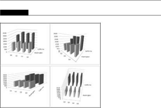
Figure 19.27 shows two versions of 3-D column chart with two data series. The left chart is the original, and the right chart shows the effect of changing the series order. To change the series order, choose Chart Tools Design Data Select Data. In the Select Data Source dialog box, select a series and use the arrow buttons to change its order.
FIGURE 19.27
A 3-D column chart, before and after changing the series order.
Fortunately, Excel allows you to change the viewing angle of 3-D charts. Doing so may reveal portions of the chart that are otherwise hidden. To rotate a 3-D chart, choose Chart Tools Layout Background 3-D Rotation, which displays the 3-D Rotation tab of the Format Chart Area dialog box. You can make your rotations and perspective changes by clicking the appropriate controls.
Figure 19.28 shows four different views of the same chart. As you can see, you can accidentally distort the chart to make it virtually worthless in terms of visualizing information. If accuracy of presentation is important, a 3-D chart is hardly ever the best choice.
Creating combination charts
A combination chart is a single chart that consists of series that use different chart types. A combination chart may also include a second value axis. For example, you may have a chart that shows both columns and lines, with two value axes. The value axis for the columns is on the left, and the value axis for the line is on the right. A combination chart requires at least two data series.
Creating a combination chart involves changing one or more of the data series to a different chart type. Select the data series to change and then choose Chart Tools Design Type Change Chart Type. In the Change Chart Type dialog box, select the chart type that you want to apply to the selected series. Using a second Value Axis is optional.
465
Part III: Creating Charts and Graphics
FIGURE 19.28
Changing the viewing angle to show different views of the same 3-D column chart.
Note
If anything other than a series is selected when you choose Chart Tools Design Type Change Chart Type, all the series in the chart change. n
Figure 19.29 shows a column chart with two data series. The values for the Precipitation series are very low — so low that they’re barely visible on the Value Axis scale. This is a good candidate for a combination chart.
The following steps describe how to convert this chart into a combination chart (column and line) that uses a second Value Axis.
1.Double-click the Precipitation data series to display the Format Data Series dialog box.
2.Click the Series Options tab and select the Secondary Axis option.
3.With the Precipitation data series still selected, choose Chart Tools Design Type Change Chart Type.
4.In the Change Chart Type dialog box, select the Line type and click OK.
466

Chapter 19: Learning Advanced Charting
Figure 19.30 shows the modified chart. The Precipitation data appears as a line, and it uses the Value Axis on the right.
FIGURE 19.29
The Precipitation series is barely visible.
FIGURE 19.30
The Precipitation series is now visible.
On the CD
This workbook is available on the companion CD-ROM. The filename is weather combination chart. xlsx.
467

Part III: Creating Charts and Graphics
Note
In some cases, you can’t combine chart types. For example, you can’t create a combination chart that involves a bubble chart or a 3-D chart. If you choose an incompatible chart type for the series, Excel lets you know. n
Figure 19.31 demonstrates just how far you can go with a combination chart. This chart combines five different chart types: Pie, Area, Column, Line, and XY. I can’t think of any situation that would warrant such a chart, but it’s an interesting demo.
FIGURE 19.31
A five-way combination chart.
Displaying a data table
In some cases, you may want to display a data table, which displays the chart’s data in tabular form, directly in the chart.
To add a data table to a chart, choose Chart Tools Layout Labels Data Table. This control is a drop-down list with a few options to choose from. For more options, use the Format Data Table dialog box. Figure 19.32 shows a combination chart that includes a data table.
468