

- •About the Author
- •About the Technical Editor
- •Credits
- •Is This Book for You?
- •Software Versions
- •Conventions This Book Uses
- •What the Icons Mean
- •How This Book Is Organized
- •How to Use This Book
- •What’s on the Companion CD
- •What Is Excel Good For?
- •What’s New in Excel 2010?
- •Moving around a Worksheet
- •Introducing the Ribbon
- •Using Shortcut Menus
- •Customizing Your Quick Access Toolbar
- •Working with Dialog Boxes
- •Using the Task Pane
- •Creating Your First Excel Worksheet
- •Entering Text and Values into Your Worksheets
- •Entering Dates and Times into Your Worksheets
- •Modifying Cell Contents
- •Applying Number Formatting
- •Controlling the Worksheet View
- •Working with Rows and Columns
- •Understanding Cells and Ranges
- •Copying or Moving Ranges
- •Using Names to Work with Ranges
- •Adding Comments to Cells
- •What Is a Table?
- •Creating a Table
- •Changing the Look of a Table
- •Working with Tables
- •Getting to Know the Formatting Tools
- •Changing Text Alignment
- •Using Colors and Shading
- •Adding Borders and Lines
- •Adding a Background Image to a Worksheet
- •Using Named Styles for Easier Formatting
- •Understanding Document Themes
- •Creating a New Workbook
- •Opening an Existing Workbook
- •Saving a Workbook
- •Using AutoRecover
- •Specifying a Password
- •Organizing Your Files
- •Other Workbook Info Options
- •Closing Workbooks
- •Safeguarding Your Work
- •Excel File Compatibility
- •Exploring Excel Templates
- •Understanding Custom Excel Templates
- •Printing with One Click
- •Changing Your Page View
- •Adjusting Common Page Setup Settings
- •Adding a Header or Footer to Your Reports
- •Copying Page Setup Settings across Sheets
- •Preventing Certain Cells from Being Printed
- •Preventing Objects from Being Printed
- •Creating Custom Views of Your Worksheet
- •Understanding Formula Basics
- •Entering Formulas into Your Worksheets
- •Editing Formulas
- •Using Cell References in Formulas
- •Using Formulas in Tables
- •Correcting Common Formula Errors
- •Using Advanced Naming Techniques
- •Tips for Working with Formulas
- •A Few Words about Text
- •Text Functions
- •Advanced Text Formulas
- •Date-Related Worksheet Functions
- •Time-Related Functions
- •Basic Counting Formulas
- •Advanced Counting Formulas
- •Summing Formulas
- •Conditional Sums Using a Single Criterion
- •Conditional Sums Using Multiple Criteria
- •Introducing Lookup Formulas
- •Functions Relevant to Lookups
- •Basic Lookup Formulas
- •Specialized Lookup Formulas
- •The Time Value of Money
- •Loan Calculations
- •Investment Calculations
- •Depreciation Calculations
- •Understanding Array Formulas
- •Understanding the Dimensions of an Array
- •Naming Array Constants
- •Working with Array Formulas
- •Using Multicell Array Formulas
- •Using Single-Cell Array Formulas
- •Working with Multicell Array Formulas
- •What Is a Chart?
- •Understanding How Excel Handles Charts
- •Creating a Chart
- •Working with Charts
- •Understanding Chart Types
- •Learning More
- •Selecting Chart Elements
- •User Interface Choices for Modifying Chart Elements
- •Modifying the Chart Area
- •Modifying the Plot Area
- •Working with Chart Titles
- •Working with a Legend
- •Working with Gridlines
- •Modifying the Axes
- •Working with Data Series
- •Creating Chart Templates
- •Learning Some Chart-Making Tricks
- •About Conditional Formatting
- •Specifying Conditional Formatting
- •Conditional Formats That Use Graphics
- •Creating Formula-Based Rules
- •Working with Conditional Formats
- •Sparkline Types
- •Creating Sparklines
- •Customizing Sparklines
- •Specifying a Date Axis
- •Auto-Updating Sparklines
- •Displaying a Sparkline for a Dynamic Range
- •Using Shapes
- •Using SmartArt
- •Using WordArt
- •Working with Other Graphic Types
- •Using the Equation Editor
- •Customizing the Ribbon
- •About Number Formatting
- •Creating a Custom Number Format
- •Custom Number Format Examples
- •About Data Validation
- •Specifying Validation Criteria
- •Types of Validation Criteria You Can Apply
- •Creating a Drop-Down List
- •Using Formulas for Data Validation Rules
- •Understanding Cell References
- •Data Validation Formula Examples
- •Introducing Worksheet Outlines
- •Creating an Outline
- •Working with Outlines
- •Linking Workbooks
- •Creating External Reference Formulas
- •Working with External Reference Formulas
- •Consolidating Worksheets
- •Understanding the Different Web Formats
- •Opening an HTML File
- •Working with Hyperlinks
- •Using Web Queries
- •Other Internet-Related Features
- •Copying and Pasting
- •Copying from Excel to Word
- •Embedding Objects in a Worksheet
- •Using Excel on a Network
- •Understanding File Reservations
- •Sharing Workbooks
- •Tracking Workbook Changes
- •Types of Protection
- •Protecting a Worksheet
- •Protecting a Workbook
- •VB Project Protection
- •Related Topics
- •Using Excel Auditing Tools
- •Searching and Replacing
- •Spell Checking Your Worksheets
- •Using AutoCorrect
- •Understanding External Database Files
- •Importing Access Tables
- •Retrieving Data with Query: An Example
- •Working with Data Returned by Query
- •Using Query without the Wizard
- •Learning More about Query
- •About Pivot Tables
- •Creating a Pivot Table
- •More Pivot Table Examples
- •Learning More
- •Working with Non-Numeric Data
- •Grouping Pivot Table Items
- •Creating a Frequency Distribution
- •Filtering Pivot Tables with Slicers
- •Referencing Cells within a Pivot Table
- •Creating Pivot Charts
- •Another Pivot Table Example
- •Producing a Report with a Pivot Table
- •A What-If Example
- •Types of What-If Analyses
- •Manual What-If Analysis
- •Creating Data Tables
- •Using Scenario Manager
- •What-If Analysis, in Reverse
- •Single-Cell Goal Seeking
- •Introducing Solver
- •Solver Examples
- •Installing the Analysis ToolPak Add-in
- •Using the Analysis Tools
- •Introducing the Analysis ToolPak Tools
- •Introducing VBA Macros
- •Displaying the Developer Tab
- •About Macro Security
- •Saving Workbooks That Contain Macros
- •Two Types of VBA Macros
- •Creating VBA Macros
- •Learning More
- •Overview of VBA Functions
- •An Introductory Example
- •About Function Procedures
- •Executing Function Procedures
- •Function Procedure Arguments
- •Debugging Custom Functions
- •Inserting Custom Functions
- •Learning More
- •Why Create UserForms?
- •UserForm Alternatives
- •Creating UserForms: An Overview
- •A UserForm Example
- •Another UserForm Example
- •More on Creating UserForms
- •Learning More
- •Why Use Controls on a Worksheet?
- •Using Controls
- •Reviewing the Available ActiveX Controls
- •Understanding Events
- •Entering Event-Handler VBA Code
- •Using Workbook-Level Events
- •Working with Worksheet Events
- •Using Non-Object Events
- •Working with Ranges
- •Working with Workbooks
- •Working with Charts
- •VBA Speed Tips
- •What Is an Add-In?
- •Working with Add-Ins
- •Why Create Add-Ins?
- •Creating Add-Ins
- •An Add-In Example
- •System Requirements
- •Using the CD
- •What’s on the CD
- •Troubleshooting
- •The Excel Help System
- •Microsoft Technical Support
- •Internet Newsgroups
- •Internet Web sites
- •End-User License Agreement
Chapter 19: Learning Advanced Charting
Tip
Changing the size and position of the Plot Area can have a dramatic effect on the overall look of your chart. When you’re fine-tuning a chart, you’ll probably want to experiment with various sizes and positions for the Plot Area. n
Working with Chart Titles
A chart can have several different types of titles:
•Chart title
•Category (X) axis title
•Value (Y) axis title
•Second category (X) axis title
•Second value (Y) axis title
•Depth axis title (for true 3-D charts)
The number of titles that you can use depends on the chart type. For example, a pie chart supports only a chart title because it has no axes.
To add a chart title, activate the chart and choose Chart Tools Layout Labels Chart Title. To add a title to one or more of the axes, choose Chart Tools Layout Labels Axis Titles. These controls are drop-down lists, and each has several options.
After you add a title, you can replace the default text and drag the titles to a different position. However, you can’t change the size of a title by dragging. The only way to change the size of a title is to change the font size.
Adding Free-Floating Text to a Chart
Text in a chart is not limited to titles. In fact, you can add free-floating text anywhere you want. To do so, activate the chart and choose Chart Tools Layout Insert Text Box. Click in the chart to create the text box and enter the text. You can resize the text box, move it, change its formatting, and so on. You can also add a Shape to the chart and then add text to the Shape (if the Shape is one that accepts text).
Many people prefer to use a text box in place of a chart’s “official” title elements. Resizing a title is not possible (except by changing its font size). If you use a text box, though, you can resize it by dragging its corners, change the text alignment, and even rotate it.
445

Part III: Creating Charts and Graphics
The chart title or any of the axis titles can also use a cell reference. For example, you can create a link so the chart always displays the text contained in cell A1 as its title. To create a link, select the title, type an equal sign (=), point to the cell, and press Enter. After you create the link, the Formula bar displays the cell reference when you select the title.
Working with a Legend
A chart’s legend consists of text and keys that identify the data series in the chart. A key is a small graphic that corresponds to the chart’s series (one key for each series).
To add a legend to your chart, choose Chart Tools Layout Labels Legend. This drop-down control contains several options for the legend placement. After you add a legend, you can drag it to move it anywhere you like.
Tip
If you move a legend from its default position, you may want to change the size of the Plot Area to fill in the gap left by the legend. Just select the Plot Area and drag a border to make it the desired size. n
The quickest way to remove a legend is to select the legend and then press Delete.
You can select individual items within a legend and format them separately. For example, you may want to make the text bold to draw attention to a particular data series. To select an element in the legend, first select the legend and then click the desired element.
If you didn’t include legend text when you originally selected the cells to create the chart, Excel displays Series 1, Series 2, and so on in the legend. To add series names, choose Chart Tools Design Data Select Data to display the Select Data Source dialog box (see Figure 19.6). Select the series name and click the Edit button. In the Edit Series dialog box, type the series name or enter a cell reference that contains the series name. Repeat for each series that needs naming.
FIGURE 19.6
Use the Select Data Source dialog box to change the name of a data series.
446

Chapter 19: Learning Advanced Charting
In some cases, you may prefer to omit the legend and use callouts to identify the data series. Figure 19.7 shows a chart with no legend. Instead, it uses Shapes to identify each series. These Shapes are from the Callouts section of the Chart Tools Layout Insert Shapes Gallery.
FIGURE 19.7
Using Shapes as callouts in lieu of a legend.
Copying Chart Formatting
You created a killer chart and spent hours customizing it. Now you need to create another one just like it, but with a different set of data. What are your options? You have several choices:
•Copy the formatting. Create your new chart with the default formatting. Then select your original chart and choose Home Clipboard Copy (or press Ctrl+C). Click your new chart and choose Home Clipboard Paste Paste Special. In the Paste Special dialog box, select the Formats option.
•Copy the chart; change the data sources. Press Ctrl while you click the original chart and drag. This creates an exact copy of your chart. Then choose Chart Tools Design Data Select Data. In the Select Data Source dialog box, specify the data for the new chart.
•Create a chart template. Select your chart and then choose Chart Tools Design Type Save as Template. Excel prompts you for a name. When you create your next chart, use this template as the chart type.
447

Part III: Creating Charts and Graphics
Cross-Reference
For more information about using chart templates, see “Creating Chart Templates,” later in this chapter. n
Working with Gridlines
Gridlines can help the viewer determine what the chart series represents numerically. Gridlines simply extend the tick marks on an axis. Some charts look better with gridlines; others appear more cluttered. Sometimes, horizontal gridlines alone are enough although XY charts often benefit from both horizontal and vertical gridlines.
To add or remove gridlines, choose Chart Tools Layout Axes Gridlines. This drop-down control contains options for all possible gridlines in the active chart.
Note
Each axis has two sets of gridlines: major and minor. Major units display a label. Minor units are located between the labels. n
To modify the color or thickness of a set of gridlines, click one of the gridlines and use the commands from the Chart Tools Format Shape Styles group.
If gridlines seem too overpowering, consider changing them to a lighter color or use one of the dashed options.
Modifying the Axes
Charts vary in the number of axes that they use. Pie and doughnut charts have no axes. All 2-D charts have two axes (three, if you use a secondary-value axis; four, if you use a secondary-category axis in an XY chart). True 3-D charts have three axes.
Excel gives you a great deal of control over these axes, via the Format Axis dialog box. The content of this dialog box varies depending on the type of axis selected.
Value axis
To change a value axis, right-click it and choose Format Axis. Figure 19.8 shows the Axis Options tab of the Format Axis dialog box. The other tabs in the dialog box deal with cosmetic formatting.
On the Axis Options tab, the four sets of option buttons at the top determine the scale of the axis (its minimum, maximum, and intervals). By default, Excel determines these values based on the numerical range of the data, and the settings are set to Auto. You can override Excel’s choice and set any or all of them to Fixed and then enter your own values.
448

Chapter 19: Learning Advanced Charting
FIGURE 19.8
These options are available for a Value Axis.
Adjusting the scale of a value axis can dramatically affect the chart’s appearance. Manipulating the scale, in some cases, can present a false picture of the data. Figure 19.9 shows two line charts that depict the same data. The chart on the left uses Excel’s default (Auto) axis scale values, which extend from 7,400 to 9,400. In the chart on the right, the Minimum scale value was set to 0, and the Maximum scale value was set to 10,000. The first chart makes the differences in the data seem more prominent. The second chart gives the impression that there is not much change over time.
FIGURE 19.9
These two charts show the same data, but use a different Value Axis scales.
449

Part III: Creating Charts and Graphics
The actual scale that you use depends on the situation. There are no hard-and-fast rules regarding setting scale values except that you shouldn’t misrepresent data by manipulating the chart to prove a point that doesn’t exist.
Tip
If you’re preparing several charts that use similarly scaled data, keeping the scales the same is a good idea so that the charts can be compared more easily. n
Another option in the Format Axis dialog box is Values in Reverse Order. The left chart in Figure 19.10 uses default axis settings. The right chart uses the Values in Reverse Order option, which reverses the scale’s direction. Notice that the Category Axis is at the top. If you would prefer that it remain at the bottom of the chart, select the Maximum Axis Value option for the Horizontal Axis Crosses setting.
FIGURE 19.10
The right chart uses the Values in Reverse Order option.
If the values to be plotted cover a very large numerical range, you may want to use a logarithmic scale for the value axis. A log scale is most often used for scientific applications. Figure 19.11 shows two charts. The left chart uses a standard scale, and the right chart uses a logarithmic scale.
Note
The Base setting is 10, so each scale value in the chart is 10 times greater than the one below it. Increasing the major unit to 100 results in a scale in which each tick mark value is 100 times greater than the one below. You can specify a base value between 2 and 1,000. n
On the CD
This workbook, log scale.xlsx, is available on the companion CD-ROM. n
450

Chapter 19: Learning Advanced Charting
FIGURE 19.11
These charts display the same data, but the right chart uses a logarithmic scale.
If your chart uses very large numbers, you may want to change the Display Units settings. Figure 19.12 shows a chart that uses very large numbers. The chart on the right uses the Display Units as Millions settings, with the option to Show Display Units Labels on Chart.
FIGURE 19.12
The chart on the right uses display units of millions.
The Major and Minor Tick Mark options control how the tick marks are displayed. Major tick marks are the axis tick marks that normally have labels next to them. Minor tick marks fall between the major tick marks.
451
Part III: Creating Charts and Graphics
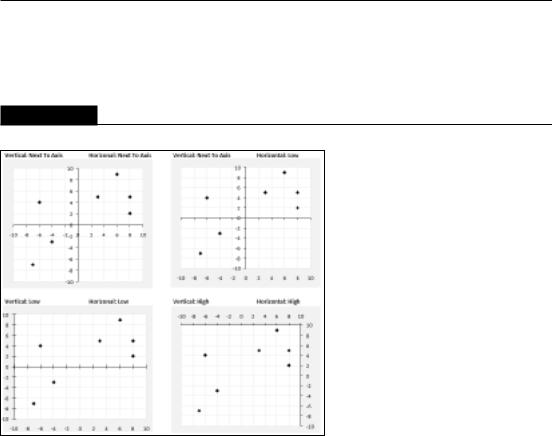
Excel lets you position the axis labels at three different locations: Next to Axis, High, and Low. Each axis extends from –10 to +10. When you combine these settings with the Axis Crosses At option, you have a great deal of flexibility, as shown in Figure 19.13.
FIGURE 19.13
Various ways to display axis labels and crossing points.
Category axis
Figure 19.14 shows the Axis Options tab of the Format Axis dialog box when a category axis is selected. Some options are the same as those for a value axis.
Excel chooses how to display category labels, but you can override its choice. Figure 19.15 shows a column chart with month labels. Because of the lengthy category labels, Excel displays the text at an angle. If you make the chart wider, the labels will then appear horizontally. You can also adjust the labels from the Alignment tab of the Format Axis dialog box.
In some cases, you really don’t need every category label. You can adjust the Interval between Labels settings to skip some labels (and cause the text to display horizontally). Figure 19.16 shows such a chart; the Interval between Labels setting is 3.
452

Chapter 19: Learning Advanced Charting
FIGURE 19.14
These options are available for a category axis.
FIGURE 19.15
Excel determines how to display category axis labels.
453

Part III: Creating Charts and Graphics
FIGURE 19.16
Changing the Interval between Labels setting makes labels display horizontally.
When you create a chart, Excel recognizes whether your category axis contains date or time values. If so, it uses a time-based category axis. Figure 19.17 shows a simple example. Column A contains dates, and column B contains the values plotted in the column chart. The data consists of values for only 10 dates, yet Excel created the chart with 30 intervals on the category axis. It recognized that the category axis values were dates and created an equal-interval scale.
FIGURE 19.17
Excel recognizes dates and creates a time-based category axis.
You can override Excel’s decision to use a time-based category axis by choosing the Text Axis option for Axis Type. Figure 19.18 shows the chart after making this change. In this case, using a time-based category axis presents a truer picture of the data.
454