

- •About the Author
- •About the Technical Editor
- •Credits
- •Is This Book for You?
- •Software Versions
- •Conventions This Book Uses
- •What the Icons Mean
- •How This Book Is Organized
- •How to Use This Book
- •What’s on the Companion CD
- •What Is Excel Good For?
- •What’s New in Excel 2010?
- •Moving around a Worksheet
- •Introducing the Ribbon
- •Using Shortcut Menus
- •Customizing Your Quick Access Toolbar
- •Working with Dialog Boxes
- •Using the Task Pane
- •Creating Your First Excel Worksheet
- •Entering Text and Values into Your Worksheets
- •Entering Dates and Times into Your Worksheets
- •Modifying Cell Contents
- •Applying Number Formatting
- •Controlling the Worksheet View
- •Working with Rows and Columns
- •Understanding Cells and Ranges
- •Copying or Moving Ranges
- •Using Names to Work with Ranges
- •Adding Comments to Cells
- •What Is a Table?
- •Creating a Table
- •Changing the Look of a Table
- •Working with Tables
- •Getting to Know the Formatting Tools
- •Changing Text Alignment
- •Using Colors and Shading
- •Adding Borders and Lines
- •Adding a Background Image to a Worksheet
- •Using Named Styles for Easier Formatting
- •Understanding Document Themes
- •Creating a New Workbook
- •Opening an Existing Workbook
- •Saving a Workbook
- •Using AutoRecover
- •Specifying a Password
- •Organizing Your Files
- •Other Workbook Info Options
- •Closing Workbooks
- •Safeguarding Your Work
- •Excel File Compatibility
- •Exploring Excel Templates
- •Understanding Custom Excel Templates
- •Printing with One Click
- •Changing Your Page View
- •Adjusting Common Page Setup Settings
- •Adding a Header or Footer to Your Reports
- •Copying Page Setup Settings across Sheets
- •Preventing Certain Cells from Being Printed
- •Preventing Objects from Being Printed
- •Creating Custom Views of Your Worksheet
- •Understanding Formula Basics
- •Entering Formulas into Your Worksheets
- •Editing Formulas
- •Using Cell References in Formulas
- •Using Formulas in Tables
- •Correcting Common Formula Errors
- •Using Advanced Naming Techniques
- •Tips for Working with Formulas
- •A Few Words about Text
- •Text Functions
- •Advanced Text Formulas
- •Date-Related Worksheet Functions
- •Time-Related Functions
- •Basic Counting Formulas
- •Advanced Counting Formulas
- •Summing Formulas
- •Conditional Sums Using a Single Criterion
- •Conditional Sums Using Multiple Criteria
- •Introducing Lookup Formulas
- •Functions Relevant to Lookups
- •Basic Lookup Formulas
- •Specialized Lookup Formulas
- •The Time Value of Money
- •Loan Calculations
- •Investment Calculations
- •Depreciation Calculations
- •Understanding Array Formulas
- •Understanding the Dimensions of an Array
- •Naming Array Constants
- •Working with Array Formulas
- •Using Multicell Array Formulas
- •Using Single-Cell Array Formulas
- •Working with Multicell Array Formulas
- •What Is a Chart?
- •Understanding How Excel Handles Charts
- •Creating a Chart
- •Working with Charts
- •Understanding Chart Types
- •Learning More
- •Selecting Chart Elements
- •User Interface Choices for Modifying Chart Elements
- •Modifying the Chart Area
- •Modifying the Plot Area
- •Working with Chart Titles
- •Working with a Legend
- •Working with Gridlines
- •Modifying the Axes
- •Working with Data Series
- •Creating Chart Templates
- •Learning Some Chart-Making Tricks
- •About Conditional Formatting
- •Specifying Conditional Formatting
- •Conditional Formats That Use Graphics
- •Creating Formula-Based Rules
- •Working with Conditional Formats
- •Sparkline Types
- •Creating Sparklines
- •Customizing Sparklines
- •Specifying a Date Axis
- •Auto-Updating Sparklines
- •Displaying a Sparkline for a Dynamic Range
- •Using Shapes
- •Using SmartArt
- •Using WordArt
- •Working with Other Graphic Types
- •Using the Equation Editor
- •Customizing the Ribbon
- •About Number Formatting
- •Creating a Custom Number Format
- •Custom Number Format Examples
- •About Data Validation
- •Specifying Validation Criteria
- •Types of Validation Criteria You Can Apply
- •Creating a Drop-Down List
- •Using Formulas for Data Validation Rules
- •Understanding Cell References
- •Data Validation Formula Examples
- •Introducing Worksheet Outlines
- •Creating an Outline
- •Working with Outlines
- •Linking Workbooks
- •Creating External Reference Formulas
- •Working with External Reference Formulas
- •Consolidating Worksheets
- •Understanding the Different Web Formats
- •Opening an HTML File
- •Working with Hyperlinks
- •Using Web Queries
- •Other Internet-Related Features
- •Copying and Pasting
- •Copying from Excel to Word
- •Embedding Objects in a Worksheet
- •Using Excel on a Network
- •Understanding File Reservations
- •Sharing Workbooks
- •Tracking Workbook Changes
- •Types of Protection
- •Protecting a Worksheet
- •Protecting a Workbook
- •VB Project Protection
- •Related Topics
- •Using Excel Auditing Tools
- •Searching and Replacing
- •Spell Checking Your Worksheets
- •Using AutoCorrect
- •Understanding External Database Files
- •Importing Access Tables
- •Retrieving Data with Query: An Example
- •Working with Data Returned by Query
- •Using Query without the Wizard
- •Learning More about Query
- •About Pivot Tables
- •Creating a Pivot Table
- •More Pivot Table Examples
- •Learning More
- •Working with Non-Numeric Data
- •Grouping Pivot Table Items
- •Creating a Frequency Distribution
- •Filtering Pivot Tables with Slicers
- •Referencing Cells within a Pivot Table
- •Creating Pivot Charts
- •Another Pivot Table Example
- •Producing a Report with a Pivot Table
- •A What-If Example
- •Types of What-If Analyses
- •Manual What-If Analysis
- •Creating Data Tables
- •Using Scenario Manager
- •What-If Analysis, in Reverse
- •Single-Cell Goal Seeking
- •Introducing Solver
- •Solver Examples
- •Installing the Analysis ToolPak Add-in
- •Using the Analysis Tools
- •Introducing the Analysis ToolPak Tools
- •Introducing VBA Macros
- •Displaying the Developer Tab
- •About Macro Security
- •Saving Workbooks That Contain Macros
- •Two Types of VBA Macros
- •Creating VBA Macros
- •Learning More
- •Overview of VBA Functions
- •An Introductory Example
- •About Function Procedures
- •Executing Function Procedures
- •Function Procedure Arguments
- •Debugging Custom Functions
- •Inserting Custom Functions
- •Learning More
- •Why Create UserForms?
- •UserForm Alternatives
- •Creating UserForms: An Overview
- •A UserForm Example
- •Another UserForm Example
- •More on Creating UserForms
- •Learning More
- •Why Use Controls on a Worksheet?
- •Using Controls
- •Reviewing the Available ActiveX Controls
- •Understanding Events
- •Entering Event-Handler VBA Code
- •Using Workbook-Level Events
- •Working with Worksheet Events
- •Using Non-Object Events
- •Working with Ranges
- •Working with Workbooks
- •Working with Charts
- •VBA Speed Tips
- •What Is an Add-In?
- •Working with Add-Ins
- •Why Create Add-Ins?
- •Creating Add-Ins
- •An Add-In Example
- •System Requirements
- •Using the CD
- •What’s on the CD
- •Troubleshooting
- •The Excel Help System
- •Microsoft Technical Support
- •Internet Newsgroups
- •Internet Web sites
- •End-User License Agreement
Part III: Creating Charts and Graphics
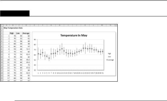
FIGURE 18.36
Plotting temperature data with a stock chart.
Learning More
This chapter introduced Excel charts, including examples of the types of charts that you can create. For many uses, the information in this chapter is sufficient to create a wide variety of charts.
Those who require control over every aspect of their charts can find the information they need in the next chapter. It picks up where this one left off and covers the details involved in creating the perfect chart.
436

CHAPTER
Learning Advanced
Charting
Excel makes creating a basic chart very easy. Select your data, choose a chart type, and you’re finished. You may take a few extra seconds and select one of the prebuilt Chart Layouts, and maybe even select
one of the Chart Styles. But if your goal is to create the most effective chart possible, you probably want to take advantage of the additional customization techniques available in Excel.
Customizing a chart involves changing its appearance as well as possibly adding new elements to it. These changes can be purely cosmetic (such as changing colors modifying line widths, or adding a shadow) or quite substantial (say, changing the axis scales or adding a second Value Axis). Chart elements that you might add include such features as a data table, a trend line, or error bars.
The preceding chapter introduced charting in Excel and described how to create basic charts. This chapter takes the topic to the next level. You learn how to customize your charts to the maximum so that they look exactly as you want. You also pick up some slick charting tricks that will make your charts even more impressive.
Selecting Chart Elements
Modifying a chart is similar to everything else you do in Excel: First you make a selection (in this case, select a chart element), and then you issue a command to do something with the selection.
You can select only one chart element (or one group of chart elements) at a time. For example, if you want to change the font for two axis labels, you must work on each set of axis labels separately.
IN THIS CHAPTER
Understanding chart customization
Changing basic chart elements
Working with data series
Discovering some chartmaking tricks
437

Part III: Creating Charts and Graphics
Excel provides three ways, described in the following sections, to select a particular chart element:
•Mouse
•Keyboard
•Chart Elements control
Selecting with the mouse
To select a chart element with your mouse, just click the element. The chart element appears with small circles at the corners.
Tip
Some chart elements are a bit tricky to select. To ensure that you select the chart element that you intended to select, view the Chart Element control, located in the Chart Tools Format Current Selection group of the Ribbon (see Figure 19.1). n
FIGURE 19.1
The Chart Element control displays the name of the selected chart element. In this example, the Legend is selected.
When you move the mouse over a chart, a small chart tip displays the name of the chart element under the mouse pointer. When the mouse pointer is over a data point, the chart tip also displays the value of the data point.
438

Chapter 19: Learning Advanced Charting
Tip
If you find these chart tips annoying, you can turn them off. Choose File Options and click the Advanced tab in the Excel Options dialog box. Locate the Display section and clear either or both the Show Chart Element Names on Hover or the Show Data Point Values on Hover check boxes. n
Some chart elements (such as a series, a legend, and data labels) consist of multiple items. For example, a chart series element is made up of individual data points. To select a particular data point, click twice: First click the series to select it and then click the specific element within the series (for example, a column or a line chart marker). Selecting the element enables you to apply formatting to only a particular data point in a series.
You may find that some chart elements are difficult to select with the mouse. If you rely on the mouse for selecting a chart element, you may have to click it several times before the desired element is actually selected. Fortunately, Excel provides other ways to select a chart element, and it’s worth your while to be familiar with them. Keep reading to see how.
Selecting with the keyboard
When a chart is active, you can use the up-arrow and down-arrow navigation keys on your keyboard to cycle among the chart’s elements. Again, keep your eye on the Chart Elements control to ensure that the selected chart element is what you think it is.
•When a chart series is selected: Use the left-arrow and right-arrow keys to select an individual item within the series.
•When a set of data labels is selected: You can select a specific data label by using the left-arrow or right-arrow key.
•When a legend is selected: Select individual elements within the legend by using the left-arrow or right-arrow keys.
Selecting with the Chart Element control
The Chart Element control is located in the Chart Tools Format Current Selection group and also in the Chart Tools Layout Current Selection group. This control displays the name of the currently selected chart element. It’s a drop-down control, and you can also use it to select a particular element in the active chart (see Figure 19.2).
The Chart Element control also appears in the Mini toolbar, which is displayed when you rightclick a chart element.
The Chart Element control enables you to select only the top-level elements in the chart. To select an individual data point within a series, for example, you need to select the series and then use the navigation keys (or your mouse) to select the desired data point.
439

Part III: Creating Charts and Graphics
Draft Mode for Charts
If you create complex charts with lots of formatting, you may find that screen updating slows down. If so, that’s a good time to turn on Draft mode.
New Feature
The Draft Mode charting option is new to Excel 2010. n
Select the chart, and choose Chart Tools Design Mode Draft. This command toggles Draft mode for the selected chart. This Ribbon button also has a drop-down list, which has commands to apply Draft mode to all charts. A Draft Mode indicator appears in the lower-right corner. Click this indicator to switch from Draft mode to Normal mode.
When a chart is displayed in Draft mode, some formatting may be hidden. For example, dashed and dotted lines appear solid, shadows are hidden, gradients display as solid colors, and transparent elements are not transparent.
When you edit a chart in Draft mode, you’ll notice that some formatting commands appear to have no effect. For example, if you apply a shadow to a chart element, the shadow does not appear. However, if you set the chart to Normal mode, the formatting will appear. Therefore, I recommend formatting your charts using Normal mode, not Draft mode.
In the unlikely event that you would like Draft mode to be the default for all charts, choose File Options, click the Advanced tab, locate the Charts section, and select the Insert Charts Using Draft Mode check box.
FIGURE 19.2
Using the Chart Element drop-down control to select a chart element.
440