

CHAPTER 8 USING THE FORMS API
Using the HTML5 Forms APIs
Now that we’ve spent some time familiarizing ourselves with the new form element types, let’s turn to the attributes and APIs that are present on both the old and new form controls. Many of them are designed to reduce the amount of scripting needed to create a powerful web application user interface. You may find that the new attributes give you the power to enhance your user interface in ways that you had not considered. Or, at the very least, you may be able to remove blocks of script in your existing pages.
New Form Attributes and Functions
First, we’ll consider new attributes, functions, and a few elements that did not previously exist in earlier versions of HTML. Like the new input types, it is generally safe to use these attributes today, whether or not your target browser supports them. This is because the attributes will be safely ignored by any browser on the market today if the browser does not understand them.
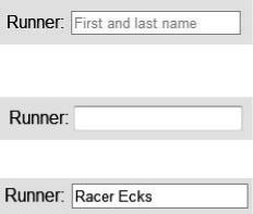
The placeholder Attribute
The placeholder attribute gives input controls an easy way to provide descriptive, alternate hint text which is shown only when the user has not yet entered any values. This is common in many modern user interface frameworks, and popular JavaScript frameworks have also provided emulation of this feature. However, modern browsers have it built-in.
To use this attribute, simply add it to an input with a text representation. This includes the basic text type, as well as the semantic types such as email, number, url, etc.
<label>Runner: <input name="name" placeholder="First and last name"></label>
In a modern browser, this causes the field to display a faint version of the placeholder text which will disappear whenever the user or application puts focus into the field, or whenever there is a value present.
The same attribute, when running in a non-supporting browser, will just be ignored, causing the default field behavior to display.
Similarly, whenever a value is entered in the field, the placeholder text will not appear.
200

CHAPTER 8 USING THE FORMS API
The autocomplete Attribute
The autocomplete attribute, introduced in Internet Explorer 5.5, has finally been standardized. Hooray! (Browsers have been supporting the attribute for nearly as long as its inception, but having a specified behavior helps everyone.)
The autocomplete attribute tells the browser whether or not the value of this input should be saved for future. For example:
<input type="text" name="creditcard" autocomplete="off">
The autocomplete attribute should be used to protect sensitive user data from insecure storage in the local browser files. Table 8-3 shows the different behavior types.
Table 8-3. Autocomplete Behavior in Input Controls
Type |
Purpose |
on |
The field is not secure, and its value can be saved and restored. |
off |
The field is secure, and its value should not be saved. |
unspecified |
Default to the setting on the containing <form>. If not contained in a form, or no value is |
|
set on the form, then behave as if on. |
|
|
The autofocus Attribute
The autofocus attribute lets a developer specify that a given form element should take input focus immediately when the page loads. Only one attribute per page should specify the autofocus attribute. Behavior is undefined if more than one control is set to autofocus.
Note Only one autofocus control per page is difficult to achieve if your content is being rendered into a portal or shared content page. Do not rely on autofocus if you are not in complete control of the page.
To set the focus automatically to a control such as a search text field, simply set the autofocus attribute on that element alone:
<input type="search" name="criteria" autofocus>
Like other boolean attributes, no value needs to be specified for the true case.
201
CHAPTER 8 USING THE FORMS API
Note Autofocus can annoy users if they are not expecting a focus change. Many users utilize keystrokes for navigation, and switching focus to a form control subverts that ability. Use it only when it is a given that a form control should take all default keys.
The spellcheck Attribute
The spellcheck attribute can be set on input controls with text content, as well as the textarea. When set, it suggests to the browser whether or not spelling feedback should be given. A normal representation of this element is to draw a red dotted line under text that does not map any entry in the currently set dictionary. This hints to the user to double-check the spelling or to get a suggestion from the browser itself.
Note that the spellcheck attribute needs a value. You can’t just set the attribute alone on the element.
<textarea id=”myTextArea” spellcheck=”true”>
Also note that most browsers will default to leaving the spellcheck on, so unless the element (or one of its parent elements) turns off spellchecking, it will display by default.
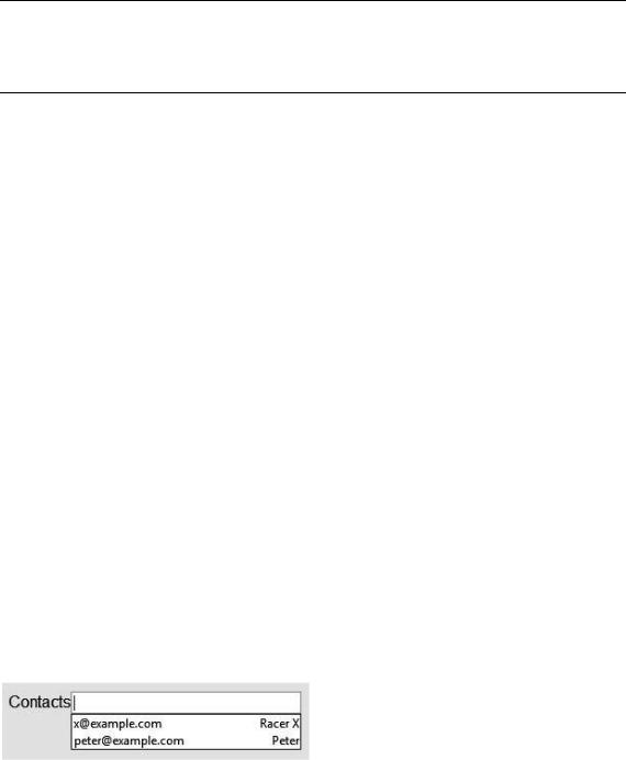
The list Attribute and the datalist Element
The list attribute and datalist element combine to let a developer specify a list of possible values for an input. To use this combination:
1.Create a datalist element in your document with its id set to a unique value. The datalist can be located anywhere in the document.
2.Populate the datalist with as many option elements as needed to represent the full set of suggestions for values of a control. For example, a datalist representing e-mail contacts should contain all of the contact e-mail addresses as individual option children.
<datalist id="contactList">
<option value="x@example.com" label="Racer X"> <option value="peter@example.com" label="Peter">
</datalist>
3.Link the input element to the datalist by setting the list attribute to a value which is the id of the associated datalist.
<input type="email" id="contacts" list="contactList">
On a supporting browser this produces a customized list control like the following:
202
CHAPTER 8 USING THE FORMS API
The min and max Attributes
As seen before in our example for <input type="range">, the min and max attributes allow a numerical input to be constrained to minimum and maximum values. One, both, or neither of these attributes can be provided as necessary, and the input control should adjust accordingly to increase or decrease the range of acceptable values. For example, to create a range control representing a level of confidence in ability from zero% to 100%, the following code could be used as follows:
<input id="confidence" name="level" type="range" min="0" max="100" value="0">
This would create a range control with a minimum zero value and maximum of 100, which, coincidentally, are the default values for the same.
The step Attribute
Also, for input types which expect numerical values, the step attribute specifies the granularity of increments or decrements in value as the range is adjusted. For example, our confidence level range control listed above can be set up with a step attribute of five as follows:
<input id="confidence" name="level" type="range" min="0" max="100" step="5" value="0">
This would limit the acceptable values to be increments of five from the starting value. In other words, only 0, 5, 10, 15, … 100 would be allowed either through typed input or through a slider control, depending on the browser representation of the input.
The default step value is dependent on the type of control to which it is applied. For a range input, the default step is one. To accompany the step attribute, HTML5 introduces two functions on the input element that allow the value to be controlled: stepUp and stepDown.
As you might expect, these functions increment or decrement the current value, respectively. As you might also expect, the amount by which the value is increased or decreased is the value of the step. As such, the value of a numeric input control can be tweaked without direct input from the user.
The valueAsNumber Function
The new valueAsNumber function is a handy way to convert the value of a control from text to number… and back! That is the case because the valueAsNumber is both a getter and a setter function. When called as a getter, the valueAsNumber function converts the text value of an input field into a number type upon which calculations are allowed. If the text value does not cleanly convert into a number type, then the NaN value (Not-a-Number) is returned.
The valueAsNumber can also be used to set the value of an input to a numeric type. For example, our confidence range could be set using a call such as:
document.getElementById("confidence").valueAsNumber(65);
Make sure the number meets the requirements of the min, max, and step, or an error will be thrown.
The required Attribute
If any input control has the required attribute set, then a value must be set on it before its form can be submitted. For example, to set a text input field as required, simply add the attribute as shown here:
203