

C H A P T E R 8
Using the Forms API
In this chapter, we’ll explore all the new capabilities at your command with a longstanding technology: HTML Forms. Forms have been the backbone of the explosion of the Web since they first appeared. Without form controls, web business transactions, social discussions, and efficient searches would simply not be possible.
Sadly, HTML5 Forms is one of the areas in greatest flux in both specification and implementation, in spite of having been in design for many years. There’s good and bad news. The good news is that the progress in this area, while incremental, is increasing fairly rapidly. The bad news is that you’ll need to tread carefully to find the subset of new form controls that will work in all your target browsers. The forms specification details a large set of APIs, and it is not uncommon to find that each major new release of an HTML5-compliant web browser adds support for one or more form controls and some of the helpful validation features.
Regardless, we’ll use this chapter to help you navigate through the virtual sea of controls and find which ones are ready to use today, and which are nearing release.
Overview of HTML5 Forms
If you are already familiar with forms in HTML—and we assume you are if you are interested in pro HTML programming—then you will find the new additions in HTML5 to be a comfortable fit on a solid foundation. If you aren’t yet familiar with the basics of form usage, we recommend any of the numerous books and tutorials on creating and handling form values. The topic is well covered at this point, and you will be happy to know that:
•Forms should still be encapsulated in a <form> element where the basic submission attributes are set.
•Forms still send the values of the controls to the server when the user or the application programmer submits the page.
•All of the familiar form controls—text fields, radio buttons, check boxes, and so on—are still present and working as before (albeit with some new features).
•Form controls are still fully scriptable for those who wish to write their own modifiers and handlers.
193

CHAPTER 8 USING THE FORMS API
HTML Forms Versus XForms
You may have heard references to XForms in the last few years, long before the HTML5 effort gained much traction. XForms is an XML-centric, powerful, and somewhat complex, standard for specifying client-side form behavior that has been developed in its own W3C working group for nearly ten years. XForms harnesses the full power of XML Schema to define precise rules for validation and formatting. Unfortunately, no current major browser supports XForms without additional plug-ins.
HTML5 Forms are not XForms.
Functional Forms
HTML5 Forms has instead focused on evolving the existing, simple HTML Forms to encompass more types of controls and address the practical limitations that web developers face today. There is an important note to keep in mind, especially as you compare form implementations across different browsers.
Note The most important concept to grasp about HTML5 Forms is that the specification deals with functional behavior and semantics, not appearances or displays.
For example, while the specification details the functional APIs for elements such as color and date pickers, number selectors, and email address entry, the specification does not state how browsers should render these elements to end users. This is a great choice on multiple levels. It allows browsers to compete on innovate ways to provide user interaction; it separates styling from semantics; and it allows future or specialized user input devices to interact in ways that are natural to their operation. However, until your targeted browser platforms support all the form controls in your application, make sure you provide enough contextual information for the user to know how to interact with a fallback rendering. With the right tips and descriptions, users will have no trouble with your application, even if it falls back to alternate content when presented with unknown input types.
HTML5 Forms encompasses a great number of new APIs and elements types, and support for them is all over the map now. In order to wrap our heads around all the new functionality, we will address it by breaking it into two categories
•New input types
•New functions and attributes
However, before we even start with that, let’s take a quick assessment of how the HTML5 Form specifications are supported in today’s browsers.
Browser Support for HTML5 Forms
Browser support for HTML5 Forms is growing, but still limited. The major browser vendors all support many of the form controls, with Opera taking the lead in early implementations. However, the specification is stable.
Checking for browser support is less useful in the context of the new Forms, as they have been designed to degrade gracefully in older browsers. Largely, this means that it is safe for you to use the new
194

CHAPTER 8 USING THE FORMS API
elements today, because older browsers will fall back to simple text field displays for any input types that they do not understand. However, as we’ll see later in this chapter, this raises the importance of multitier form validation, as it is not sufficient to rely on the presence of browser validators to enforce the data types for your form controls, even if you assume full modern-browser support.
Now that we have surveyed the browser landscape, let’s take a look at the new form controls added in the HTML5 specification.
An Input Catalog
One of the best places to get a catalog of all the new and changed elements in HTML5 is the markup list maintained at the W3C site itself. The W3C keeps a catalog page file at http://dev.w3.org/html5/markup/
This page denotes all the current and future elements in an HTML page. New and changed elements are noted in the catalog list. However, “new” in this list only means that the element has been added since the HTML4 specification—not that the element is implemented in browsers or in a final specification yet. With that warning in place, let’s take a look at the new form elements arriving with HTML5, starting with the ones that are being implemented today. Table 8-1 lists the new type attributes. For example, many HTML developers will be intimately familiar with <input type="text"> and <input type="checkbox">. The new input types follow a similar model to the existing ones.
Table 8-1. New HTML5 Form Elements Appearing in Browsers
Type |
Purpose |
tel |
Telephone number |
Email address text field |
|
url |
Web location URL |
search |
Term to supply to a search engine. For example, the search bar atop a browser. |
range |
Numeric selector within a range of values, typically visualized as a slider |
number |
A field containing a numeric value only |
|
|
What do these new input types provide? In terms of programmatic APIs… not a lot. In fact, in the case of the types for tel, email, url, and search, there are no attributes distinguishing them from the simplest input type of text.
So, what do you get exactly by specifying that an input is of a specialized type? You get specialized input controls. (Restrictions may apply. Offer void in many desktop browsers.)
Let’s illustrate with an example. By specifying that an input is of type email
<input type="email">
rather than using the conventional standard, which states that a field is merely of type text
<input type="text">
195
CHAPTER 8 USING THE FORMS API
you provide a hint to the browser to present a different user interface or input where applicable. You also provide the browser the ability to further validate the field before submission, but we’ll cover that topic later in this chapter.
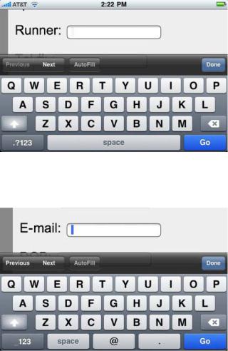
Mobile device browsers have been some of the quickest to take up support for these new form input types. On a phone, every key press or tap is a higher burden on a user who may not have a full keyboard. Consequently, the mobile device browsers support these new input types by displaying a different input interface based on the type declared. In the Apple iPhone, the standard onscreen keyboard display for an input with type text appears as it does in Figure 8-1.
Figure 8-1. Onscreen keyboard display for an input with type text
However, when an input field is marked as being of type e-mail, the iPhone presents a different keyboard layout customized for e-mail entry, as shown in Figure 8-2.
Figure 8-2. Onscreen keyboard display for an input with type e-mail
Note the subtle tweaks to the space bar area of the keyboard to allow for the @ symbol and easy access to the period. Similar tweaks to the keyboard layout are done for type URL and type search. However, in the desktop version of the Safari browser—and in any browser that does not explicitly
196
CHAPTER 8 USING THE FORMS API
support the types for e-mail, URL, search, and tel—only the normal text input field will be displayed. Future browsers, even the desktop versions, may provide visual hints or cues to the user to indicate that the field is of a certain subtype. Opera, for example, will display a small envelope icon next to a field to indicate that it is expecting an e-mail address. However, it is safe to use these types in your web applications today, as any browser will either optimize for the type or simply do nothing at all.
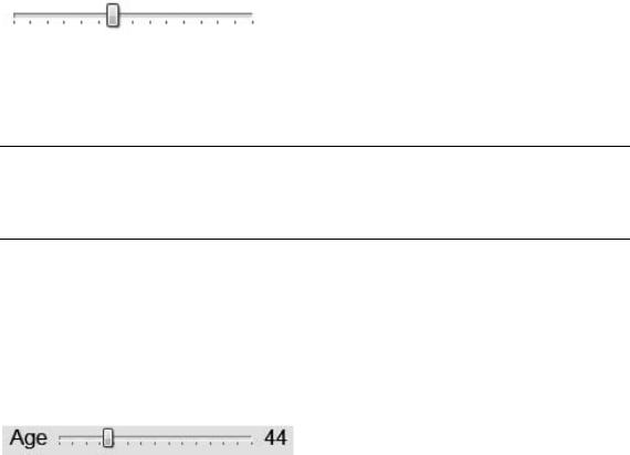
Another specialized type that is gaining traction in browsers now is the <input type="range">. This specialized input control is designed to let users pick from within a range of numbers. For example, a range control could be used in a form to select an age from a range that limits access to minors under the age of, say, 18. By creating a range input and setting its special min and max values, a developer can request that a page display a constrained numerical picker that only operates within the specified bounds. In the Opera browser, for example, the control:
<input type="range" min="18" max="120">
gives a convenient way to pick a suitable value for age-restricted material. In the Opera browser, it displays as follows:
Unfortunately, the range input itself doesn’t display a numerical representation of the browser. Moreover, without one, it is practically impossible for the user to know what the currently selected value happens to be. To fix this, one can easily add an onchange handler to update a display field based on changes to the current range value as shown in Listing 8-1.
Note Why don’t range elements contain visual displays by default? Perhaps it is so that user interface designers can customize the exact position and appearance of displays. Making the display optional adds a bit of work, but much more flexibility.
The new form controls now include a simple output element, which is designed just for this type of operation. An output is a form element, which simply holds a value. As such, we can use it to display the value of our range control.
Listing 8-1. onchange Handler to Update an output
<label for="age">Age</label>
<input id="age" type="range" min="18" max="120" value="18" onchange="ageDisplay.value=value"> <output id="ageDisplay">18</output>
This gives a nice display to our range input, as follows:
Opera and the WebKit-based browsers—Safari and Chrome—have now added support for the type range element. Firefox support is planned, but not yet scheduled as of this writing. Firefox will fall back to a simple text element when presented with a range input type.
197
CHAPTER 8 USING THE FORMS API
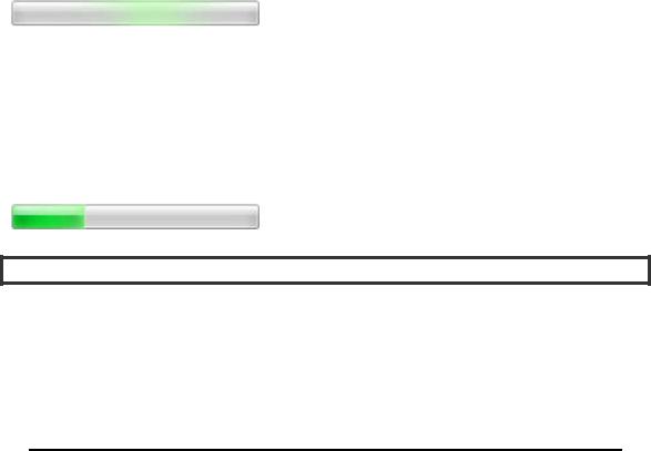
Another of the new form elements that has gained widespread support is the progress element. The progress element does exactly what you might expect; it displays the percentage of a task that is completed in a handy visual format.
Progress can be either determinate or indeterminate. Think of indeterminate progress as a task that takes an unknown amount of time, yet one where you want to assure the user that some progress is being made. To show an indeterminate progress element, simply include one with no attributes:
<progress></progress>
An indeterminate progress bar usually displays a bar in motion, but with no indicator of the overall percentage complete.
A determinate progress bar, on the other hand, shows an actual percentage-style display of the completed work. To trigger a determinate progress bar display, set the value and max attributes on the element. The percentage of the bar displayed as completed is calculated by dividing the value you set by the max you set. They can be any values you choose, to make calculation easier. For example, to show 30% completion, we can create a progress element such as:
<progress value=”30” max=”100”></progress>
With these values set, the user can quickly see how much of your long-running operation or multistep process is complete. Using script to change the value attribute, it is easy to update the display to indicate progress toward a final goal.
Here Be Dragons
Brian says: “The phrase ‘Here be dragons’ is said to have been used in history to denote dangerous areas on maps where unknown perils lurk. The same could be said for the following form elements. Although they are specified, and have been for lengths of time now, most are lacking in actual implementation.
As such, expect large changes between now and the time that browser developers have had a chance to play with the designs, smooth the rough edges, and respond with feedback and changes. Rather than rely on the following components as inevitable, take them as a sign of the direction in which HTML5 forms are moving. If you attempt to use them today, the risk you take is your own…”
Additional form elements that are planned but not widely supported yet include the ones listed in Table 8-2.
198
CHAPTER 8 USING THE FORMS API
Table 8-2. Future HTML5 Form Elements
Type |
Purpose |
color |
Color selector, which could be represented by a wheel or swatch picker |
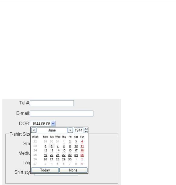
datetime |
Full date and time display, including a time zone, as shown in Figure 8-3 |
datetime-local |
Date and time display, with no setting or indication for time zones |
time |
Time indicator and selector, with no time zone information |
date |
Selector for calendar date |
week |
Selector for a week within a given year |
month |
Selector for a month within a given year |
|
|
Although some early implementations of these elements are beginning to appear in leading edge browsers (for example, the datetime display in Opera as shown in Figure 8-3), we won’t focus on them in this chapter as they are likely to undergo significant change. Stay tuned to future revisions!
Figure 8-3. Display for an input of type datetime
199