PART 4: MAKING THINGS LOOK GOOD |
451 |
|
|
9.Click a second time on Four. This selects the one legend entry.
10.Press Delete. That one entry in the legend is deleted.
11.Repeat steps 8-10 for series Three, Two, and One.
There are a number of special charts where extra rogue series are used to create some formatting. For more examples, check out:
●● Mario Garcia’s amazing five rogue charts in order from Learn Excel Podcast episode 1026. ●● Andy Pope’s charting tutorials at http://www.andypope.info/.
●● Jon Peltier’s charting tutorials at http://peltiertech.com/Excel/Charts/.
TWO STACKED, ONE CLUSTERED COLUMN
Problem: I need to create two stacked columns clustered with a third column.
Figure 1135 This is harder than it looks.
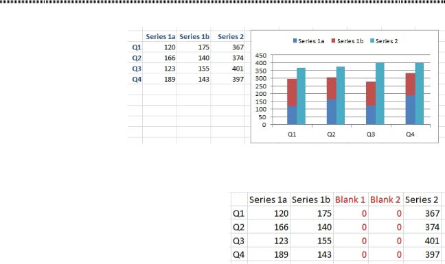
Strategy: This chart uses two rogue series and a hidden secondary axis. Follow these steps carefully. 1. Add two blank series between Series 1b and Series 2. Fill with zeroes.
|
Figure 1136 Two extra series. |
4 |
|
|
|
2. |
Create a stacked column chart from all five series. |
|
3. |
If you are plotting quarters, Excel will put the wrong data along the horizontal axis. Click the Switch |
|
4. |
Row/Column icon to move the Series 1a, Series 1b, and so on to the legend. |
|
Go to the Layout tab in the ribbon. Use the leftmost dropdown to choose Series 2. |
|
|
5. |
Click Format Selection to open the Format Dialog box. |
|
6. |
Choose Secondary Axis. Don’t close the Format dialog box. |
|
7. |
Go back to the dropdown and choose Series Blank 1. |
|
8. |
In the Format dialog box, choose Secondary Axis. |
|
9. |
Go back to the dropdown and choose Series Blank 2. |
|
10.In the Format dialog box, choose Secondary Axis. |
|
|
11.Go back to the dropdown and choose Series 2. |
|
|
12.Go to the Design tab of the ribbon. Choose Change Chart Type. Choose the first column chart, known |
|
|
|
as a Clustered Column Chart. This changes all three of the series that use the secondary axis. |
|
At this point, you finally have something that looks almost correct. There are still several things to fix: |
|
|
●● |
The left vertical axis is using a different scale than the first. |
|
●● |
The stacked column is wider than the clustered column. |
|
●● |
There are two extra entries in the legend. |
|
●● |
You really don’t need to show the secondary axis once you make them have the same scale. |
|
PART 4: MAKING THINGS LOOK GOOD |
453 |
|
|
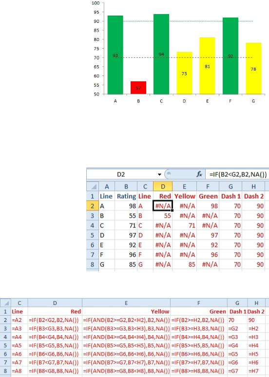
Figure 1139 Color the columns based on their value.
Strategy: Charts don’t support conditional formatting (yet). However, you can use formulas to separate your data into three series, one series for red, one series for yellow, and one series for green. Only one se- ries will be filled for each category. The other series will be #N/A.
The formulas below break the value in column B into one of three series in D, E, or F. Each value in B goes to exactly one cell in D:F.
Figure 1140 |
Formulas break the data into three series. |
4 |
|
||
|
|
|
The formulas used to create the table above are shown below.
Figure 1141 IF statements decide which color to use.
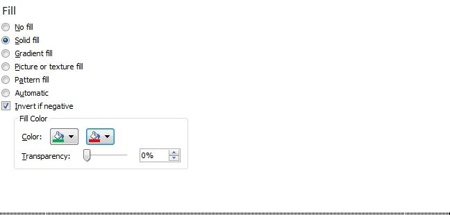
When you create the chart, create a stacked column chart. You will have to select each series and use For- mat, Shape Fill to choose the correct color.
If you need one color for positive and another color for negative, you can use a regular column chart. For- mat the series. On the Fill category, choose Invert if Negative. you can choose Green for the first color and red for the second color.
454 |
POWER EXCEL WITH MR EXCEL |
|
|
Figure 1142 This is new (back) in Excel 2010.
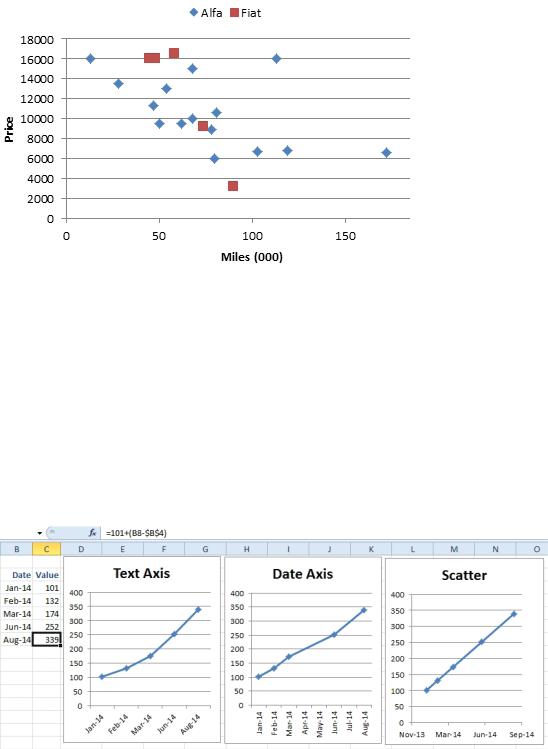
SCATTER CHARTS ARE VERSATILE BUT REQUIRE A DIFFERENT WORKFLOW
Problem: How to I create a scatter chart with two series?
Strategy: Create a chart with one series. Then select the second series and use Paste Special to get that data on the chart. Most of the charts that you use in Excel have labels for the category axis in column 1, data for the first series in column 2, data for the third series in category 3, and so on. Microsoft has shoehorned the scatter chart into the same engine used to create regular charts and it makes it a bit difficult to specify the second series.
In a scatter chart, the first column is used to specify a numeric location along the x-axis. The second col- umn is used to specify a numeric location along the y-axis. Scatter charts are also known as X-Y charts for this reason.
Scientists use scatter charts to compare two variables. If you have some variable that you can control, put that along the x-axis. Plot another variable which is dependent on the first variable along the x-axis. The resulting pattern of the dots plotted in the chart allow you to spot patterns and outliers.
Excel tricksters use scatter charts because they solve a number of problem. The only way to show hours and minutes along the x-axis is to use a scatter chart. Scatter charts are also really good ways of drawing a line at a specific place on a chart.
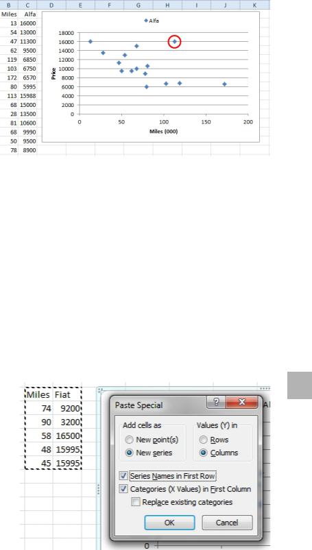
I like to use scatter charts to compare two different populations of data. This particular chart is maddening to create in one step. For whatever reason, the scatter chart almost always comes out when I am used car shopping. We will start with that scenario.
I just went through one of the online car shopping sites and found all of the Alfa Romeo Spider Veloce ve- hicles for sale in the United States. I made a list of them, comparing mileage and asking price. I wanted to see how mileage and asking price are correlated. Mileage goes in column 1. Asking price in column 2. For reasons that will become evident later, the heading for column 2 should be Alfa.
1. Select the two columns including the headings.
2. Insert, Scatter, Scatter With Only Markers
3. Layout, Chart Title, None
4. Layout, Axis Titles, Primary Horizontal Axis Title, Title Below Axis. 5. Click on the Axis Title and type Miles (000). Press Enter.
6. Layout, Axis Titles, Primary Vertical Axis Title, Title Below Axis. 7. Click on the Axis Title and type Price. Press Enter.
8. Layout, Legend, Show Legend at Top.
You now have the chart shown below. You would expect the dots to slope from top left to lower right. As the miles increase, the price should go down. The dots roughly fall in this pattern, but there are outliers.
The highest priced car is the one with only 13,000 miles. That is impressive for a car that is 20-30 years old at this point. But, there is also a car for the same price with 113,000 miles. That point is in an outlier. The other cars with that many miles are half the price. Either this car is pristine and restored, or the owner has no sense of reality.
PART 4: MAKING THINGS LOOK GOOD |
457 |
|
|
Figure 1147 For irregularly spaced time data, the scatter is a must.
Gotcha: Labeling scatter charts is annoyingly difficult using Excel. If you need to label individual points, search for Rob Bovey’s Chart Labeler utility. It is free. It does exactly what you need.
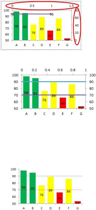
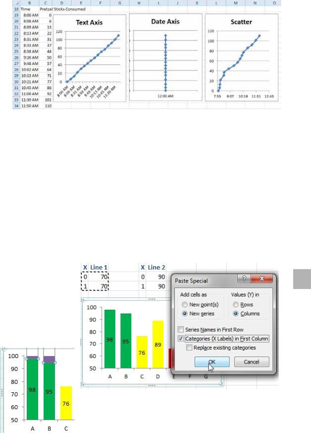
Scatter charts are a great way to draw on a chart. Do you need a straight line? It only takes two points to draw a line. Way back in Figure 1139, I added two line chart series to draw a horizontal line at 70 and 90 in that chart. Those lines don’t stretch all the way across the chart. They start in the middle of the first point and extend to the end of the last point. Had I added two scatter chart series instead, I could have achieved a true line all the way across the chart.
You need nerves of steel to do this, because during several steps, your chart will head in the wrong direc- tion. You need to keep going until the end when everything will look OK. Follow these steps to add lines at 70 and 90 to a chart.
1. For the first line, you need two data points. Plan on having the x-axis stretch from 0 to 1. (Think about this like 0 to 100% of the width of the chart). Enter a range that shows the height at 0 is 70 and the height at 100 is 70. This will be a straight line all the way across the chart at a height of 70. This is entered as a two-row by two-column range.
2. Enter the range for the second line. Enter 0, 90; 1, 90 in four cells.
3. Select the first range of four cells. Ctrl+C to copy.
4. Select the chart. Paste Special. 4 Choose New Series. Columns.
Categories in First Column. Leave the other two checkboxes unchecked.
Already, things are starting to look bad. The new series is added as a stacked series on top of A & B.
Figure 1148 Paste the first line to the chart.
Figure 1149 This doesn’t look like a line.