

Phone_81_Development_for_Absolute_Beginners
.pdf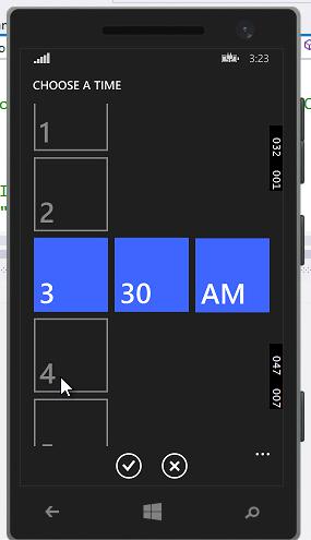
I can choose a time, then tap the check mark to accept the new time or the x icon to cancel the selection. When I choose a time and click the Button, I retrieve the Time in a raw format. Again, I could use the built-in DateTime functions or String.Format to nicely format the time as desired:
Windows Phone 8.1 Development for Absolute Beginners – Page 60
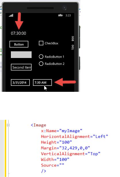
Next, we’ll look at the Image control:
To demonstrate this control, I’ll need to add the sunny.png file from the Assets folder in the Lesson5.zip file that accompanies this lesson. You can drag that sunny.png file from Windows
Explorer into the Assets folder of the Solution Explorer. When you’re finished you should see the image file listed in your Assets folder like so:
Windows Phone 8.1 Development for Absolute Beginners – Page 61
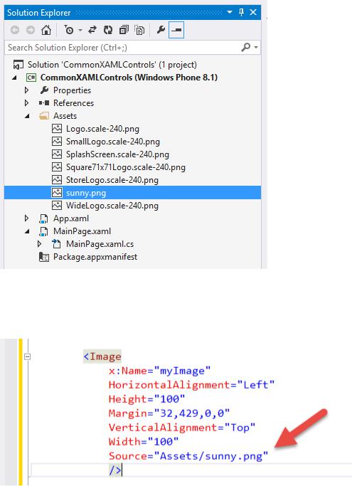
Now I’ll edit the Image code I added a moment ago to set the Source attribute to: “Assets/sunny.png”:
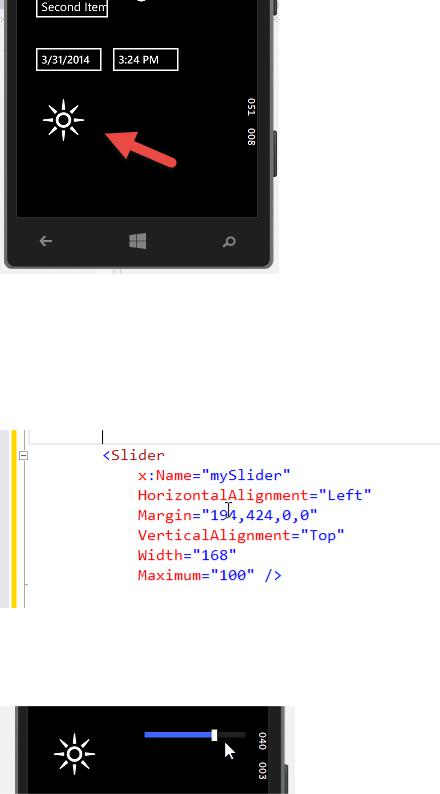
When I run the app, I can see the image:
Windows Phone 8.1 Development for Absolute Beginners – Page 62
Later in this series, we’ll learn how to programmatically set the Source property of the Image control by constructing a URI object. More on that later.
Next, we’ll work with the Slider control which allows a user to choose a value between a
Minimum and Maximum value. In this case, the Minimum will be 0 (the default) and the Maximum will be 100.
When we run the app, you can drag the slider to the right (higher value) or to the left (lower value):
The Slider simplifies numerical input as long as there’s only a limited set of values and precision is not important.
Windows Phone 8.1 Development for Absolute Beginners – Page 63
Next, I’ll demonstrate the use of a ProgressBar. You typically use a ProgressBar to display feedback to the end user as to the progression of a given operation. As the bar creeps from left to right, it lets the user know the approximate progress and pace of the operation.
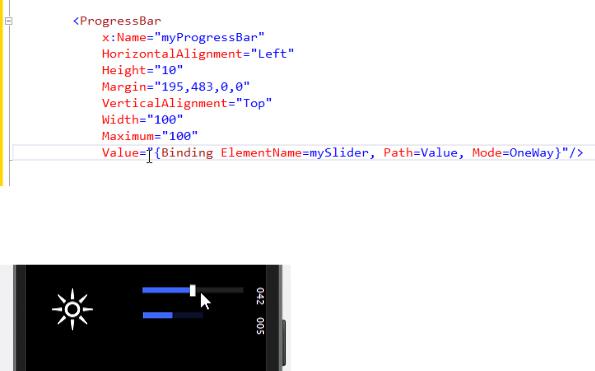
In our case, we’ll use the ProgressBar to mirror the current value of the Slider control. In other words, as you drag the Slider left and right, we’ll retrieve the value of the Slider and set it to the value of the ProgressBar. We certainly could accomplish this in C#, however in this case we’ll use a special feature of XAML called binding. Here, we’ll set the Value attribute of the
ProgressBar to the Value of the mySlider control using a special binding syntax:
We’ll learn more about this binding syntax later. For now, when we run the app and change the value of the Slider, the ProgressBar’s value changes as well.
Most of this series will rely on binding, but not to other controls. Rather, we’ll be binding to data that represents information our app will manage in memory and to the Phone’s storage.
Similar to the ProgressBar is the ProgressRing. While the ProgressBar provides feedback as to the estimated completion of a given task, the ProgressRing only provides feedback to the user that the operation is in progress with no indication how long until completion. We’ll add the ProgressRing’s XAML to our MainPage.xaml:
Windows Phone 8.1 Development for Absolute Beginners – Page 64
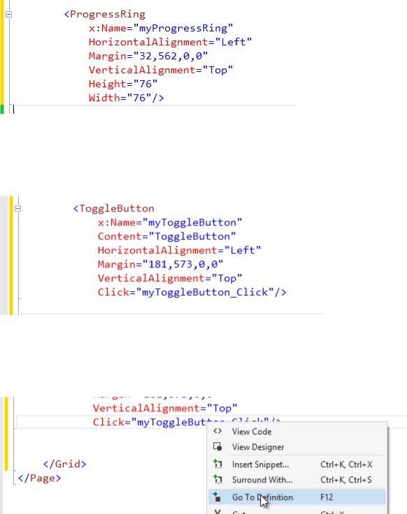
And I’ll pair this control up with another common control, the ToggleButton. The ToggleButton has three states: On, Off and Unknown. First, we’ll add the ToggleButton:
I’ll want to respond each time the user taps the ToggleButton, so I’ll handle the Click event. Once again, I’ll right-click the event handler method name “myToggleButton_Click” and select “Go To Definition” from the context menu:
… to create a method stub. Inside the method, I’ll add the following code:
Windows Phone 8.1 Development for Absolute Beginners – Page 65
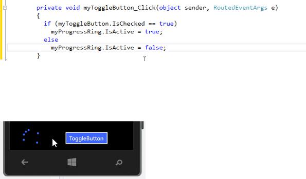
Based on the IsChecked property of the ToggleButton, I’ll set the ProgressRing’s IsActive property to true (turns it on) or false (turns it off). When I run the app and click the ToggleButton to the On state, the ring pulsates:
These are some of the very most common controls. Some of them like our DatePicker, TimePicker, the ComboBox employ other controls like the Flyout that will display other options on another “page” and when you make the selection, it will return to the original page with the given control set to the selection the user made.
There are literally hundreds of additional properties, dozens for each of the controls that are displayed here for specific purpose, and as we go through the series you'll learn a few. But ultimately, if you can imagine some desired interaction or display based on previous experience working with the Phone or with apps in general there's probably going to be a property that will allow that will facilitate that feature. I recommend perusing the list of properties for a given control to get an idea of what it can do. When you come across a property you do not understand, take a moment and search MSDN for more information to see if it can help you accomplish what you need.
Windows Phone 8.1 Development for Absolute Beginners – Page 66
Lesson 6: Themes and Styles XAML
The Windows Phone operating system has a distinctive look and feel. I’m not just talking about the tile-based user interface, but also the colors and typography. If you search online for
“windows phone style guide” you’ll find official documents from Microsoft that outline these suggestions. However, even inside of those guidelines, there is room for creative expression and branding. So, you’ll want to know the rules and know when to break them.
In this lesson, I’m going to talk about the technical aspects of working with XAML to style your app. Primarily, I’ll talk about creating re-usable resources and styles that can be shared between many elements whether on the same page or the same application. Finally, we’ll talk about the pre-built themes that are available so that forces consistency across all apps on a given user’s phone.
Suppose you have a particular color or setting that you know you’ll want to re-use throughout a page or the entire app, or a color or setting that you may want to change occasionally and you want to make the change in one place and have it reflected everywhere that style is used, similar to a Cascading Style Sheet style. In that case, you can create a resource and then bind to it as needed.
I created a simple Phone project called XAMLResources with the simplest {StaticResource} example I could think of:
(1 ) I add <Page.Resources> as a child element of <Phone> to hold Local (or rather, page-level) Resources. Any resources or styles created here will only be available on this page, not other pages.
(2 ) I create a SolidColorBrush resource that I can reference with the key "MyBrush".
<Page.Resources>
<SolidColorBrush x:Key="MyBrush" Color="Brown" /> </Page.Resources>
(3 ) To utilize this SolidColorBrush with the key “MyBrush”, I’ll bind to it like so:
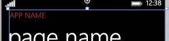
<TextBlock Text="APP NAME"
Foreground="{StaticResource MyBrush}" />
The result:
Windows Phone 8.1 Development for Absolute Beginners – Page 67
The key is the binding syntax which we’ll see often for different purposes in XAML. Binding to a resource takes the form of:
{StaticResource ResourceName}
The curly braces indicate binding. The first word “StaticResource” define the type of binding … we’re binding to a resource that is defined in XAML, as opposed to a more dynamic form of binding for data which we’ll talk about later.
Beyond simple resources, styles allow you to collect one or more settings that can be re-used across a Page or across an entire app for a specific control. Then, when you want to re-use that style, you set a given control’s Style attribute and bind it to that style you defined.
Virtually every control and even the Page itself has features of its appearance that can be customized, whether it be fonts, colors, border thickness, width and height or what have you. All of these attributes can be set on an individual basis on each control in your XAML.
Here I create the following style:
<Page.Resources>
. . .
<Style TargetType="Button" x:Key="MyButtonStyle"> <Setter Property="Background" Value="Blue" /> <Setter Property="FontFamily" Value="Arial Black" /> <Setter Property="FontSize" Value="36" />
</Style> </Page.Resources>
Here I create a Style that I can reference with the key "MyButtonStyle". Notice that the TargetType is set to Button ... this style only applies to Button controls. Inside of this style, I can set individual attributes of the Button. I have three attributes set using <Setter > elements that include the Property (attribute on the Button) I want to set and the value I want it set to. So, in this case, I create a style which sets the Background attribute to the SolidColorBrush "Blue" as well as certain attributes of the Font to give it a distinctive appearance.
(4) Next I bind my Button's Background attribute to the value bound to MyButtonStyle.
<Button Content="My Brush Example"
Height="100"
Windows Phone 8.1 Development for Absolute Beginners – Page 68
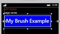
Style="{StaticResource MyButtonStyle}" />
Which produces this result:
In this overly simplistic example, it may not be readily apparent the value of this approach. As you application grows large and you want to keep a consistent appearance between the controls on the page, you may find this quite handy. It keeps the XAML concise and compact. And, if you need to change the style or color for any reason, you can change it once and have the change propagate to everywhere it has been applied.
I created these Local Resources on the page, meaning they are scoped to just the MainPage.xaml. What if I wanted to share these Resources across the entire application? In that case, I would remove them from the Page’s <Page.Resources> and add them in the App.xaml's <Application.Resources> section as a System Resource:
<Application
. . .>
<Application.Resources>
<SolidColorBrush x:Key="MyBrush" Color="Brown" /> <Style TargetType="Button" x:Key="MyButtonStyle"> <Setter Property="Background" Value="Blue" />
<Setter Property="FontFamily" Value="Arial Black" /> <Setter Property="FontSize" Value="36" />
</Style> </Application.Resources>
</Application>
And there should be no change to the appearance of the Button on my original MainPage.xaml.
Windows Phone 8.1 Development for Absolute Beginners – Page 69