

Phone_81_Development_for_Absolute_Beginners
.pdf(4)For more complex property settings, XAML offers property element syntax which harnesses the intelligent XAML parser to rely on default properties and deduction to reduce the amount of XAML code required to express a design.
(5)We learned about the embedded syntax style and the embedded nature of elements which suggests a relationships between visual elements. For example, the Phone contains a Grid for layout, which in turn contains input or other types of controls. These are represented with opening and closing elements representing containment or ownership.
(6)We learned about default properties; each control has a default property which can be set using that same style of embedded syntax.
Next, let's learn more about the Grid for layout, we'll learn about XAML's attached property syntax and how events are wired up in the next lesson.
Windows Phone 8.1 Development for Absolute Beginners – Page 30
Windows Phone 8.1 Development for Absolute Beginners – Page 31
Lesson 4: Understanding XAML Layout and Events
In this lesson I want to talk about layout, or in other words, how controls are positioned and arranged on your app's user interface.
So, my game plan:
(1)We'll start by talking about the two primary elements used in layout and positioning: the Grid element and StackPanel element.
(2)With regards to the Grid, I'll talk about defining rows and columns and various sizing options and techniques you can use to fully unlock the power of the Grid
(3)With regards to the StackPanel, we’ll discuss how to change the orientation of items inside the StackPanel, and how to affect the alignment of items as well.
(4)Finally, we'll talk about how event handers are "wired up" from both XAML and in C#.
Understanding the Basics of Grids
The Grid element is used for laying out other controls ... it allows you to define rows and columns, and then each control can request which row and column they want to be placed inside of.
When you use the Blank App Template, you’re provided very little layout guidance to get started.
Note: I typically don’t like to talk about previous versions of things that are no longer relevant to beginners, however since the following ideas I’m about to talk about were so prevalent in articles and books I feel it is necessary to talk about this.
In the past, the Page templates provided a high level <Grid> element named "LayoutRoot" that created three distinct areas:
(1)A very short top-most row for the app name
(2)A second short row for the page’s name
(3)One very large row (the remainder of the space available) that contained another Grid called the “ContentPanel”. The intent of the ContentPanel was that you would add the remainder of your XAML layout code there.
Keep that in mind because you may see articles and books based on previous versions of Phone tooling support in Visual Studio to the “ContentPanel”.
Windows Phone 8.1 Development for Absolute Beginners – Page 32
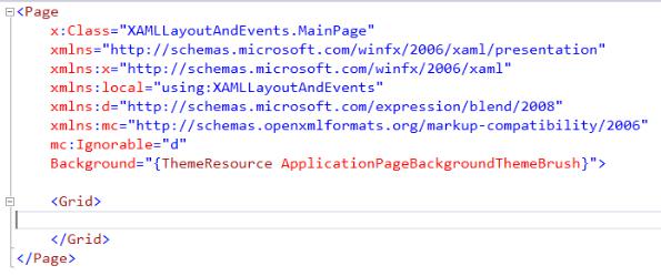
However, in the tooling support for Phone 8.1, the Page template contains a single empty grid:
This Grid appears that there's no rows or columns defined. However, by default, there's always one RowDefinition and one ColumnDefinition even if it's not explicitly defined, and these take up the full vertical and horizontal space available to represent one large "cell" in the Grid. Any items placed between the opening and closing <Grid></Grid> elements are understood to be inside that single implicitly defined "cell".
Grid RowDefinitions and ColumnDefinitions and defining sizes
I’ll create a quick example of a Grid that defines two rows to illustrate two primary ways of row height sizes (Project: RowDefinitions):
<Grid> <Grid.RowDefinitions>
<RowDefinition Height="Auto" /> <RowDefinition Height="*" />
</Grid.RowDefinitions>
<Rectangle Height="100" Fill="Beige" Grid.Row="0" /> <Rectangle Grid.Row="1" Fill="SteelBlue" />
</Grid>
The result:
Windows Phone 8.1 Development for Absolute Beginners – Page 33

First, notice how the two Rectangles place themselves inside of the two rows ... by using an attribute Grid.Row="0" and Grid.Row=”1” respectively. You reference both rows and columns using a zero-based numbering scheme.
Second, notice the two different row heights … Height=”Auto” and Height=”*”. There are three syntaxes that you can use to help persuade the sizing for each row and column. I used the term "persuade" intentionally. With XAML layout, heights and widths are relative and can be influenced by a number of factors. All of these factors are considered by the layout engine to determine the actual placement of items on the page.
For example, "Auto" means that the height for the row should be tall enough to accommodate all of the controls that are placed inside of it. If the tallest control (in this case, a Rectangle) is 100 pixels tall, then that's the actual height of the row. If it's only 50 pixels, then THAT is the height of the row. Therefore, "Auto" means the height is relative to the controls inside of the row.
The asterisk is known as "star sizing" and means that the height of the row should take up all the rest of the height available.
Here's a quick example of another way to use "star sizing" ... I created a project that has three rows defined in the ContentPanel. Notice the heights of each one (Project: StarSizing):
<Grid>
Windows Phone 8.1 Development for Absolute Beginners – Page 34
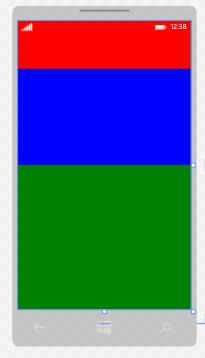
<Grid.RowDefinitions> <RowDefinition Height="1*" /> <RowDefinition Height="2*" /> <RowDefinition Height="3*" />
</Grid.RowDefinitions>
<Rectangle Fill="Red" Grid.Row="0" /> <Rectangle Fill="Blue" Grid.Row="1" /> <Rectangle Fill="Green" Grid.Row="2" />
</Grid>
This produces the following result:
Putting a number before the asterisk, I'm saying "Of all the space available, give me 1 or 2 or 3 shares of the remainder". Since the sum of all those rows adds up to six, each 1* is equivalent to 1/6th of the height available. Therefore, 3* would get half of the height available as depicted in the output of this example:
Besides Auto and star sizing, you can also specify widths and heights (as well as margins) in terms of pixels. In fact, when only numbers are present, it represents that number of pixels. Generally, it's not a good idea to use exact pixels in layouts for widths and heights because of the likelihood that screens -- even Windows Phone screens, can have different dimensions. Instead, it's preferable to use relative values like Auto and star sizing for layout.
Windows Phone 8.1 Development for Absolute Beginners – Page 35
One thing to note from this example is that control widths and heights are assumed to be 100% unless otherwise specified. That's why the rectangles take up the entire "cell" width. This is why in Lesson 2 the button first occupied the entire grid, and why I had to specify I wanted the button to be 200 x 100 pixels instead.
I want to also point out that a Grid can have a collection of ColumnDefinitions as you can see from this example app I created called GridsRowsAndColumns. Here we have a 3 by 3 grid:
<Page.Resources>
<Style TargetType="TextBlock">
<Setter Property="FontSize" Value="42" /> </Style>
</Page.Resources>
<Grid> <Grid.RowDefinitions>
<RowDefinition Height="*" /> <RowDefinition Height="*" /> <RowDefinition Height="*" />
</Grid.RowDefinitions> <Grid.ColumnDefinitions>
<ColumnDefinition Width="*" /> <ColumnDefinition Width="*" /> <ColumnDefinition Width="*" />
</Grid.ColumnDefinitions>
<TextBlock>1</TextBlock>
<TextBlock Grid.Column="1">2</TextBlock> <TextBlock Grid.Column="2">3</TextBlock>
<TextBlock Grid.Row="1">4</TextBlock>
<TextBlock Grid.Row="1" Grid.Column="1">5</TextBlock>
<TextBlock Grid.Row="1" Grid.Column="2">6</TextBlock>
<TextBlock Grid.Row="2">7</TextBlock>
<TextBlock Grid.Row="2" Grid.Column="1">8</TextBlock>
<TextBlock Grid.Row="2" Grid.Column="2">9</TextBlock>
</Grid>
... and the result is a simple grid with a number in each "cell":
Windows Phone 8.1 Development for Absolute Beginners – Page 36
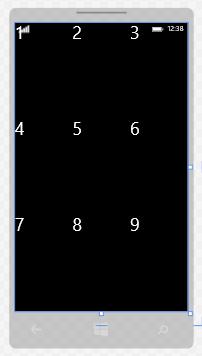
The other thing I want you to notice about this example is that when you don't specify a Grid.Row or Grid.Column, it is assumed to mean the first row (row 0) or first column (column 0). Relying on the defaults keeps your code more concise.
Grid cell Alignments and Margins
I have another example app called AlignmentAndMargins. This XAML:
<Grid>
<Rectangle Fill="Blue" Height="100" Width="100" HorizontalAlignment="Left" VerticalAlignment="Top" />
<Rectangle Fill="Red" Height="100" Width="100"
HorizontalAlignment="Right" VerticalAlignment="Bottom" />
<Rectangle Fill="Green"
Windows Phone 8.1 Development for Absolute Beginners – Page 37
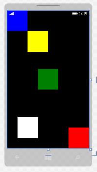
Height="100"
Width="100"
HorizontalAlignment="Center"
VerticalAlignment="Center" />
<Rectangle Fill="Yellow"
Height="100"
Width="100"
HorizontalAlignment="Left"
VerticalAlignment="Top"
Margin="100,100"/>
<Rectangle Fill="White"
Height="100"
Width="100"
HorizontalAlignment="Left"
VerticalAlignment="Bottom"
Margin="50,0,0,50"/>
</Grid>
Produces this result:
Most of this example should be obvious if you stare at it for a few moments, but there are several finer distinctions I want to make about Alignments and Margins. First, it points out how
Windows Phone 8.1 Development for Absolute Beginners – Page 38
VerticalAlignment and HorizontalAlignment work, even in a given Grid cell (and the same will hold true in a StackPanel as well). The ___Alignment attributes PULL controls TOWARDS their boundaries. By contrast, the Margin attributes PUSH controls AWAY from their boundaries.
The second observation is the odd way in which Margins are defined ... as a series of numeric values separated by commas. This convention was borrowed from Cascading Style Sheets. The numbers represent the margin pixel values in a clock-wise fashion starting from the left side. So,
Margin="10,20,30,40"
Means, 10 pixels from the left boundary, 20 pixels from the top boundary, 30 pixels from the right boundary, 40 pixels from the bottom boundary. In this case, the boundary is a single Grid cell (since the Content panel only has not defined any additional RowDefinitions and ColumnDefinitions).
A bit earlier I said that it's generally a better idea to use relatives sizes like Auto and * to define heights and widths ... why, then, are margins are defined using pixels? Margins are expressed in exact pixels because they are usually just small values to provide spacing or padding between two relative values and can therefore be a fixed value without negatively impacting the overall layout of the page.
StackPanel basics
It will arrange your controls in a flow from top to bottom or from left to right depending on the Orientation property you set.
Here’s an example of using A LOT of StackPanels to achieve a intricate layout:
<Grid>
<StackPanel Orientation="Horizontal" VerticalAlignment="Top"> <Rectangle Width="200" Height="200" Fill="Bisque" /> <StackPanel Orientation="Vertical">
<StackPanel Orientation="Horizontal">
<Rectangle Width="100" Height="100" Fill="Azure" /> <StackPanel Orientation="Vertical">
<Rectangle Width="100" Height="50" Fill="RosyBrown" /> <Rectangle Width="100" Height="50" Fill="DarkCyan" /> </StackPanel>
</StackPanel>
<StackPanel Orientation="Horizontal">
<Rectangle Width="100" Height="100" Fill="Tomato" /> <StackPanel Orientation="Vertical">
<Rectangle Width="100" Height="50" Fill="BurlyWood" />
Windows Phone 8.1 Development for Absolute Beginners – Page 39