

iif_kpmp_Borsellino_Day_Trader_s_Course.pdf
.pdf
4
Technical Analysis 102
“The trend is your friend,” the old trading adage goes. But what, exactly, is the prevailing trend? In this chapter we will address trend lines and what they illustrate in the market. A trend line is a linear, graphical representation of at least two points in the market that attempt to identify the general trend, or the trend of the extreme limits. Those points could be from one significant low to another, between two highs, or between a low and a high. Conceivably, you could use any two points on a chart (since every price on a chart is part of the market). But the most telling trend lines are usually those drawn between two significant, consecutive highs and two significant, consecutive lows.
TREND LINES
As you’ll recall in Chapter 3, when you look at a price chart certain patterns and features stand out, such as the peaks (highs) and valleys (lows). Trend lines then can be drawn on the chart, connecting those highs or lows, and extended out into the future. The trend line projects a path that the market would take if it continued on its course. Remember, Newtonian physics states that an object in motion will con-
75

76 |
TECHNICAL ANALYSIS 102 |
tinue that motion until it meets an equal or opposite force. The same thing applies to the market. A stock or index that is trending in one direction will tend to continue that trend until it meets with an equal or opposite force in the form of support or resistance—and very often this change can be very abrupt.
Thus, as the market moves up and down in smaller gyrations within an overall pattern, the trend lines identify the potential areas of significant force—meaning where it’s likely to hit resistance to slow or stop an uptrend or to find support to slow or stop a downtrend.
To begin, take a chart of any stock or index, since these methods apply to all markets that trade. Figure 4.1 is a chart of the Dow Jones Industrial Average (symbol INDU).
Just looking at the chart, two of the features that stand out are the peak in early March and then the next peak in late March. The line
11500 |
|
|
|
|
|
|
11000 |
|
|
|
|
|
|
10500 |
|
|
|
|
|
|
Price |
|
|
|
|
|
|
10000 |
|
|
|
|
|
|
9500 |
|
|
|
|
|
|
9000 |
|
|
|
|
|
|
Nov 20 |
Dec 19 |
Jan 17 |
Feb 14 |
Mar 16 |
Apr 20 |
May 18 |
DTN InterQuote |
|
|
|
|
www.interquote.com |
|
Figure 4.1 INDU Historical Chart (Source: www.interquote.com, DTN Financial Services)

TREND LINES |
77 |
drawn between these two consecutive highs forms a trend line that marks resistance that this market faces on the upside. Then later in April, once the market was able to get above that trend line, it rallied steadily.
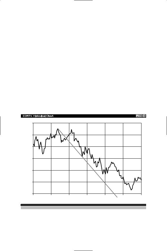
Similarly, let’s look at a trend line formed by two significant lows. Figure 4.2 is a chart of the Nasdaq Composite.
Draw a line from the low in late July to the low made in midOctober, and then extend that line into the future. This line shows the support level under the market from mid-October through December. (Looking farther into the future, the market traded above this line in January and February, and then touched it in early March before trading higher.)
Other trend lines extend from a significant high to a significant low, or from a significant low to a significant high. These types of trend
Price
4500
4000
3500
3000
2500
2000
1500 |
|
|
|
|
|
|
Apr 20 |
Jun 23 |
Aug 25 |
Oct 31 |
Jan 02 |
Mar 08 |
May 14 |
DTN InterQuote |
www.interquote.com |
Figure 4.2 COMPX Historical Chart (Nasdaq Composite Index— Combine) (Source: www.interquote.com, DTN Financial Services)
78 |
TECHNICAL ANALYSIS 102 |
lines are the most useful when each point is part of a separate, but consecutive chart pattern. For example, you might start the line at a significant high point at the end of an uptrend, and then select a low in a rangebound pattern that follows.
Figure 4.3 is an example of such a trend line, using the same Nasdaq chart as in Figure 4.2. This type of high to low (or low to high) trend line can be drawn in several places. One example is from the mid-July high, which is at the end of an uptrend pattern, to the midOctober low, which is part of a sharp sell-off pattern. This trend line, when extended into the future, is support when the market is above this line and resistance when it trades below it. Going forward, lines like this are significant, especially as the market approaches them. For example, if the market were trading below this type of trend line, one
Price
4500
4000
3500
3000
2500
2000
1500 |
|
|
|
|
|
|
Apr 20 |
Jun 23 |
Aug 25 |
Oct 31 |
Jan 02 |
Mar 08 |
May 14 |
DTN InterQuote |
www.interquote.com |
Figure 4.3 COMPX Historical Chart (Source: www.interquote.com, DTN Financial Services)

TREND LINES |
79 |
would look for the market to face considerable resistance as it approached the line.
As with moving averages, discussed in Chapter 3, a variety of trend lines can be drawn and applied to the same chart. But just as we did in our exercises in Chapter 3, it’s important not to rush the steps. Rather, take each trend line you apply to a chart one at a time. What does it show you? When the line is extended, what significant highs and/or lows does it touch?
Applying different trend lines to your chart—and studying each, one at a time—you may find that some are more meaningful to you than others. For example, a trend line that touches one or more highs (or lows) shows an area of resistance (or support).
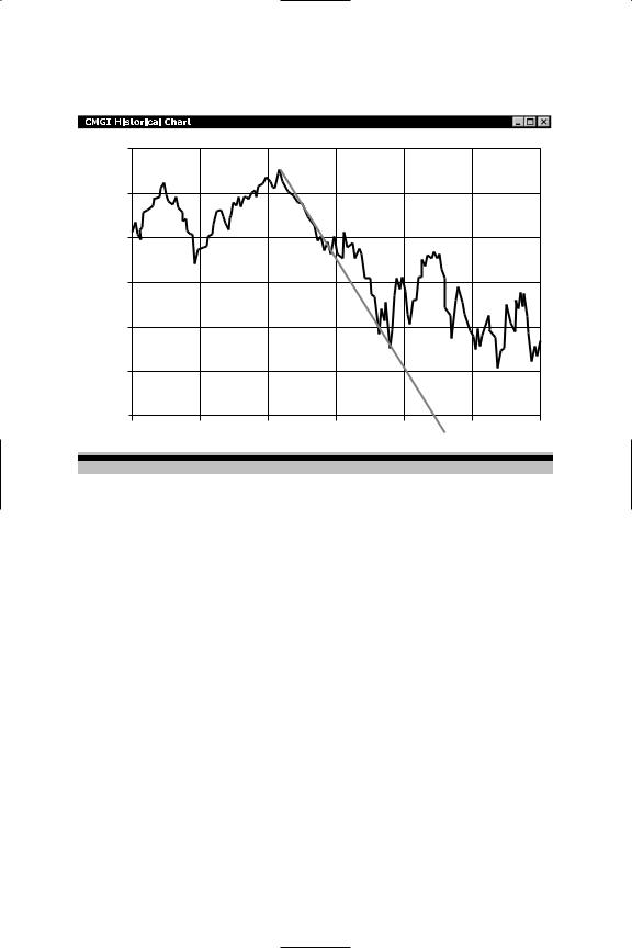
Additionally, there are other kinds of lines that can be applied to a chart. One type is the regression line that marks the mean of the market activity—the level around which much of the market activity has been centered. To draw a regression line, first choose a particular pattern on your chart. Now, draw a line that is in the middle of that price activity. (See Figure 4.4.) This line, which you’ve drawn by eye, can be made more exact by charting software that allows for regression lines to be drawn.
The resulting regression line bisects the market activity. Now, add two parallel lines—one above and one below—that connect two highs and two lows.
These three lines show you the median of the market (the regression line in the center) and the outer limits of this particular move. These parallel lines also form trend channels, which we will also discuss. In a trending market, you’d expect the activity to center around the regression line, with most up moves and down moves contained by the channel lines.
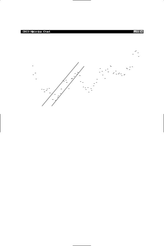
Trend channels can also be applied to any clearly defined trend. The top line is drawn between two or more highs. The bottom line is drawn between two or more lows. Figure 4.5 is an example of a trend channel drawn on a chart of Cisco Systems.
The bottom channel line connects three lows. The top channel line also connects three points. Interestingly, in Figure 4.5, the stock trades off when it breaks below the bottom line of the channel.
80 |
TECHNICAL ANALYSIS 102 |
Price
1550
1500
1450
1400
1350
1300
1250 |
|
|
|
|
|
Jul 03 |
Aug 01 |
Aug 29 |
Sep 27 |
Oct 25 |
Nov 22 |
DTN InterQuote |
www.interquote.com |
Figure 4.4 CMGI Historical Chart (Source: www.interquote.com, DTN Financial Services)
Channel lines can also be used to define trading ranges. In this case, the lines will be roughly horizontal, connecting high points above and low points below. When the market is in a trading range it is in a kind of holding pattern that is defined by no significant higher highs or significant lower lows. Rather, the market trades within those parameters. This might happen after the market has made a large move to the upside or the downside and is now consolidating. We sometimes refer to that as the market “taking a breath.” In other words, buyers and sellers are active within a certain range, but there is no real impetus— at least at that point—to propel the market upward or downward.
But nothing stays in a range forever. As a trader, you’ll be using your technical analysis to look for signs that the market is likely to test the outer limits of that trading range, either on the upside or on the downside. In Figure 4.6, McDonald’s Corporation’s stock traded in a
TREND LINES |
81 |
26 |
|
|
|
|
|
|
|
|
|
|
|
|
|
|
|
|
|
|
|
|
|
|
|
|
|
|
|
|
|
|
|
|
|
|
|
|
|
|
|
|
|
|
|
|
|
|
|
|
|
|
|
|
|
|
|
|
|
|
|
|
|
|
|
|
|
|
|
|
|
|
|
|
|
|
|
|
|
|
|
|
|
|
|
|
|
|
|
|
|
|
|
|
|
|
|
|
|
|
|
|
|
|
|
|
|
|
|
|
|
|
|
|
|
24 |
|
|
|
|
|
|
|
|
|
|
|
|
|
|
|
|
|
|
|
|
|
|
|
|
|
|
|
|
|
|
|
|
|
|
|
|
|
|
|
|
|
|
|
|
|
|
|
|
|
|
|
|
|
|
|
|
22 |
|
|
|
|
|
|
|
|
|
|
|
|
|
|
|
|
|
|
|
|
|
|
|
|
|
|
|
|
|
|
|
|
|
|
|
|
|
|
|
|
|
|
|
|
|
|
|
|
|
|
|
|
|
|
|
|
|
|
|
|
|
|
|
|
|
|
|
|
|
|
|
|
|
|
|
|
|
|
|
|
|
|
|
|
|
|
|
|
|
|
|
|
|
|
|
|
|
|
|
|
|
|
|
|
|
|
|
|
|
|
|
|
|
|
|
|
|
|
|
|
|
|
|
|
|
|
|
|
|
|
|
|
|
|
|
|
|
|
|
|
|
|
|
|
|
|
|
|
|
|
|
|
|
|
|
|
|
|
|
|
|
|
|
|
|
|
|
|
|
|
|
|
|
|
|
|
|
|
|
|
|
|
|
|
|
|
|
|
|
|
|
|
|
|
|
|
|
|
|
|
|
|
|
|
|
|
|
|
|
|
|
|
|
|
|
|
|
|
|
|
|
|
|
|
|
|
|
|
|
|
|
|
|
|
|
|
|
|
|
|
|
|
|
|
|
|
|
|
|
|
|
|
|
|
|
|
|
|
|
|
|
|
|
|
|
|
|
|
|
|
|
|
|
|
|
|
|
|
|
|
|
|
|
|
20 |
|
|
|
|
|
|
|
|
|
|
|
|
|
|
|
|
|
|
|
|
|
|
|
|
|
|
|
|
|
|
|
|
|
|
|
|
|
|
|
|
|
|
|
|
|
|
|
|
|
|
|
|
|
|
|
|
|
|
|
|
|
|
|
|
|
|
|
|
|
|
|
|
|
|
|
|
|
|
|
|
|
|
|
|
|
|
|
|
|
|
|
|
|
|
|
|
|
|
|
|
|
|
|
|
|
|
|
|
|
|
|
|
|
Price |
|
|
|
|
|
|
|
|
|
|
|
|
|
|
|
|
|
|
|
|
|
|
|
|
|
|
|
|
|
|
|
|
|
|
|
|
|
|
|
|
|
|
|
|
|
|
|
|
|
|
|
|
|
|
||
18 |
|
|
|
|
|
|
|
|
|
|
|
|
|
|
|
|
|
|
|
|
|
|
|
|
|
|
|
|
|
|
|
|
|
|
|
|
|
|
|
|
|
|
|
|
|
|
|
|
|
|
|
|
|
|
|
|
16 |
|
|
|
|
|
|
|
|
|
|
|
|
|
|
|
|
|
|
|
|
|
|
|
|
|
|
|
|
|
|
|
|
|
|
|
|
|
|
|
|
|
|
|
|
|
|
|
|
|
|
|
|
|
|
|
|
14 |
|
|
|
|
|
|
|
|
|
|
|
|
|
|
|
|
|
|
|
|
|
|
|
|
|
|
|
|
|
|
|
|
|
|
|
|
|
|
|
|
|
|
|
|
|
|
|
|
|
|
|
|
|
|
|
|
|
|
|
|
|
|
|
|
|
|
|
|
|
|
|
|
|
|
|
|
|
|
|
|
|
|
|
|
|
|
|
|
|
|
|
|
|
|
|
|
|
|
|
|
|
|
|
|
|
|
|
|
|
|
|
|
|
|
|
|
|
|
|
|
|
|
|
|
|
|
|
|
|
|
|
|
|
|
|
|
|
|
|
|
|
|
|
|
|
|
|
|
|
|
|
|
|
|
|
|
|
|
|
|
|
|
|
|
|
|
|
|
|
|
|
|
|
|
|
|
|
|
|
|
|
|
|
|
|
|
|
|
|
|
|
|
|
|
|
|
|
|
|
|
|
|
|
|
|
|
|
|
|
|
|
|
|
|
|
|
|
|
|
|
|
|
|
|
|
|
|
12 |
|
|
|
|
|
|
|
|
|
|
|
|
|
|
|
|
|
|
|
|
|
|
|
|
|
|
|
|
|
|
|
|
|
|
|
|
|
|
|
|
|
|
|
|
|
|
|
|
|
|
|
|
|
|
|
|
|
|
|
|
|
|
|
|
|
|
|
|
|
|
|
|
|
|
|
|
|
|
|
|
|
|
|
|
|
|
|
|
|
|
|
|
|
|
|
|
|
|
|
|
|
|
|
|
|
|
|
|
|
|
|
|
|
|
|
|
|
|
|
|
|
|
|
|
|
|
|
|
|
|
|
|
|
|
|
|
|
|
|
|
|
|
|
|
|
|
|
|
|
|
|
|
|
|
|
|
|
|
|
|
|
|
|
|
|
|
|
|
||
Mar 23 |
|
|
Apr 02 |
|
|
Apr 16 |
|
|
|
Apr 24 |
|
|
May 02 |
|
|
May 10 |
|
May 21 |
||||||||||||||||||||||||||||||||||||||
|
|
|
|
|
|
|
|
|
|
|
|
|
|
|
|
|
|
|
|
|
|
|
|
|
|
|
|
|
|
|
|
|
|
|
|
|
|
|
|
|
|
|
|
|
|
|
|
|
|
|
|
|
|
|
|
|
|
|
|
|
|
|
|
|
|
|
|
|
|
|
|
|
|
|
|
|
|
|
|
|
|
|
|
|
|
|
|
|
|
|
|
|
|
|
|
|
|
|
|
|
|
|
|
|
|
|
|
|
|
|
|
|
|
DTN InterQuote |
|
|
|
|
|
|
|
|
|
|
|
|
|
|
|
|
|
|
|
|
|
|
|
|
|
|
|
|
|
|
|
|
|
|
|
|
www.interquote.com |
|||||||||||||||||||
Figure 4.5 CSCO Historical Chart (Cisco Systems) (Source: www.interquote.com, DTN Financial Services)
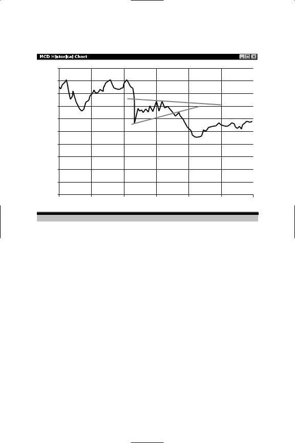
range between roughly $29 and $31 a share from late January through late February 2001, when it broke below the bottom of the range and then traded significantly lower.
As you can see by these examples, the trend lines delineate support or resistance in the future, based on previous highs and lows.
Often, we think of a trading range as a sign of a dull or otherwise uneventful market. However, there are times when the market is in a trading range and resting for a big move to come. Usually, the longer the market stays in a trading range, the more potential it has to make a large move—up or down—once that range is exceeded. The exception to this is when the market is “dead,” meaning it has little activity.
The chart patterns you identify tell a story of what is happening in the market at that time, reflecting the interplay between buyers and sellers. For example, in an uptrend the buyers are aggressive, eager to
82 |
TECHNICAL ANALYSIS 102 |
|
36 |
|
|
|
|
|
|
34 |
|
|
|
|
|
|
32 |
|
|
|
|
|
|
30 |
|
|
|
|
|
|
28 |
|
|
|
|
|
Price |
26 |
|
|
|
|
|
|
|
|
|
|
|
|
|
24 |
|
|
|
|
|
|
22 |
|
|
|
|
|
|
20 |
|
|
|
|
|
|
18 |
|
|
|
|
|
|
16 |
|
|
|
|
|
|
Nov 17 |
Dec 18 |
Jan 16 |
Feb 14 |
Mar 19 |
Apr 23 |
DTN InterQuote |
|
|
|
|
www.interquote.com |
|
Figure 4.6 MCD Historical Chart (McDonald’s Corporation) (Source: www.interquote.com, DTN Financial Services)
establish positions in a particular stock or index at whatever price the sellers are willing to give them.
In a downtrend, the opposite occurs. The sellers are more aggressive as they take profits on previous long positions, or as they establish short positions in anticipation that a particular stock or index is going down. In between, when the market is more or less in a sideways or rangebound pattern, there is a transition phase in which both sides participate. In this phase, buyers may be lightly establishing positions in anticipation of an up move, and sellers may be getting out of long positions or establishing small short positions in anticipation of a decline. Remember, what makes a market is not only the presence of buyers and sellers, but the confluence of opinions.
The strength or conviction of the prevailing market opinion can be seen in a bar chart that depicts buy and sell volume. Some software

BREAKOUTS AND TRIANGLES |
83 |
shows a volume chart for a stock. You’ll see bars that are shaded one color for price lower (depicting sell volume is higher) and another for price higher (when buy volume is higher). These bars also show the volume for the time frame measured. Intraday or for the longer term, you can use the volume chart to help you see the bias or strength of conviction among the buyers and sellers in the market.
Before going on to the next set of indicators—oscillators—let’s address the other kind of chart patterns that, with time and experience, may become meaningful to you. These patterns can be found on any chart, from very short-term measuring minutes to very long-term (several years). The patterns tell the same story, although the time frame to which the story applies differs.
BREAKOUTS AND TRIANGLES
When you look at a chart, it’s fairly easy to see where the market has been. The challenge, obviously, is to determine where it’s likely to go next. One of the things that traders look for is a sign of a pending breakout from an existing range. One potential breakout pattern to look for is the triangle or pennant formation.
Think of an isosceles triangle turned on its side with the apex or point facing to the right. This pattern is formed as the range of the market narrows. This contraction is caused by up and down movements that neither surpass previous highs nor go below previous lows. This kind of action has the effect of coiling a spring tighter and tighter until it propels itself outward. Similarly, when the market does break out of this tightening range, it is usually with increased volatility and volume and mostly in one direction for a period of time without a significant pullback.
As the market contracts, it becomes easier to see the triangle if you add trend lines, one connecting all the tops and one connecting all the bottoms. Extending those two lines (the top line sloping downward and the bottom line sloping upward), they will cross at some point in the future. That point becomes the apex of the triangle. The normal breakout point from this kind of pattern is often around three-quarters