584 Chapter 17 Creating Graphical User Interfaces
horizontalTextPosition, verticalTextPosition, and iconTextGap. For example, the following code displays a label with text and an icon:
//Create an image icon from an image file ImageIcon icon = new ImageIcon("image/grapes.gif");
//Create a label with a text, an icon,
//with centered horizontal alignment
JLabel jlbl = new JLabel("Grapes", icon, SwingConstants.CENTER);
//Set label's text alignment and gap between text and icon jlbl.setHorizontalTextPosition(SwingConstants.CENTER); jlbl.setVerticalTextPosition(SwingConstants.BOTTOM); jlbl.setIconTextGap(5);
|
javax.swing.JComponent |
|
|
|
|
|
The get and set methods for these data fields are provided |
|
|
|
|
|
|
in the class, but omitted in the UML diagram for brevity. |
|
javax.swing.JLabel |
|
|
|
|
|
|
|
|
-text: String |
|
The label’s text. |
|
-icon: javax.swing.Icon |
|
The label’s image icon. |
|
-horizontalAlignment: int |
|
The horizontal alignment of the text and icon on the label. |
|
-horizontalTextPosition: int |
|
The horizontal text position relative to the icon on the label. |
|
-verticalAlignment: int |
|
The vertical alignment of the text and icon on the label. |
|
-verticalTextPosition: int |
|
The vertical text position relative to the icon on the label. |
|
-iconTextGap: int |
|
The gap between the text and the icon on the label. |
|
+JLabel() |
|
Creates a default label with no text and icon. |
|
+JLabel(icon: javax.swing.Icon) |
|
Creates a label with an icon. |
|
+JLabel(icon: Icon, hAlignment: int) |
|
Creates a label with an icon and the specified horizontal alignment. |
|
+JLabel(text: String) |
|
Creates a label with text. |
|
+JLabel(text: String, icon: Icon, |
|
Creates a label with text, an icon, and the specified horizontal alignment. |
|
hAlignment: int) |
|
|
|
+JLabel(text: String, hAlignment: int) |
|
Creates a label with text and the specified horizontal alignment. |
|
|
|
|
FIGURE 17.15 JLabel displays text or an icon, or both.
Video Note
Use labels and text fields
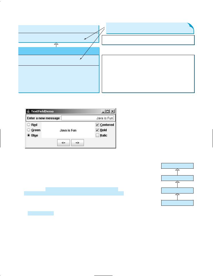
17.6 Text Fields
A text field can be used to enter or display a string. JTextField is a subclass of JTextComponent. Figure 17.16 lists the constructors and methods in JTextField.
JTextField inherits JTextComponent, which inherits JComponent. Here is an example of creating a text field with red foreground color and right horizontal alignment:
JTextField jtfMessage = new JTextField("T-Strom"); jtfMessage.setForeground(Color.RED); jtfMessage.setHorizontalAlignment(SwingConstants.RIGHT);
When you move the cursor in the text field and press the Enter key, it fires an ActionEvent. Listing 17.5 gives a program that adds a text field to the preceding example to let the user
set a new message, as shown in Figure 17.17.
javax.swing.text.JTextComponent
-text: String -editable: boolean
javax.swing.JTextField
-columns: int -horizontalAlignment: int
+JTextField() +JTextField(column: int) +JTextField(text: String)
+JTextField(text: String, columns: int)
+addActionEvent(listener: ActionListener): void
17.6 Text Fields 585
The get and set methods for these data fields are provided in the class, but omitted in the UML diagram for brevity.
The text contained in this text component.
Indicates whether this text component is editable (default: true).
The number of columns in this text field.
The horizontal alignment of this text field (default: LEFT). Creates a default empty text field with number of columns set to 0. Creates an empty text field with a specified number of columns. Creates a text field initialized with the specified text.
Creates a text field initialized with the specified text and columns. Adds an ActionListener for this object.
FIGURE 17.16 JTextField enables you to enter or display a string.
 JPanel with BorderLayout for a label and
a text field
FIGURE 17.17 A label and a text field are added to set a new message.
LISTING 17.5 TextFieldDemo.java
1 import java.awt.*;
2 import java.awt.event.*;
3 import javax.swing.*;
4
5 public class TextFieldDemo extends RadioButtonDemo {
6 private JTextField jtfMessage = new JTextField(10);
7
8/** Main method */
9public static void main(String[] args) {
10TextFieldDemo frame = new TextFieldDemo();
11frame.pack();
12frame.setTitle("TextFieldDemo");
13frame.setLocationRelativeTo(null); // Center the frame
14frame.setDefaultCloseOperation(JFrame.EXIT_ON_CLOSE);
15frame.setVisible(true);
16}
17
18public TextFieldDemo() {
19// Create a new panel to hold label and text field
20JPanel jpTextField = new JPanel();
21jpTextField.setLayout(new BorderLayout(5, 0));
ButtonDemo
CheckBoxDemo
RadioButtonDemo
TextFieldDemo
create frame pack frame
create UI

586 Chapter 17 |
Creating Graphical User Interfaces |
|
22 |
|
jpTextField.add( |
|
23 |
|
new JLabel("Enter a new message"), BorderLayout.WEST); |
|
24 |
|
jpTextField.add(jtfMessage, BorderLayout.CENTER); |
|
25 |
|
add(jpTextField, BorderLayout.NORTH); |
|
26 |
|
|
|
|
|
|
|
27 |
|
jtfMessage.setHorizontalAlignment(JTextField.RIGHT); |
|
28 |
|
|
|
|
|
|
|
29 |
|
// Register listener |
listener |
30 |
|
jtfMessage.addActionListener(new ActionListener() { |
|
|
31 |
|
/** Handle ActionEvent */ |
|
32 |
|
public void actionPerformed(ActionEvent e) { |
|
33 |
|
|
messagePanel.setMessage(jtfMessage.getText()); |
|
|
|
34 |
|
|
jtfMessage.requestFocusInWindow(); |
|
|
|
|
35 |
} |
|
|
|
|
|
36 |
}); |
|
|
|
|
|
37 |
} |
|
|
|
|
|
|
38 |
} |
|
|
|
|
|
|
TextFieldDemo extends RadioButtonDemo and adds a label and a text field to let the user |
|
enter a new message. After you set a new message in the text field and press the Enter key, a |
|
new message is displayed. Pressing the Enter key on the text field triggers an action event. |
|
The listener sets a new message in messagePanel (line 33). |
pack() |
|
The pack() method (line 11) automatically sizes the frame according to the size of the |
|
components placed in it. |
requestFocusInWindow() |
|
The requestFocusInWindow() method (line 34) defined in the Component class requests |
|
the component to receive input focus. Thus, jtfMessage.requestFocusInWindow() |
|
requests the input focus on jtfMessage. You will see the cursor on jtfMessage after the |
|
actionPerformed method is invoked. |
|
|
Note |
JPasswordField |
|
If a text field is used for entering a password, use JPasswordField to replace JTextField. |
|
|
JPasswordField extends JTextField and hides the input text with echo characters (e.g., |
|
|
******). By default, the echo character is *. You can specify a new echo character using the |
|
|
setEchoChar(char) method. |
|
17.7 Text Areas |
|
If you want to let the user enter multiple lines of text, you have to create several instances of |
|
JTextField. A better alternative is to use JTextArea, which enables the user to enter mul- |
|
tiple lines of text. Figure 17.18 lists the constructors and methods in JTextArea. |
|
|
Like JTextField, JTextArea inherits JTextComponent, which contains the methods |
|
getText, setText, isEditable, and setEditable. Here is an example of creating a text |
|
area with 5 rows and 20 columns, line-wrapped on words, red foreground color, and |
|
Courier font, bold, 20 pixels. |
|
|
JTextArea jtaNote = new JTextArea("This is a text area", 5, 20); |
wrap line |
|
jtaNote.setLineWrap(true); |
wrap word |
|
jtaNote.setWrapStyleWord(true); |
|
|
jtaNote.setForeground(Color.red); |
|
|
jtaNote.setFont(new Font("Courier", Font.BOLD, 20)); |
JTextArea does not handle scrolling, but you can create a JScrollPane object to hold an instance of JTextArea and let JScrollPane handle scrolling for JTextArea, as follows:
// Create a scroll pane to hold text area
JScrollPane scrollPane = new JScrollPane(jta = new JTextArea()); add(scrollPane, BorderLayout.CENTER);
17.7 Text Areas 587
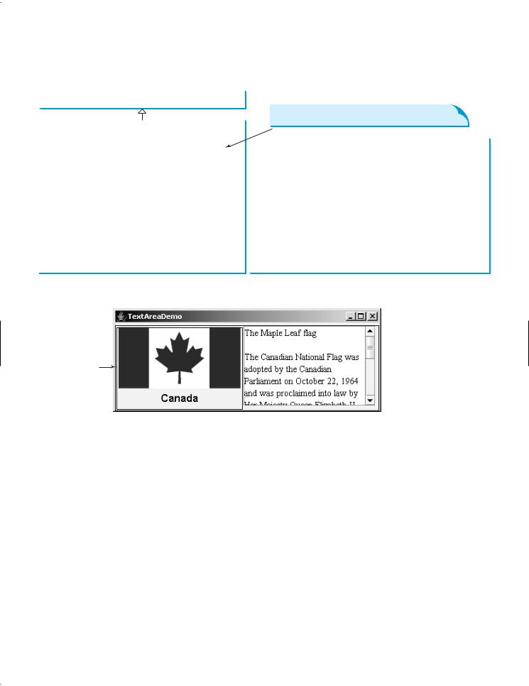
Listing 17.7 gives a program that displays an image and a text in a label, and a text in a text area, as shown in Figure 17.19.
|
javax.swing.text.JTextComponent |
|
|
|
|
|
The get and set methods for these data fields are provided |
|
|
|
|
|
in the class, but omitted in the UML diagram for brevity. |
|
javax.swing.JTextArea |
|
|
|
|
|
|
|
|
-columns: int |
|
The number of columns in this text area. |
|
-rows: int |
|
The number of rows in this text area. |
|
-tabSize: int |
|
The number of characters used to expand tabs (default: 8). |
|
-lineWrap: boolean |
|
Indicates whether the line in the text area is automatically |
|
|
|
wrapped (default: false). |
|
-wrapStyleWord: boolean |
|
Indicates whether the line is wrapped on words or characters (default: false). |
|
+JTextArea() |
|
Creates a default empty text area. |
|
+JTextArea(rows: int, columns: int) |
|
Creates an empty text area with the specified number of rows and columns. |
|
+JTextArea(text: String) |
|
Creates a new text area with the specified text displayed. |
|
+JTextArea(text: String, rows: int, columns: int) |
|
Creates a new text area with the specified text and number of rows and columns. |
|
+append(s: String): void |
|
Appends the string to text in the text area. |
|
+insert(s: String, pos: int): void |
|
Inserts string s in the specified position in the text area. |
|
+replaceRange(s: String, start: int, end: int): |
|
Replaces partial text in the range from position start to end with string s. |
|
void |
|
Returns the actual number of lines contained in the text area. |
|
+getLineCount(): int |
|
|
|
|
|
FIGURE 17.18 JTextArea enables you to enter or display multiple lines of characters.
A label showing an image and a text
 DescriptionPanel
with BorderLayout
 A text area inside a scroll panel
FIGURE 17.19 The program displays an image in a label, a title in a label, and a text in the text area.
Here are the major steps in the program:
1.Create a class named DescriptionPanel that extends JPanel, as shown in Listing 17.6. This class contains a text area inside a scroll pane, and a label for displaying an image icon and a title. This class is used in the present example and will be reused in later examples.
2.Create a class named TextAreaDemo that extends JFrame, as shown in Listing 17.7. Create an instance of DescriptionPanel and add it to the center of the frame. The relationship between DescriptionPanel and TextAreaDemo is shown in Figure 17.20.
LISTING 17.6 DescriptionPanel.java
1 import javax.swing.*;
2 import java.awt.*;
3
4 public class DescriptionPanel extends JPanel {
5/** Label for displaying an image icon and a text */
6 |
private JLabel jlblImageTitle = new JLabel(); |
label |
7 |
|
|
588 Chapter 17 Creating Graphical User Interfaces
|
8 |
|
/** Text area for displaying text */ |
|
|
|
|
|
|
text area |
9 |
|
private JTextArea jtaDescription = new JTextArea(); |
|
10 |
|
|
|
|
|
|
|
|
|
|
|
|
|
|
|
|
|
11 |
|
public DescriptionPanel() { |
|
|
|
|
|
|
|
12 |
|
|
// Center the icon and text and place the text under the icon |
label properties |
13 |
|
|
jlblImageTitle.setHorizontalAlignment(JLabel.CENTER); |
|
14 |
|
|
jlblImageTitle.setHorizontalTextPosition(JLabel.CENTER); |
|
15 |
|
|
jlblImageTitle.setVerticalTextPosition(JLabel.BOTTOM); |
|
16 |
|
|
|
|
|
|
|
|
|
|
|
|
|
|
|
|
|
17 |
|
|
// Set the font in the label and the text field |
|
18 |
|
|
jlblImageTitle.setFont(new Font("SansSerif", Font.BOLD, 16)); |
|
19 |
|
|
jtaDescription.setFont(new Font("Serif", Font.PLAIN, 14)); |
|
20 |
|
|
|
|
|
|
|
|
|
|
|
|
|
|
|
|
|
21 |
|
|
// Set lineWrap and wrapStyleWord true for the text area |
wrap line |
22 |
|
|
jtaDescription.setLineWrap(true); |
|
|
|
|
|
|
|
wrap word |
23 |
|
|
jtaDescription.setWrapStyleWord(true); |
|
|
|
|
|
|
|
read only |
24 |
|
|
jtaDescription.setEditable(false); |
|
|
|
|
|
|
|
|
|
25 |
|
|
|
|
|
|
|
|
|
|
|
|
|
|
|
|
|
26 |
|
|
// Create a scroll pane to hold the text area |
scroll pane |
27 |
|
|
JScrollPane scrollPane = new JScrollPane(jtaDescription); |
|
28 |
|
|
|
|
|
|
|
|
|
|
|
|
|
|
|
|
|
29 |
|
|
// Set BorderLayout for the panel, add label and scrollpane |
|
30 |
|
|
setLayout(new BorderLayout(5, 5)); |
|
|
|
|
|
|
|
31 |
|
|
add(scrollPane, BorderLayout.CENTER); |
|
|
|
|
|
|
|
32 |
|
|
add(jlblImageTitle, BorderLayout.WEST); |
|
|
|
|
|
|
|
33 |
} |
|
|
|
|
|
|
|
|
|
|
|
|
|
|
|
34 |
|
|
|
|
|
|
|
|
|
|
|
|
|
|
|
|
|
35 |
|
/** Set the title */ |
|
|
|
|
|
|
|
36 |
|
public void setTitle(String title) { |
|
|
|
|
|
|
|
37 |
|
|
jlblImageTitle.setText(title); |
|
|
|
|
|
|
|
38 |
} |
|
|
|
|
|
|
|
|
|
|
|
|
|
|
|
39 |
|
|
|
|
|
|
|
|
|
|
|
|
|
|
|
|
|
40 |
|
/** Set the image icon */ |
|
|
|
|
|
|
|
41 |
|
public void setImageIcon(ImageIcon icon) { |
|
|
|
|
|
|
|
42 |
|
|
jlblImageTitle.setIcon(icon); |
|
|
|
|
|
|
|
43 |
} |
|
|
|
|
|
|
|
|
|
|
|
|
|
|
|
44 |
|
|
|
|
|
|
|
|
|
|
|
|
|
|
|
|
|
45 |
|
/** Set the text description */ |
|
|
|
|
|
|
|
46 |
|
public void setDescription(String text) { |
|
|
|
|
|
|
|
47 |
|
|
jtaDescription.setText(text); |
|
|
|
|
|
|
|
48 |
} |
|
|
|
|
|
|
|
|
|
|
|
|
|
|
|
49 |
} |
|
|
|
|
|
|
|
|
|
|
|
|
|
|
|
|
|
|
|
|
|
|
|
|
|
|
|
|
|
|
|
|
|
|
|
|
|
|
|
|
|
javax.swing.JFrame |
|
|
|
|
|
javax.swing.JPanel |
|
|
|
|
|
|
|
|
|
|
|
|
|
|
1 |
|
1 |
|
|
|
|
|
|
|
|
|
|
|
|
|
|
|
|
|
|
|
|
|
|
|
|
|
|
|
|
|
|
|
|
|
DescriptionPanel |
|
TextAreaDemo |
|
|
|
|
|
|
|
|
|
|
|
|
|
|
|
|
|
|
|
|
|
|
|
|
|
|
|
|
|
|
|
|
|
|
|
|
|
|
|
|
|
|
|
|
|
-jlblImage: JLabel
-jtaDescription: JTextArea
+setImageIcon(icon: ImageIcon): void +setTitle(title: String): void +setDescription(text: String): void
FIGURE 17.20 TextAreaDemo uses DescriptionPanel to display an image, title, and text description of a national flag.
17.7 Text Areas 589
The text area is inside a JScrollPane (line 27), which provides scrolling functions for the text area. Scroll bars automatically appear if there is more text than the physical size of the text area, and disappear if the text is deleted and the remaining text does not exceed the text area size.
The lineWrap property is set to true (line 22) so that the line is automatically wrapped when the text cannot fit in one line. The wrapStyleWord property is set to true (line 23) so that the line is wrapped on words rather than characters. The text area is set noneditable (line 24), so you cannot edit the description in the text area.
It is not necessary to create a separate class for DescriptionPanel in this example. Nevertheless, this class was created for reuse in the next section, where you will use it to display a description panel for various images.
LISTING 17.7 TextAreaDemo.java
1 import java.awt.*;
2 import javax.swing.*;
3
4 public class TextAreaDemo extends JFrame {
5// Declare and create a description panel
6 |
private DescriptionPanel descriptionPanel = new DescriptionPanel(); |
create decriptionPanel |
7 |
|
|
8public static void main(String[] args) {
9 |
TextAreaDemo frame = new TextAreaDemo(); |
create frame |
10frame.pack();
11frame.setLocationRelativeTo(null); // Center the frame
12frame.setDefaultCloseOperation(JFrame.EXIT_ON_CLOSE);
13frame.setTitle("TextAreaDemo");
14frame.setVisible(true);
15}
16 |
|
|
17 |
public TextAreaDemo() { |
|
18 |
// Set title, text and image in the description panel |
create UI |
19descriptionPanel.setTitle("Canada");
20String description = "The Maple Leaf flag \n\n" +
21"The Canadian National Flag was adopted by the Canadian " +
22"Parliament on October 22, 1964 and was proclaimed into law " +
23"by Her Majesty Queen Elizabeth II (the Queen of Canada) on " +
24"February 15, 1965. The Canadian Flag (colloquially known " +
25"as The Maple Leaf Flag) is a red flag of the proportions " +
26"two by length and one by width, containing in its center a " +
27"white square, with a single red stylized eleven-point " +
28"maple leaf centered in the white square.";
29descriptionPanel.setDescription(description);
30descriptionPanel.setImageIcon(new ImageIcon("image/ca.gif"));
31
32// Add the description panel to the frame
33setLayout(new BorderLayout());
34 |
add(descriptionPanel, BorderLayout.CENTER); |
add decriptionPanel |
35}
36}
TextAreaDemo simply creates an instance of DescriptionPanel (line 6) and sets the title (line 19), image (line 30), and text in the description panel (line 29). DescriptionPanel is a subclass of JPanel. DescriptionPanel contains a label for displaying an image icon and a text title, and a text area for displaying a description of the image.