

90 |
9 Visual Elements and Fonts |
who is preparing a presentation and who is worried about pronunciation is in the third column (which does have a range of values, but these are very easy to comprehend immediately).
The result is now that the presenter only gives the audience the information that they really need to know and excludes everything else.
This is what the presenter could say:
I think that from this table it is clear that the number of different words we use in a presentation only increases slightly from a 10-minute presentation to a 20-minute presentation. The significance of this is in the third column. You don’t have to learn the pronunciation of many words. In fact, most of those 300 or 320 different words you will probably already know how to pronounce. This is great news. You just have to learn between 10 and 20 words for a 10-minute presentation. And only a few words more for a presentation that is twice as long.
Note how the presenter
•does not describe the table
•tells the audience where to focus their attention (the third column)
•explains the importance of the data
•uses a lot of short sentences—they are easy for the presenter to say, and easy for the audience to understand
•shows enthusiasm (great news)
If you were the presenter and you were worried that someone in the audience might question your accuracy, then you could also say,
By the way, the number of words in a presentation obviously varies from presenter to presenter, so someone who speaks very fast may use up to 1800 words. And the number of different words will very much depend on the number of different technical words that a presenter needs. So instead of 300 it could be 450 different words. But in any case the number of different words doesn’t rise considerably if you speak for 20 or 40 minutes rather than just 10 minutes.
9.12 Explain graphs in a meaningful way
The statistics that you give the audience (whether your own statistics or those of others) will be very familiar to you, so there is a natural tendency to explain them too quickly and in too much detail. The secret is just to select a few and explain them in a way that the audience can understand.
If the statistics are in the form of a graph, it helps the audience to understand better if you explain what the quantities are on each axis and why you chose them. This gives the data a context and also allows you to add some personal details about how and why you selected them. Obviously, however, if the axes are self-explanatory there is no need to comment on them.
9.12 Explain graphs in a meaningful way |
91 |
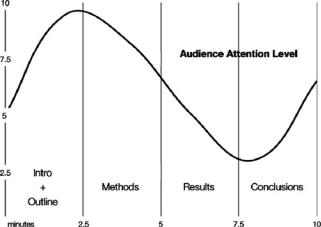
Think about how you might explain and comment on the graph below.
Would this be a helpful commentary for the audience?
In the graph that can be seen in this slide, which delineates the typical attention curve of an audience during a 10-minute presentation at an international conference, the x-axis of this two-dimensional plot represents the number of minutes, and the y-axis the amount of attention paid by an audience. The graph highlights that at the beginning of a presentation the level of attention is relatively low. Then it rises rapidly, reaching a peak at about two minutes. After approximately three minutes it begins to drop quite rapidly until it reaches its lowest point at around seven minutes thirty seconds. Finally, it rises quite steeply in the ninth minute and reaches a second peak in the last minute.
The problem with the above is that it contains no information that the audience could not have worked out for themselves. Basically all you have done is describe the curve in a rather abstract and tedious way. What you really need to do is to interpret the curve and point out to the audience what lessons can be learned from it. You could say something like this:
OK, so let’s look at the typical attention curve of an audience during a 10-minute presentation. [Pauses three to five seconds to let audience absorb the information on the graph]. What I’d like you to note is that attention at the beginning is actually quite low. People are sitting down, sending messages on their Blackberry, and so on. This means that you may not want to give your key information in the first 30 seconds simply because the audience may not even hear it. But very quickly afterwards, the audience reach maximum attention. So this is the moment to tell them your most important points. Then, unless you have really captivated them, their attention goes down until a minute from the end when it shoots up again. At least it should shoot up. But only if you signal to the audience that you are coming to an end. So you must signal the ending, otherwise you may miss this opportunity for high-level attention. Given that their attention is going to be relatively high, you need to make sure your conclusions contain the information that you want your audience to remember. So stressing your important points when the audience’s attention will naturally be high—basically at the
92 |
9 Visual Elements and Fonts |
beginning and end—is crucial. But just as important is to do everything you can to raise the level of attention when you are describing your methodology and results. The best ways to do this are . . .
Note how the presenter
•does not describe the line, but talks about the implications
•does not mention what the x and y axes represent because they are obvious in this case
•highlights for the audience what they need to know
•repeats his/her key points at least twice (i.e., give important information at the beginning and end, signal that you are coming to an end)
•addresses the audience directly by using you
Note also how the graph helps the audience to understand which part of the presentation the minutes correspond to. The graph thus shows that audience attention is dropping considerably around the fifth to seventh/eighth minutes, which correspond to when a presenter is normally giving his/her results. Consequently, given that the results are often the most important part of a presentation, the presenter needs to do everything possible to recapture the attention of the audience and ensure that they actually hear the results.
NB: The information on this graph is only a very approximate idea of how much time to spend on each part of a 10-minute presentation. In some cases, your methodology may be much more important/interesting than your results, in which case you will dedicate more time to it.
9.13Remember the difference in usage between commas and points in numbers
Note how in the graph in 9.12, the minutes have been indicated a decimal point (2.5) rather than with commas (2,5). The international convention is to use the US system of points for decimals (.) and commas (,) for whole numbers. For example, 3.025 is said three point zero two five and 3,125 is said three thousand one hundred and twenty-five. Ensure you make this change when you convert graphs and tables from a figure or text written in your own language into an English version.
9.14Design pie charts so that the audience can immediately understand them
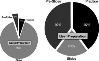
The two pie charts below represent the percentages of time spent on three aspects of preparing a presentation.
9.14 Design pie charts so that the audience can immediately understand them |
93 |
The secret to pie charts is not to have too many slices. Given that in the first chapter of this book I outlined 10 stages for preparing a presentation, there could have been 10 slices in the pie. But 10 slices would be hard for the audience to decipher on the slide and difficult for the presenter to explain. Plus it would be almost impossible to put clear labels on each slice. In any case, you can always tell your audience that you have considerably simplified the chart, and that if they are interested in seeing the full version they can see it in your paper, on your website, etc.
Notice how the two pie charts are not the same size. This tells the audience that the second chart is the one they should give the most attention to.
If you do reduce a pie chart to its most important elements, it will be easy for the audience to understand immediately. It will also require minimal comment by you, as highlighted by the revised version below:
ORIGINAL |
REVISED |
In the next slide we can see a comparison |
I think these pie charts are self-explanatory. |
between the typical practice of presenters |
People spend too much time on designing |
during their preparation of a presentation |
slides, rather than preparing what they want |
and the ideal practice. Pre-slide preparation |
to say and then practicing it. (27 words) |
in the normal practice is allocated 5% of the |
|
time in comparison with 40% in the ideal |
|
time. On the other hand, in the normal prac- |
|
tice 90% of the presenter’s time is dedicated |
|
to slide creation . . . (63 words) |
|
|
|
Note how in the original version above, the presenter gives no extra useful information—it is merely a tedious description of the information contained on the chart. The revised version simply limits itself to interpreting the data.
An alternative to the above pie charts is not to have a slide at all. You could simply walk to the whiteboard and write 90 and 20% in large characters. You then say to the audience,
94 |
9 Visual Elements and Fonts |
If you are like most presenters, you probably spend about 90% of your time preparing your slides. This leaves you only 10% to think about what you will actually say and to practice saying it. The result is often very poor presentations. Instead you should reduce the slide preparation time to 20% and use the other 80% of the time for deciding exactly what to say and then how to say it. (72 words)
Note how the presenter directly addresses the audience using you (rather than saying “Typically presenters spend about 90% of their time preparing their slides”). This alternative is useful if you already have lots of figures in your presentation and so it provides variety. Also, it immediately attracts the audience’s attention if you walk over to the whiteboard. However, it does mean that you will have to spend more words explaining everything (72 words rather than 27).
So another alternative is to reproduce the pie chart on the whiteboard—which should not take more than about 10 seconds—and then give you explanation as in the revised version above.
The moral of the story is to always think about the most audience-oriented and quickest way to present information. In the case above, a pie chart (whether as a slide or on a whiteboard) is the quickest, easiest, and most effective way for you to convey information to the audience.
What all the figures in 9.11, 9.12, and 9.14 highlight is that the easier a figure is to understand, the less time you will have to spend on explaining it. Likewise, the more complex it is, the more difficult it will be for you to explain—and the consequence will be that you will be less relaxed and therefore more likely to confuse the audience and make mistakes in your English.
Please note that all the information presented in these figures is only very approximate and is based purely on my personal observations.

Chapter 10
Getting and Keeping the Audience’s Attention
You will learn how to
•attract and retain your audience’s attention throughout your presentation
•understand when audience attention is at its highest and lowest
Why is this important?
According to the presentations expert Shay McConnon, Juries typically remember only 60% of what they are told. Why? The case is not about them. No matter how hard they try, people have difficulty paying attention to presentations that aren’t about them.
A. Wallwork, English for Presentations at International Conferences, |
95 |
DOI 10.1007/978-1-4419-6591-2_10, C Springer Science+Business Media, LLC 2010 |
|