

There are a couple of important lessons to learn from this example:
 The correct formula is much more complex than a simple AVERAGE. You needed to perform a temporary aggregation of values to correct the granularity of the table because the data is scattered around the table instead of being in an organized placement.
 It is very likely that you would not notice these errors if you were not familiar with your data. Looking at the report in Figure 1-6, you might easily spot that the yearly income looks too high to be true—as if none of your customers earns less than $2,000,000 a year! But for more complex calculations, identifying the error can be much more complex and might result in a report showing inaccurate numbers.
You must increase the granularity to produce reports at the desired detail, but increasing it too much makes it harder to compute some numbers. How do you choose the correct granularity? Well, this is a difficult question; we will save the answer for later. We hope to be able to transfer to you the knowledge to detect the correct granularity of data in your models, but keep in mind that choosing the correct granularity is a hard skill to develop, even for seasoned data modelers. For now, it is enough to start learning what granularity is and how important it is to define the correct granularity for each table in your model.
In reality, the model on which we are working right now suffers from a bigger issue, which is somewhat related to granularity. In fact, the biggest issue with this model is that it has a single table that contains all the information. If your model has a single table, as in this example, then you must choose the granularity of the table, taking into account all the possible measures and analyses that you might want to perform. No matter how hard you work, the granularity will never be perfect for all your measures. In the next sections, we will introduce the method of using multiple tables, which gives you better options for multiple granularities.
Introducing the data model
You learned in the previous section that a single-table model presents issues in defining the correct granularity. Excel users often employ single-table models because this was the only option available to build PivotTables before the release of the 2013 version of Excel. In Excel 2013, Microsoft introduced the Excel Data Model, to let you load many tables and link them through relationships, giving users the capability to create powerful data models.
What is a data model? A data model is just a set of tables linked by relationships. A single-table model is already a data model, although not a very
interesting one. As soon as you have multiple tables, the presence of relationships makes the model much more powerful and interesting to analyze.
Building a data model becomes natural as soon as you load more than one table. Moreover, you typically load data from databases handled by professionals who created the data model for you. This means your data model will likely mimic the one that already exists in the source database. In this respect, your work is somewhat simplified.
Unfortunately, as you learn in this book, it is very unlikely that the source data model is perfectly structured for the kind of analysis you want to perform. By showing examples of increasing complexity, our goal is to teach you how to start from any data source to build your own model. To simplify your learning experience, we will gradually cover these techniques in the rest of the book. For now, we will start with the basics.
To introduce the concept of a data model, load the Product and Sales tables from the Contoso database into the Excel data model. When the tables are loaded, you’ll get the diagram view shown in Figure 1-7, where you can see the two tables along with their columns.
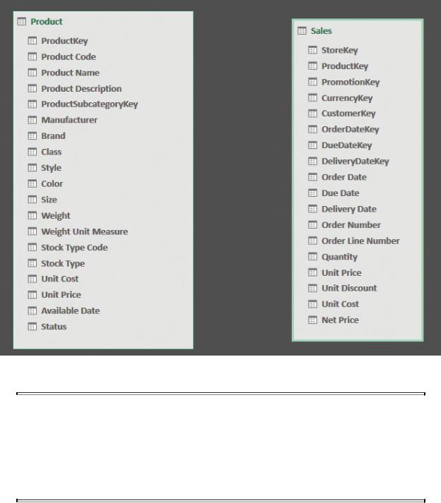
FIGURE 1-7 Using the data model, you can load multiple tables.
 Note
Note
The relationship diagram is available in Power Pivot. To access it, click the Power Pivot tab in the Excel ribbon and click Manage. Then, in the Home tab of the Power Pivot window, click Diagram View in the View group.
Two disconnected tables, as in this example, are not yet a true data model. They are only two tables. To transform this into a more meaningful model, you must create a relationship between the two tables. In this example, both the Sales table and the Product table have a ProductKey column. In Product, this is a primary key, meaning it has a different value in each row and can be used to uniquely identify a product. In the Sales table, it serves a different purpose: to identify the

product sold.
 Info
Info
The primary key of a table is a column that has a different value for every row. Thus, once you know the value of the column, you can uniquely identify its position in the table—that is, its row. You might have multiple columns that have a unique value; all of them are keys. The primary key is nothing special. From a technical point of view, it is just the column that you consider as the one that uniquely identifies a row. In a customer table, for example, the primary key is the customer code, even if it might be the case that the name is also a unique column.
When you have a unique identifier in a table, and a column in another table that references it, you can create a relationship between the two tables. Both facts must hold true for the relationship to be valid. If you have a model where the desired key for the relationship is not a unique identifier in one of the two tables, you must massage the model with one of the many techniques you learn in this book. For now, let us use this example to state some facts about a relationship:
 The Sales table is called the source table The relationship starts from Sales. This is because, to retrieve the product, you always start from Sales. You gather the product key value in the Sales and search for it in the Product table. At that point, you know the product, along with all its attributes.
 The Product table is known as the target of the relationship This is because you start from Sales and you reach Product. Thus, Product is the target of your search.
 A relationship starts from the source and it reaches the target In other words, a relationship has a direction. This is why it is often represented as an arrow starting from the source and indicating the target. Different products use different graphical representations for a relationship.
 The source table is also called the many side of the relationship This name comes from the fact that, for any given product, there are likely to be many sales, whereas for a given sale, there is only one product. For this same reason, the target table is known as the one side of the relationship. This book uses one side and many side terminology.
 The ProductKey column exists in both the Sales and Product tables
ProductKey is a key in Product, but it is not a key in Sales. For this reason, it is called a primary key when used in Product, whereas it is called a foreign key when used in Sales. A foreign key is a column that points to a primary key in another table.
All these terms are very commonly used in the world of data modeling, and this book is no exception. Now that we’ve introduced them here, we will use them often throughout the book. But don’t worry. We will repeat the definitions a few times in the first few chapters until you become acquainted with them.
Using both Excel and Power BI, you can create a relationship between two tables by dragging the foreign key (that is, ProductKey in Sales) and dropping it on the primary key (that is, ProductKey in Product). If you do so, you will quickly discover that both Excel and Power BI do not use arrows to show relationships. In fact, in the diagram view, a relationship is drawn identifying the one and the many side with a number (one) and an asterisk (many). Figure 1-8 illustrates this in Power Pivot’s diagram view. Note that there is also an arrow in the middle, but it does not represent the direction of the relationship. Rather, it is the direction of filter propagation and serves a totally different purpose, which we will discuss later in this book.

FIGURE 1-8 A relationship is represented as a line, in this case connecting the Product and Sales tables, with an indication of the side (1 for one side, * for many side).
 Note
Note
If your Power Pivot tab disappears, it is likely because Excel ran into an issue and disabled the add-in. To re-enable the Power Pivot add-in, click the File tab and click Options in the left pane. In the left pane of the Excel Options window, click Add-Ins. Then, open the Manage list box at the bottom of the page, select COM Add-Ins, and click Go. In the COM Add-Ins window, select Microsoft Power Pivot for Excel. Alternatively, if it is already selected, then deselect it. Then click OK. If you deselected Power Pivot, return to the COM Add-Ins window and re-select the add-in. The Power Pivot tab
should return to your ribbon.
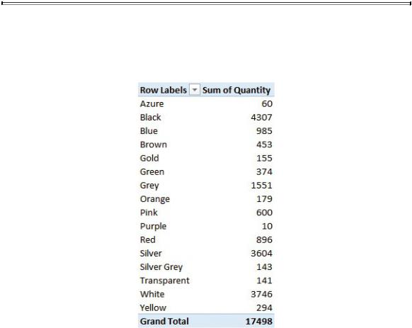
When the relationship is in place, you can sum the values from the Sales table, slicing them by columns in the Product table. In fact, as shown in Figure 1-9, you can use Color (that is, a column from the Product table—refer to Figure 1-8) to slice the sum of Quantity (that is, a column in the Sales table).
FIGURE 1-9 Once a relationship is in place, you can slice the values from one table by using columns in another one.
You have seen your first example of a data model with two tables. As we said, a data model is simply a set of tables (Sales and Product, in this example) that are linked by relationships. Before moving on with more examples, let us spend a little more time discussing granularity—this time, in the case where there are multiple tables.
In the first section of this chapter, you learned how important—and complex—it is to define the correct granularity for a single table. If you make the wrong choice, calculations suddenly become much harder to author. What about granularity in the new data model, which now contains two tables? In this case, the problem is somewhat different, and to some extent, easier to solve, even if—at the same time—it’s a bit more complex to understand.
Because there are two tables, now you have two different granularities. Sales has a granularity at the individual sale level, whereas Product has a granularity at
the product level. In fact, granularity is a concept that is applied to a table, not to the model as a whole. When you have many tables, you must adjust the granularity level for each table in the model. Even if this looks to be more complex than the scenario where you have a single table, it naturally leads to models that are simpler to manage and where granularity is no longer an issue.
In fact, now that you have two tables, it is very natural to define the granularity of Sales at the individual sale level and the granularity of Product to its correct one, at the product level. Recall the first example in this chapter. You had a single table containing sales at the granularity of the product category and subcategory. This was because the product category and product subcategory were stored in the Sales table. In other words, you had to make a decision about granularity, mainly because you stored information in the wrong place. Once each piece of information finds its right place, granularity becomes much less of a problem.
In fact, the product category is an attribute of a product, not of an individual sale. It is—in some sense—an attribute of a sale, but only because a sale is pertinent to a product. Once you store the product key in the Sales table, you rely on the relationship to retrieve all the attributes of the product, including the product category, the color, and all the other product information. Thus, because you do not need to store the product category in Sales, the problem of granularity becomes much less of an issue. Of course, the same happens for all the attributes of Product—for example the color, the unit price, the product name, and, generally, all the columns in the Product table.
 Info
Info
In a correctly designed model, granularity is set at the correct level for each table, leading to a simpler and, at the same time, more powerful structure. This is the power of relationships—a power that you can use once you start thinking in terms of multiple tables and get rid of the single-table approach you probably inherited from Excel.
If you look carefully at the Product table, you will notice that the product category and subcategory are missing. Instead, there is a ProductSubcategoryKey column, whose name suggests that it is a reference (that is, a foreign key) to the key in another table (where it is a primary key) that contains the product subcategories. In fact, in the database, there are two tables containing a product category and product subcategory. Once you load both of them into the model and build the right relationships, the structure mirrors the one shown in Figure 1-10, in

Power Pivot’s diagram view.
FIGURE 1-10 Product categories and subcategories are stored in different tables, which are reachable by relationships.
As you can see, information about a product is stored in three different tables: Product, Product Subcategory, and Product Category. This creates a chain of relationships, starting from Product, reaching Product Subcategory, and finally Product Category.
What is the reason for this design technique? At first sight, it looks like a complex mode to store a simple piece of information. However, this technique has many advantages, even if they are not very evident at first glance. By storing the product category in a separate table, you have a data model where the category name, although referenced from many products, is stored in a single row of the Product Category table. This is a good method of storing information for two reasons. First, it reduces the size on disk of the model by avoiding repetitions of the same name. Second, if at some point you must update the category name, you only need to do it once on the single row that stores it. All the products will automatically use the new name through the relationship.
There is a name for this design technique: normalization. An attribute such as the product category is said to be normalized when it is stored in a separate table and replaced with a key that points to that table. This is a very well-known technique and is widely used by database designers when they create a data model. The opposite technique—that is, storing attributes in the table to which they belong—is called denormalization. When a model is denormalized, the same attribute appears multiple times, and if you need to update it, you will have to update all the rows containing it. The color of a product, for instance, is denormalized, because the string “Red” appears in all the red products.
At this point, you might wonder why the designer of the Contoso database decided to store categories and subcategories in different tables (in other words, to normalize them), but to store the color, manufacturer, and brand in the Product table (in other words, to denormalize them). Well, in this specific case, the answer is an easy one: Contoso is a demo database, and its structure is intended to illustrate different design techniques. In the real world—that is, with your organization’s databases—you will probably find a data structure that is either highly normalized or highly denormalized because the choice depends on the usage of the database. Nevertheless, be prepared to find some attributes that are normalized and some other that are denormalized. It is perfectly normal because when it comes to data modeling, there are a lot of different options. It might be the case that, over time, the designer has been driven to take different decisions.
Highly normalized structures are typical of online transactional processing (OLTP) systems. OLTP systems are databases that are designed to handle your everyday jobs. That includes operations like preparing invoices, placing orders, shipping goods, and solving claims. These databases are very normalized because they are designed to use the least amount of space (which typically means they run faster) with a lot of insert and update operations. In fact, during the everyday work of a company, you typically update information—for example, about a customer— want it to be automatically updated on all the data that reference this customer. This happens in a smooth way if the customer information is correctly normalized. Suddenly, all the orders from the customer will refer to the new, updated information. If the customer information were denormalized, updating the address of a customer would result in hundreds of update statements executed by the server, causing poor performance.
OLTP systems often consist of hundreds of tables because nearly every attribute is stored in a separate table. In products, for example, you will probably find one table for the manufacturer, one for the brand, one for the color, and so on. Thus, a simple entity like the product might be stored in 10 or 20 different tables, all linked through relationships. This is what a database designer would proudly call a “well designed data model,” and, even if it might look strange, she would be right in being proud of it. Normalization, for OLTP databases, is nearly always a valuable technique.
The point is that when you analyze data, you perform no insert and no update. You are interested only in reading information. When you only read, normalization is almost never a good technique. As an example, suppose you create a PivotTable on the previous data model. Your field list will look similar to what you see in Figure 1-11.
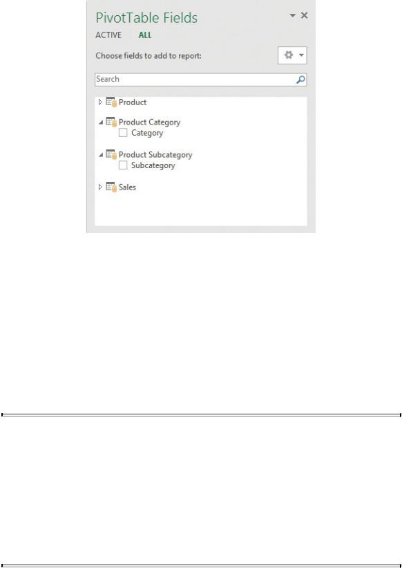
FIGURE 1-11 The field list on a normalized model has too many tables available and might become messy.
The product is stored in three tables; thus, you see three tables in the field list (in the PivotTable Fields pane). Worse, the Product Category and Product Subcategory tables contain only a single column each. Thus, even if normalization is good for OLTP systems, it is typically a bad choice for an analytical system. When you slice and dice numbers in a report, you are not interested in a technical representation of a product; you want to see the category and subcategory as columns in the Product table, which creates a more natural way of browsing your data.
 Note
Note
In this example, we deliberately hid some useless columns like the primary keys of the table, which is always a good technique. Otherwise you would see multiple columns, which make the model even harder to browse. You can easily imagine what the field list would look like with tens of tables for the product; it would take a considerable amount time to find the right columns to use in the report.
Ultimately, when building a data model to do reporting, you must reach a