UNIT 4

LOGOTYPE
Preview
Answer the questions. Then talk about your answers.
|
I. Listening and reading
L![]() isten
to the text
isten
to the text
R![]() ead
and translate itLOGOTYPE
LO//
ead
and translate itLOGOTYPE
LO//
|
|
To understand what a logo is, we first must understand what the main purpose of logos is. A logo is not just a mark – a logo reflects a business’s commercial brand via the use of shape, fonts, colour, and / or images. Paul Rand, one of the world’s greatest designers states that “a logo is a flag, a signature, a street sign. A logo does not sell directly, it identifies. A logo is rarely a description of a business. A logo is less important than the product it signifies; what it represents is more important than what it looks like”. A good logo is distinctive, appropriate, practical, graphic and simple in form, and it conveys the owner’s intended message. A concept or “meaning” is usually behind an effective logo. The Principles of Effective Logo Design
|
|
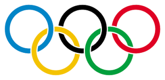
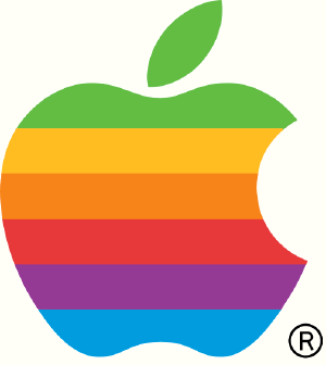
1. SimpleSimplicity makes a logo design easily& immediatelyrecognizable, versatile and memorable. Good logos feature something unexpected or unique, without being “overdrawn.”2. Memorable An effective logo design should be memorable, which is achieved by keeping it simple yet appropriate.3. TimelessAn effective logo should be timeless. – that is, it will stand the test of time. Will it still be effective in 10, 20 or 50 years?4. VersatileAn effective logo works across a variety of media and applications. Logos should be designed in vector format, to ensure that they scale to any size. The logo must work in just one colour too.Ask yourself, is your logo still effective if it is printed…In one color?In reverse color (i.e. light logo on dark background)?The size of a postage stamp?As large as a billboard?One way to create a versatile logo is to begin designing in black and white. This allows you to focus on the concept and shape, rather than color. Also keep in mind printing costs: the more colors you use, the more expensive it will befor the business over the long term.5. AppropriateHow you position the logo should be appropriate for its target audience. For example, if you are designing a logo for children’s toys store, it would be appropriate to use a childish font & color scheme. This would not be so appropriate for a law firm.A logo doesn’t need to say what a company does. The Apple logo isn’t a computer. The Mercedes logo isn’t a car. Let’s look at the classic Nike Swoosh. This logo was created by Caroline Davidson in 1971 for only $35 yet it still a strong, memorable logo, effective without colour and easily scalable. It is simple, fluid and fast and represents the wing in the famous statue of the Greek Goddess of victory, Nike – something perfect for a sporting apparel business. Nike is just one of many great logos. Think about other famous brands that you know about and check out their logos.What makes them successful? |
|
|
||