- •Contents
- •Figures and Tables
- •The Design Process
- •Involving Users in the Design Process
- •Know Your Audience
- •Analyze User Tasks
- •Build Prototypes
- •Observe Users
- •Guidelines for Conducting User Observations
- •Making Design Decisions
- •Avoid Feature Cascade
- •Apply the 80 Percent Solution
- •Characteristics of Great Software
- •High Performance
- •Ease of Use
- •Attractive Appearance
- •Reliability
- •Adaptability
- •Interoperability
- •Mobility
- •Human Interface Design
- •Human Interface Design Principles
- •Metaphors
- •Reflect the User’s Mental Model
- •Explicit and Implied Actions
- •Direct Manipulation
- •User Control
- •Feedback and Communication
- •Consistency
- •WYSIWYG (What You See Is What You Get)
- •Forgiveness
- •Perceived Stability
- •Aesthetic Integrity
- •Modelessness
- •Managing Complexity in Your Software
- •Keep Your Users in Mind
- •Worldwide Compatibility
- •Cultural Values
- •Language Differences
- •Text Display and Text Editing
- •Resources
- •Universal Accessibility
- •Visual Disabilities
- •Hearing Disabilities
- •Physical Disabilities
- •Extending the Interface
- •Build on the Existing Interface
- •Don’t Assign New Behaviors to Existing Objects
- •Create a New Interface Element Cautiously
- •Prioritizing Design Decisions
- •Meet Minimum Requirements
- •Deliver the Features Users Expect
- •Differentiate Your Application
- •The Mac OS X Environment
- •The Always-On Environment
- •Displays
- •The Dock
- •Conveying Information in the Dock
- •Clicking in the Dock
- •The Finder
- •File Formats and Filename Extensions
- •Internationalization
- •Multiple User Issues
- •Resource Management
- •Threads
- •Using Mac OS X Technologies
- •Address Book
- •Animation
- •Automator
- •Bonjour
- •Colors
- •Dashboard
- •High-Level Design Guidelines for Widgets
- •User-Interface Design Guidelines for Widgets
- •Fonts
- •Preferences
- •Printing
- •Security
- •Speech
- •Spotlight
- •User Assistance
- •Apple Help
- •Help Tags
- •Software Installation and Software Updates
- •Packaging
- •Identify System Requirements
- •Bundle Your Software
- •Installation
- •Use Internet-Enabled Disk Images
- •Drag-and-Drop Installation
- •Installation Packages
- •General Installer Guidelines
- •Setup Assistants
- •Updating Installed Applications
- •User Input
- •The Mouse and Other Pointing Devices
- •Clicking
- •Double-Clicking
- •Pressing and Holding
- •Dragging
- •The Keyboard
- •The Functions of Specific Keys
- •Character Keys
- •Modifier Keys
- •Arrow Keys
- •Function Keys
- •Keyboard Shortcuts
- •Reserved Keyboard Shortcuts
- •Creating Your Own Keyboard Shortcuts
- •User-Defined Keyboard Shortcuts
- •Keyboard Focus and Navigation
- •Type-Ahead and Key-Repeat
- •Selecting
- •Selection Methods
- •Selection by Clicking
- •Selection by Dragging
- •Changing a Selection
- •Selections in Text
- •Selecting With the Mouse
- •What Constitutes a Word
- •Selecting Text With the Arrow Keys
- •Selections in Spreadsheets
- •Selections in Graphics
- •Editing Text
- •Inserting Text
- •Deleting Text
- •Replacing a Selection
- •Intelligent Cut and Paste
- •Editing Text Fields
- •Entering Passwords
- •Drag and Drop
- •Drag-and-Drop Overview
- •Drag-and-Drop Semantics
- •Move Versus Copy
- •When to Check the Option Key State
- •Selection Feedback
- •Single-Gesture Selection and Dragging
- •Background Selections
- •Drag Feedback
- •Destination Feedback
- •Windows
- •Text
- •Lists
- •Multiple Dragged Items
- •Automatic Scrolling
- •Using the Trash as a Destination
- •Drop Feedback
- •Finder Icons
- •Graphics
- •Text
- •Transferring a Selection
- •Feedback for an Invalid Drop
- •Clippings
- •Text
- •Fonts
- •Style
- •Inserting Spaces Between Sentences
- •Using the Ellipsis Character
- •Using the Colon Character
- •Labels for Interface Elements
- •Capitalization of Interface Element Labels and Text
- •Using Contractions in the Interface
- •Using Abbreviations and Acronyms in the Interface
- •Developer Terms and User Terms
- •Icons
- •Icon Genres and Families
- •Application Icons
- •User Application Icons
- •Viewer, Player, and Accessory Icons
- •Utility Icons
- •Document Icons
- •Toolbar Icons
- •Icons for Plug-ins, Hardware, and Removable Media
- •Icon Perspectives and Materials
- •Creating Icons
- •Tips for Designing Icons
- •A Suggested Process for Creating Icons
- •Creating Icons for Mac OS X v10.5 and Later
- •Scaling Your Artwork
- •Designing Toolbar Icons
- •Designing Icons for Icon Buttons
- •Designing Icons for Capsule-Style Toolbar Controls
- •Designing Icons for Rectangular-Style Toolbar Controls
- •System-Provided Images
- •System-Provided Images for Use in Controls
- •System-Provided Images for Use as Standalone Buttons
- •System-Provided Images for Use as Toolbar Items
- •System-Provided Images that Indicate Privileges
- •A System-Provided Drag Image
- •Cursors
- •Standard Cursors
- •Designing Your Own Cursors
- •Menus
- •Menu Behavior
- •Designing the Elements of Menus
- •Titling Menus
- •Naming Menu Items
- •Using Icons in Menus
- •Using Symbols in Menus
- •Toggled Menu Items
- •Grouping Items in Menus
- •Hierarchical Menus (Submenus)
- •The Menu Bar and Its Menus
- •The Apple Menu
- •The Application Menu
- •The Application Menu Title
- •The Application Menu Contents
- •The File Menu
- •The Edit Menu
- •The Format Menu
- •The View Menu
- •Application-Specific Menus
- •The Window Menu
- •The Help Menu
- •Menu Bar Extras
- •Contextual Menus
- •Dock Menus
- •Windows
- •Types of Windows
- •Window Appearance
- •Window Elements
- •The Title Bar
- •The Window Title
- •Title Bar Buttons
- •Indicating Changes with the Close Button
- •The Proxy Icon
- •Toolbars
- •Toolbar Appearance and Behavior
- •Designing a Toolbar
- •Scope Bars
- •Scope Bar Appearance and Behavior
- •Designing a Scope Bar
- •Source Lists
- •Source List Behavior and Appearance
- •Designing a Source List
- •Bottom Bars
- •Bottom Bar Appearance and Behavior
- •Designing a Bottom Bar
- •Drawers
- •When to Use Drawers
- •Drawer Behavior
- •Window Behavior
- •Opening Windows
- •Naming New Windows
- •Positioning Windows
- •Moving Windows
- •Resizing and Zooming Windows
- •Minimizing and Expanding Windows
- •Closing Windows
- •Window Layering
- •Main, Key, and Inactive Windows
- •Click-Through
- •Scrolling Windows
- •Automatic Scrolling
- •Panels
- •Inspector Windows
- •Transparent Panels
- •When to Use Transparent Panels
- •Designing a Transparent Panel
- •Fonts Window and Colors Window
- •About Windows
- •Dialogs
- •Types of Dialogs and When to Use Them
- •Sheets (Document-Modal Dialogs)
- •Alerts
- •Dialog Appearance and Behavior
- •Accepting Changes
- •Dismissing Dialogs
- •Providing an Apply Button in a Dialog
- •Expanding Dialogs
- •Find Windows
- •Preferences Windows
- •The Open Dialog
- •Dialogs for Saving, Closing, and Quitting
- •Save Dialogs
- •Closing a Document With Unsaved Changes
- •Attempting to Save a Locked or Read-Only Document
- •Saving Documents During a Quit Operation
- •The Choose Dialog
- •The Print Dialog
- •Print Dialog
- •Page Setup Dialog
- •Controls
- •Window-Frame Controls
- •Rectangular-Style Toolbar Controls
- •Rectangular-Style Toolbar Control Usage
- •Rectangular-Style Toolbar Control Contents and Labeling
- •Rectangular-Style Toolbar Control Specifications
- •Rectangular-Style Toolbar Control Implementation
- •Capsule-Style Toolbar Controls
- •Capsule-Style Toolbar Control Usage
- •Capsule-Style Toolbar Control Contents and Labeling
- •Capsule-Style Toolbar Control Specifications
- •Capsule-Style Toolbar Control Implementation
- •Legacy Toolbar Controls
- •Buttons
- •Push Buttons
- •Push Button Usage
- •Push Button Contents and Labeling
- •Push Button Specifications
- •Push Button Implementation
- •Icon Buttons
- •Icon Button Usage
- •Icon Button Contents and Labeling
- •Icon Button Specifications
- •Icon Button Implementation
- •Scope Buttons
- •Scope Button Usage
- •Scope Button Contents and Labeling
- •Scope Button Specifications
- •Scope Button Implementation
- •Gradient Buttons
- •Gradient Button Usage
- •Gradient Button Contents and Labeling
- •Gradient Button Specifications
- •Gradient Button Implementation
- •The Help Button
- •Bevel Buttons
- •Bevel Button Usage
- •Bevel Button Contents and Labeling
- •Bevel Button Specifications
- •Bevel Button Implementation
- •Round Buttons
- •Round Button Usage
- •Round Button Contents and Labeling
- •Round Button Specifications
- •Round Button Implementation
- •Selection Controls
- •Radio Buttons
- •Radio Button Usage
- •Radio Button Contents and Labeling
- •Radio Button Specifications
- •Radio Button Implementation
- •Checkboxes
- •Checkbox Usage
- •Checkbox Contents and Labeling
- •Checkbox Specifications
- •Checkbox Implementation
- •Segmented Controls
- •Segmented Control Usage
- •Segmented Control Contents and Labeling
- •Segmented Control Specifications
- •Segmented Control Implementation
- •Icon Buttons and Bevel Buttons with Pop-Up Menus
- •Pop-Up Menus
- •Pop-Up Menu Usage
- •Pop-Up Menu Contents and Labeling
- •Pop-Up Menu Specifications
- •Pop-Up Menu Implementation
- •Action Menus
- •Action Menu Usage
- •Action Menu Contents and Labeling
- •Action Menu Specifications
- •Action Menu Implementation
- •Combination Boxes
- •Combo Box Usage
- •Combo Box Contents and Labeling
- •Combo Box Specifications
- •Combo Box Implementation
- •Path Controls
- •Path Control Usage
- •Path Control Contents and Labeling
- •Path Control Specifications
- •Path Control Implementation
- •Color Wells
- •Image Wells
- •Date Pickers
- •Date Picker Usage
- •Date Picker Implementation
- •Command Pop-Down Menus
- •Command Pop-Down Menu Usage
- •Command Pop-Down Menu Contents and Labeling
- •Command Pop-Down Menu Specifications
- •Command Pop-Down Implementation
- •Sliders
- •Slider Usage
- •Slider Contents and Labeling
- •Slider Control Specifications
- •Slider Control Implementation
- •The Stepper Control (Little Arrows)
- •Stepper Control Specifications
- •Placards
- •Indicators
- •Progress Indicators
- •Determinate Progress Bars
- •Indeterminate Progress Bars
- •Asynchronous Progress Indicators
- •Level Indicators
- •Capacity Indicators
- •Rating Indicators
- •Relevance Indicators
- •Text Controls
- •Static Text Fields
- •Text Input Fields
- •Text Input Field Usage
- •Text Input Field Contents and Labeling
- •Text Input Field Specifications
- •Text Input Field Implementation
- •Token Fields
- •Token Field Usage
- •Token Field Specifications
- •Token Field Implementation
- •Search Fields
- •Search Field Usage
- •Search Field Contents and Labeling
- •Search Field Specifications
- •Search Field Implementation
- •Scrolling Lists
- •Scrolling List Usage
- •Scrolling List Contents and Labeling
- •Scrolling List Specifications
- •Scrolling List Implementation
- •View Controls
- •Disclosure Triangles
- •Disclosure Triangle Usage
- •Disclosure Triangle Contents and Labeling
- •Disclosure Triangle Specifications
- •Disclosure Triangle Implementation
- •Disclosure Buttons
- •Disclosure Button Usage
- •Disclosure Button Contents and Labeling
- •Disclosure Button Specifications
- •Disclosure Button Implementation
- •List Views
- •List View Usage
- •List View Contents and Labeling
- •List View Implementation
- •Column Views
- •Column View Usage
- •Column View Contents and Labeling
- •Column View Implementation
- •Split Views
- •Split View Usage
- •Split View Specifications
- •Split View Implementation
- •Tab Views
- •Tab View Usage
- •Tab View Contents and Labeling
- •Tab View Specifications
- •Tab View Implementation
- •Grouping Controls
- •Separators
- •Separator Usage
- •Separator Labeling
- •Separator Specifications
- •Separator Implementation
- •Group Boxes
- •Group Box Usage
- •Group Box Contents and Labeling
- •Group Box Specifications
- •Group Box Implementation
- •Layout Guidelines
- •Positioning Regular-Size Controls in a Window Body
- •A Simple Preferences Window
- •A Tabbed Window
- •A Standard Alert
- •Positioning Small and Mini Controls in a Window Body
- •Layout Example for Small Controls
- •Layout Example for Mini Controls
- •Grouping Controls in a Window Body
- •Grouping with White Space
- •Grouping with Separators
- •Grouping with Group Boxes
- •Positioning Text and Controls in a Bottom Bar
- •Glossary
- •Index
C H A P T E R 1 4
Windows
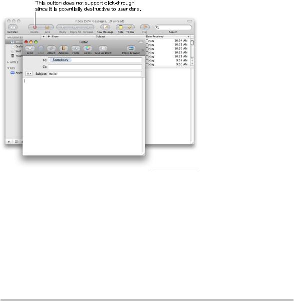
Figure 14-36 The Delete button on the inactive window does not support click-through
In general, you can implement click-through for a command that provides confirmation feedback before executing, even if the command ultimately results in destruction of data. For example, you can provide click-through for a delete button if you make sure to provide the user with the ability to cancel or confirm the action before it executes. For example, in Accounts preferences, the button for deleting users provides click-through because it also provides a confirmation dialog before executing.
If you want to implement click-through for an item that doesn’t provide confirmation feedback, consider how difficult it will be for the user to undo the action after it’s performed. For example, in Mail, the Delete button does not provide click-through because it deletes a message without providing feedback first, which is a potentially harmful action and one that is difficult to undo. Click-through for the New button in Mail is fine because its resulting action is not harmful and is easy to undo.
Scrolling Windows
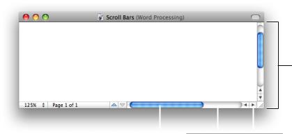
People use scroll bars to view areas of a document or a list that is larger than can fit in the current window. Only active windows can be scrolled. A window can have a horizontal scroll bar, a vertical scroll bar, both, or neither. A window that has one or more scroll bars also has a resize control in the bottom right corner. Figure 14-37 shows the parts of a scroll bar in a window.
220 |
Window Behavior |
2008-06-09 | © 1992, 2001-2003, 2008 Apple Inc. All Rights Reserved.
C H A P T E R 1 4
Windows
Figure 14-37 The elements of a scroll bar
Scroll bar
Scroller |
|
Scroll track |
|
|
|
Scroll arrow |
|
|
|
|
|||
|
|
|
The scroller size reflects how much of the content is visible; the smaller the scroller, the less of the content the user can see at that time. The scroller represents the relative location, in the whole document, of the portion that can be seen in the window.
If the entire contents of a document is visible in a window, the scroll bars do not contain scrollers. Scroll bars in inactive windows have an inactive appearance. In Figure 14-36 (page 220) you can see the inactive appearance in the scroll bar of the Mail viewer window.
For most document windows that contain a single view (scrolling text or tables, for example), do not specify any space between the window edge and scroll bars.
The user can use scroll bars by doing the following:
■Dragging the scroller. This method is usually the fastest way to move around a document. The window’s contents changes in “real time” as the user drags the scroller.
■Clicking a scroll arrow. This means, “Show me more of the document that’s hidden in this direction.” The scroller moves in the direction of the arrow. Each scroll arrow click moves the content one unit; your application determines what one unit equals. For example, a word processor would move a line of text per click, a spreadsheet could move one row or column. To ensure smooth scrolling effects, specify units of the same size throughout a document.
■Clicking or pressing in the scroll track. Clicking advances the document by a windowful (the default) or to the pointer’s hot spot, depending on the user’s choice in Appearance preferences. A “windowful” is the height or width of the window, minus at least one unit of overlap to maintain the user’s context.
This unit of overlap should be the same as one scroll arrow unit (for example, a line of text, a row of icons, or part of a picture). The Page Up and Page Down keys also move the document view by a windowful.
Pressing in the scroll track displays consecutive windowfuls of the document until the location of the scroller catches up to the location of the pointer (or until the user releases the mouse button).
It’s best not to add controls to the scroll-bar area of a window. If you add more than one control to this area, it’s hard for people to distinguish among controls and click the right one. Acceptable additions to the scroll area include a splitter bar and a status bar that shows, for example, the current page. To ensure that window controls are easy to use and understand, it’s best to place the majority of your features in the menus as commands. If you really want to provide additional access to features, consider creating a panel. Only frequently accessed features that significantly benefit users’ productivity should be elevated to the primary interface.
Window Behavior |
221 |
2008-06-09 | © 1992, 2001-2003, 2008 Apple Inc. All Rights Reserved.