


C H A P T E R 1 6
Layout Guidelines
This chapter contains guidelines that help you lay out windows and alerts. In most cases, these guidelines do not dictate exact pixel measurements you must use, but instead describe the fundamental Aqua layout principles of center equalization, text and control alignment, appropriate use of white space, and visual balance. When you follow these guidelines, you create functional, aesthetically pleasing windows that are easy for Macintosh users to understand and use.
As you design the layout of your window, be sure to observe the principle of consistency in the decisions you make (for more on this human interface design principle, see “Consistency” (page 43)). In particular, if you have a good reason to bend some of the layout guidelines, be sure you do it in a consistent way. People tend to ignore symmetry and balance, but notice inconsistency. When there is inconsistency in a window users not only notice it, but often assume that there is a functional reason for the difference. To avoid misleading users, therefore, be sure that any inconsistencies in your window are there because you want to call attention to an element in the window.
Inconsistencies in a window can also lead users to conclude that the window was merely poorly designed. For example, users probably won’t notice if the margins inside your window edges are 18 pixels wide (instead of the typically recommended 20 pixels), but they are likely to notice if the left margin is wider than the right one.
The easiest way to ensure that your windows are attractive and consistent is to use Interface Builder to design your layout. When you do this, you can take advantage of the Aqua guides that show you most of the spacing recommended in this chapter (see Interface Builder User Guide for help using Interface Builder).
Positioning Regular-Size Controls in a Window Body
Although there are many ways to arrange controls in a given window, there are guidelines you should follow so that your application has the clean, balanced Aqua look. This section provides examples of properly designed windows and alerts that use regular-size controls. For guidelines on the use of mini and small controls,see “UsingSmallandMiniVersionsofControls” (page 344). Althoughsomeoftheguidelinespresented in this section are specific to the examples shown, most are general guidelines that are applicable to all windows.
A Simple Preferences Window
Figure 16-1 shows a very simple preferences window. Note that an application with more extensive preferences probably would use a toolbar in the preferences window to provide access to different categories of preferences (see, for example, Figure 14-54 (page 239)).
Positioning Regular-Size Controls in a Window Body |
337 |
2008-06-09 | © 1992, 2001-2003, 2008 Apple Inc. All Rights Reserved.
C H A P T E R 1 6
Layout Guidelines
Figure 16-1 Preferences window example
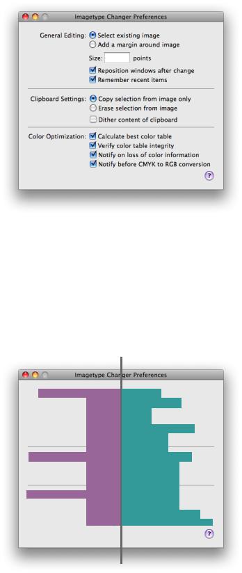
This window provides a good example of a center-equalized layout. Center equalization simply means that the visual weight is balanced on the right and left side of the content area. It does not mean center justification, where the left and right sides of an imaginary vertical line drawn through the center of a window contain exactly the same number of items or characters.
In Mac OS X, content should always be center-equalized in windows and panes. The shading in Figure 16-2 highlights this equalization. Notice that although the right side of the vertical line has more objects, it is balanced by the category labels on the left. The net result is a visually balanced window.
Figure 16-2 Example center-equalization in a preferences window
338 |
Positioning Regular-Size Controls in a Window Body |
2008-06-09 | © 1992, 2001-2003, 2008 Apple Inc. All Rights Reserved.

C H A P T E R 1 6
Layout Guidelines
When labels and controls are stacked in a group, they should line up with each other vertically. When controls are vertically aligned, it helps users see at a glance that the controls are similar in importance and that one control does not depend on another. Of course, if there is a hierarchy of controls in your window and, for example, one control depends on another, you can indent the subordinate control to show its relationship tothecontrolonwhichitdepends. (See Figure15-24 (page 276)foranexampleofinterdependentcheckboxes.)
Figure 16-3 shows the vertical alignment of controls and labels in a window. Note that the colons for the main category labels are right-aligned, whereas the checkboxes and radio buttons are left-aligned. Right-alignment of the labels makes it easier to see the relationship between each label and the controls it describes.
Figure 16-3 Example label and control alignment in a preferences window
Right-align labels and label colons
Left-align stacked items
In addition to ensuring that your content is center-equalized and appropriately aligned, it’s also important to use proper spacing in your window. Appropriate spacing not only makes a window look attractive and well-designed, but also makes it much easier for users to understand and use. When the margins inside the window edges and the spaces between user interface elements are adequate and consistent it helps to show the relationships between groups of controls and the overall flow of the window. For more examples of using white space appropriately, see “Grouping With White Space” (page 349).
The preferences window used as an example in this section uses white space in a consistent way. For example, in Figure 16-4 you can see:
■The same amount of space above and below each horizontal separator (the window in Figure 16-4 uses 12 pixels above and below each horizontal separator).
■Equal margins on both sides and the bottom edge of the window (the window in Figure 16-4 uses a 20-pixel margin in these areas).
■The same amount of space between individual controls (the window in Figure 16-4 uses 8 pixels between individual controls).
Positioning Regular-Size Controls in a Window Body |
339 |
2008-06-09 | © 1992, 2001-2003, 2008 Apple Inc. All Rights Reserved.

C H A P T E R 1 6
Layout Guidelines
Fortherecommendedspacingbetweenmembersinasetofcontrols,suchasbetweeneachradiobutton in a radio-button group, see the section that describes that control.
In addition, the window in Figure 16-4 uses a 14-pixel margin between the top controls and the bottom edge of the title bar (this margin would be the same width if the window contained a toolbar). Also, the controls in the main part of the window are separated from the Help button at the lower edge of the window by an 18-pixel space (a space of at least 16 pixels is recommended).
Figure 16-4 Example layout of a preferences window
|
|
|
|
|
|
|
|
|
Equal height between |
|
|
|
|
|
|
|
|
|
|
|
|
|
|
|
|
|
|
|
|
|
|
|
|
|
|||||
|
|
|
|
|
|
|
|
|
|
Equal height above and |
|
|
|
|
|
|
|
grouped controls |
|
below separator lines |
|
|
|
|
|
|
|
|
|
|
|
|
|
|
|
|
|
|
|
|
|
|
|
|
|
|
|
|
|
|
|
|
|
|
|
|
|
|
|
|
|
|
|
|
|
|
|
|
|
|
|
|
|
|
|
|
|
|
|
|
|
|
|
|
|
|
|
|
|
|
|
|
|
|
|
|
|
|
|
|
|
|
|
|
|
|
|
|
|
Equal space on three sides
A Tabbed Window
A tabbed window, like the one shown in Figure 16-5 follows the same general guidelines as those outlined in “A Simple Preferences Window” (page 337). However, it illustrates another implementation of many of the same basic guidelines you’ve seen so far, along with some new guidelines.
340 |
Positioning Regular-Size Controls in a Window Body |
2008-06-09 | © 1992, 2001-2003, 2008 Apple Inc. All Rights Reserved.
C H A P T E R 1 6
Layout Guidelines
Figure 16-5 Tabbed window example
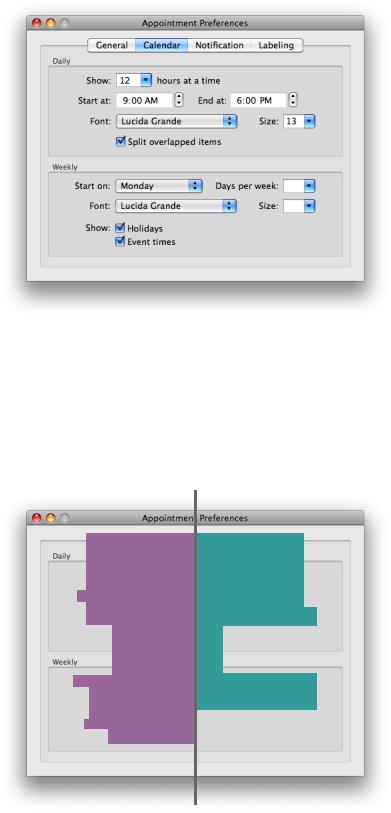
Center-equalization is again evident in Figure 16-6. The overall effect of the window is a balance between the visual weight of the controls on one side of the invisible center axis with the weight of the controls on the other side. The controls are also collectively balanced within each group box so that the distance from the farthest control on each side of the group box is the same for both the right and left sides.
Also as shown in Figure 16-6, always center a tab view within a window.
Figure 16-6 Example of center-equalization in a tabbed window
Positioning Regular-Size Controls in a Window Body |
341 |
2008-06-09 | © 1992, 2001-2003, 2008 Apple Inc. All Rights Reserved.

C H A P T E R 1 6
Layout Guidelines
Figure 16-7 illustrates a few guidelines about control placement:
■The colons for stacked labels are right-aligned.
■Stacked controls are left-aligned when appropriate.
■Similar controls have consistent widths. For example, the sizes of the Font pop-up menus and the Size combo boxes are the same in each group box.
Figure 16-7 Example of alignment of labels and controls in a tabbed window
Right-align labels and label colons
Left-align stacked items
Control widths |
Control widths |
consistent |
consistent |
Like the simple preferences window example in “A Simple Preferences Window” (page 337), the tabbed window shown in this section uses white space in a consistent way. For example, in Figure 16-8, you can see:
■Equal margins between the sides of the group boxes and the tab-pane side edges (the window in Figure 16-8 uses a 16-pixel margin in these areas).
■Equal margins between the sides and bottom of the tab pane and the window edges (the window in Figure 16-8 uses a 20-pixel margin in these areas).
■In both group boxes, the same amount of space between the bottom control and the lower edge of the group box, and the same amount of space between the top control and the upper edge of the group box. (The window in Figure 16-8 uses a 16-pixel margin between the bottom controls in each group box and the lower edge of the group box, and a 10-pixel margin between the top controls in each group box and the upper edge of the group box.)
342 |
Positioning Regular-Size Controls in a Window Body |
2008-06-09 | © 1992, 2001-2003, 2008 Apple Inc. All Rights Reserved.