

Advanced_Renderman_Book[torrents.ru]
.pdf366 13 Storytelling through Lighting, a Computer Graphics Perspective
introduce rhythm, but only if they are not exactly the same. As a design principle, rhythm is based on repetition, although just because something repeats itself doesn't mean it has rhythm. Rhythm also requires variation within its repetitive groupings. Frequency and amplitude are also factors. Frequency controls the speed of repetition; amplitude controls the intensity of the repetition and the degree of variation.
Rhythm can be established using just about any type of visual element, but colors and shapes are common repetitive elements. Rhythm can be contained within a single image or introduced over time in a shot or sequence. The editorial cutting of shots introduces another type of temporal rhythm to be considered.
13.6.3 Balance
When an object is unbalanced, it looks as though it will topple over. Instinctively, the viewer wants to place it upright or straighten it. An unbalanced object can be used as a way to achieve emphasis. An entire image that is off-balance will make the viewer uncomfortable because he wants to balance it but cannot. This discomfort can be desirable if it enhances the mood or story point. By knowing ways to balance or intentionally unbalance an image, the lighting designer can affect the mood of the scene.
A measuring scale is balanced by putting equal weight on both sides. It doesn't matter how large or dense the objects placed on the scale are, they will balance as long as they have equal weight. The balancing of a composition is similar except that the unit of weight measurement is visual emphasis; therefore, the principles of emphasis and balance are closely related.
Visual balance is achieved using two equations. The first balances the image around a horizontal axis, where the two halves, top and bottom, should achieve a sense of equilibrium. Although it is desirable to have a sense of equal distribution, because of gravity, the viewer is accustomed to this horizontal axis being placed lower than the middle of the frame.
Besides helping to create a pleasing image, the top/bottom weight ratio can also have a storytelling effect. The majority of constant factors in our visual life experience tend to be horizontal in nature-the ground plane beneath our feet, the horizon in the distance, the surfaces of water. Where these horizontal divisions are, relative to where we are, tells us how tall we are, how far off the ground we might be, or whether we might bump our heads on something. Because we are accustomed to making these comparisons, the placement of a character within the image format and the angle that the camera sees him can imply the height of a character. And because we tend to associate height as a dominating physical characteristic, it can say something about the importance of the character in his current situation. For example, in one shot a short character is placed high in the frame, and in the next shot a tall character is placed low in the frame. The shorter character in the first shot feels taller and more important to us than the character who is actually taller
367
13.6 Enhancing Mood, Atmosphere, and Drama
but is visually subservient. In A Bug's Life, an effort was made to keep the P. T. Flea character in the lower half of the image to accentuate his stature as well as his personality.
The second equation of visual balance divides the image around a central vertical axis. The horizontal format of cinema, especially widescreen, is most affected by this left/right ratio. And with the possibilities of action entering and exiting the frame or of camera pans, tracking, and dollies, this ratio has the potential to be very dynamic.
The simplest type of left/right balance is symmetrical balance, where the two sides are mirror images of each other. Heavily used in architecture, symmetrical balance feels very formal, permanent, strong, calm, and stable. One distinct advantage of symmetry is the immediate creation and emphasis of a focal point. With two similar sides, there is an obvious visual importance to whatever element is placed on the center axis. Another asset is its ability to easily organize busy, complex elements into a coherent whole. In filmmaking, symmetrical balance is sometimes used to help portray a formal, official, or religious environment or mood.
Asymmetrical balance is more commonly used, more natural in feeling, and much more challenging to achieve. Although asymmetry appears casual and unplanned, its visual ease belies the difficulty of its creation. Balance must be achieved with dissimilar elements by manipulating the visual emphasis of each. Position in the frame is also an important factor. On a scale, a heavy weight can be balanced to a lighter one by moving the heavy weight closer to the scale center point or by moving the lighter weight further away from the center. Children are familiar with this principle as they play on the teeter-totter with their friends. This principle is also true in composition. A large element placed close to the center of the image can be balanced by a smaller element placed near the edge.
A pleasing composition evokes a sense of well-being, a feeling that everything is happy and going to stay that way. A composition that is a little unbalanced or otherwise feels awkward can create a feeling of tension and apprehension. This feeling can be useful if the intent is to build story tension or to portray the emotional state of a character. A progressive building of visual tension can foretell that something bad is going to happen whether it actually does or not. A sudden change in visual tension can accentuate the shock of a dramatic change. Sometimes the composition or lighting design will intentionally be in contradiction to the subject matter. Soft, warm, beautiful lighting can be used to light a violent, ugly subject matter. This contradiction can enhance viewer discomfort because it feels especially out of context and shocking. David Lean used this approach for a scene in Dr. Zhivago where innocent students are massacred by an army.
13.6.4 Lighting Style
The establishment of mood and drama through lighting is the sum of the properties of the lights themselves: their motivation, purpose, placement, direction, range,
368 13 Storytelling through Lighting, a Computer Graphics Perspective
color, quality, quantity, and brightness. An infinite number of combinations of lighting properties can be created for a wide range of visual and emotional effects.
Value and Tone
Lighting styles are often described by their tonal range, which is the range of values from the darkest dark to the brightest highlight and the values in between. The character and mood of an image is dramatically affected by the range of values from light to dark and by their distribution within the frame. This decision is usually motivated by the dramatic quality of the story and can be consistent throughout the entire movie or vary widely with the location, time of day, or the emotional intent.
A light-hearted or comedic story might dictate a high-key lighting style. Highkey lighting is characterized by a scene that is mostly well lit, with a lot of soft fill light and no heavy or hard shadows. The sets and costumes also tend to be light in color. This doesn't mean that there aren't any dark areas, but the overall brightness tends to be light, contrast is low, and the dark areas are soft and few. The result minimizes suspense because nothing is left to the imagination of the audience. At the other end of the spectrum is low-key lighting. In a low-key lighting situation, most of the scene is darkly lit, with the emphasis on the few areas that are brightly lit. The sets and costumes are also usually dark in color. The overall impression is dark but not murky. What is seen is equally important to what is not seen. The detail only hinted at is much richer than it would be if it were well lit. Light is used to direct the viewer's attention, the darkness to stimulate the viewer's imagination. Of course, these are the polar opposites, with many possible tonal ranges in between.
Aside from the overall brightness or darkness of the style, its contrast range can evoke mood and meaning. Unlike a low-key scene where most of the frame is dark, high-contrast scenes contain a wide range of light and dark areas with a narrow middle range of grays. A high-contrast image, with many hard edges of light and shadow, has a dramatic graphic quality and can evoke a sense of energy or unrest. A low-contrast image, composed of a range of shades of middle tonality, can convey a feeling of calmness or bleak oppression. Most images are somewhere in between.
Even before the viewer has understood the story point, the lighting style can suggest a feeling for a scene, especially in comparison to adjacent scenes. Or within a single shot, one character may be modeled in bright tones and another in shadows and dark tones to suggest their individual personalities or their emotional or dramatic situations.
A black-and-white image can often work as well as a full-color image because enough visual information exists for the viewer's imagination to fill in the missing color information. In fact, a black-and-white image can sometimes be more powerful than color precisely because it requires the use of imagination.
Color
Value and color are related to each other because the light that falls on reflective surfaces, or shines through translucent materials, produces various levels of bright-
369
13.6 Enhancing Mood, Atmosphere, and Drama
ness. On black-and-white film, they are reproduced as gray values. On color film, the apparent brightness is greatly influenced by the hue and saturation of the colors, but the final outcome is still a range of values. Every color has a value, but color, which is based on wavelengths of light, offers a much broader field of visual differences and contrasts.
The color of a surface is determined by how it reflects the light that illuminates it. The apparent color of a surface depends upon the lighting situation. Unfamiliar objects appear just as the eye perceives them; that is, the apparent color and value are determined by the actual wavelength of the reflected light. For familiar objects, the principle of color and brightness constancy takes effect. Here the brain uses previous experience to augment the strictly physical perception of the eye. If the color of a familiar object differs from that in memory, the brain assumes that its environment affects the color of the object. For example, if viewers see a purple apple, chances are they have never seen an actual purple apple and will assume they are viewing a red apple as seen under blue lighting or through a blue filter. The brain then evaluates the rest of the scene with that knowledge and starts to shift the overall color of the scene toward what it thinks it would look like under white light.
A color is also perceived as a certain hue, saturation, and brightness as it relates to the color next to it. A color on a neutral background may appear very different than it would in context with other colors. Similarly, two complementary colors when juxtaposed will accentuate each other and appear more intense than they would if either were placed adjacent to an analogous color. Neutral colors can be heavily influenced by a stronger color next to them; the neutral color will tend to go toward a hue that contrasts with the strong color. In other words, a gray square next to a red one will tend to go a little greenish. This is one reason why we have a relatively poor color memory; color is so heavily influenced by what is around it.
A lighting style is described as a chosen tonal range, but it also includes a color style as well. Color style is often discussed in terms of palette, consisting of hues and tones. In order to set a style, a fairly small selection of colors are chosen according to how they relate to each other. This selection, or palette, may consist of complementary colors, analogous colors, or an infinite variety of combinations. The production designer and the lighting director work together to choose a lighting palette that works well with the sets and costumes already established as well as the desired mood.
Naturalistic lighting mimics the complementary palette found in nature. The range is from yellow/purple to orange/blue to red-orange/blue-green in varying degrees of saturation. For a daytime scene, the key light is warm, simulating the sun, while the fill light is cool, simulating the natural fill of blue sky. A nighttime scene might reverse this sense with a strong blue key light acting as moonlight with a soft warm fill emanating from incandescent interior lighting. The eye is accustomed to seeing this warm-cool relationship in a wide range of color intensities. The contrast between warm and cool is minimized during the early to middle part of the day and grows as the day nears dusk as dust particles in the atmosphere filter the color
370 13 Storytelling through Lighting, a Computer Graphics Perspective
of the light. A natural feeling still can be maintained even when using a strongly colored light that falls outside of this natural palette, as long as it appears to emanate from a visible practical source.
The similarity or contrast between lighting hues and saturation can help suggest the mood of the scene. Scenes that are lit with analogous colors tend to be more somber than scenes that use extremes. The colors of individual objects, sets, and costuming evoke emotional responses of their own. The combination of these elements into a whole image also presents an overall color for emotional consideration. Lighting can be used to accentuate or minimize individual areas of color as well as setting the tone for the overall scene.
The placement and intensities of the lights also have an effect on the overall color. A low-key, almost black-and-white effect can be achieved by minimizing object color saturation with the use of strong directional lighting and minimal fill. The emphasis falls on the shapes of objects rather than their surface colors.
Early man's use of color was largely symbolic and emotional, based in mysticism and religion, and not necessarily chosen for aesthetic reasons. The palette for a culture was established and adhered to within that culture and was used to identify itself by dynasty, race, tribe, or caste. Not until the Renaissance was color appreciated as an aesthetic choice.
Colors evoke physiological, psychological, and emotional responses. These responses are a reaction to associations we make with our past experiences and cultural heritage. Two people can have very different reactions to the same color, and one person can have varied reactions to the same color depending upon its context. Even so, there are enough common life experiences and contexts within which to draw some generalizations about how color affects us emotionally, especially in American culture where many colors have been stereotypically reinforced by advertising.
Colors are often referred to as being warm, cool, or neutral. Warm colors are generally agreed to be those that fall within the red-orange-yellow spectrum, and cool colors to be within the green-blue-violet range. Neutral colors are those that are near gray in saturation value. Cool hues tend to recede and induce calm. Warm hues stimulate the nervous system and raise the heartbeat. Pure, saturated colors tend to advance and excite, while duller, neutral colors tend to recede into the background.
Specific colors evoke more specific associations and responses. Red, for example, is an emotionally charged color that has many associations: anger, passion, fire, blood, violence, sunset, sex, adultery, aggression, power, creativity, embarrassment, and courage. It is also used as a universal symbol to stop or to denote when an error is encountered.
Green recalls calmer memories: nature, water, trees, mountains, meadows. It is an introspective, reserved color that evokes feelings of security, constancy, normalcy, balance, civility, and convention. It is a suburban color for active healthy people. It is the color of money. Green is generally a positive color, although it does have negative associations-we have all heard the expression "green with envy." Green lighting can look eerie, chemical, artificial, and unhealthy.
371
13.6 Enhancing Mood, Atmosphere, and Drama
Blue can feel heavenly and religious and is associated with Western-culture weddings. It feels spacious as it reminds us of the sky and oceans. It is a rational, conservative color that symbolizes authority, loyalty, order, peace, conformity, success, caution, and patience. Blue lighting can look gloomy, electric, and cold if there is no warm light to counterbalance it.
Violet and purple have been associated with royalty since the Egyptians when only royalty was allowed to wear it. It can feel magical, exotic, sensitive, sophisticated, idealistic, and cultured.
Yellow feels sunny and happy and reminds us of summer days and flowers. It is also associated with intellect, wisdom, timidity, cowardice, and hunger. In China, yellow is considered the royal color.
Orange is the social color, full of fun and cheerfulness. It is urban and outgoing. It has also recently become known as the safety and construction color due to its visibility. It is interesting to observe how we use color by convention. For example, when you see a coffee pot with an orange top on it, you automatically know that it contains decaf coffee.
Brown is a homey and down-to-earth color, full of duty and responsibility. It is often associated with poverty and the lower class and is easily disliked. It is also associated with the past because objects tend to turn brown with time and exposure.
Pink packs more punch than other pastel colors. It can immediately portray someone as feminine, silly, delicate, floral, pampered, tender, healthy, wealthy, vain, and indulgent.
Black can look formal, elegant, sleek, and expensive. It can feel evil, empty, mysterious, anxious, and fearful. It is associated with night, death, and inevitability.
White can feel pure, virginal, innocent, classical, and youthful; but it can also feel sterile and emotionless.
Gray is the color of oppression and isolation. It can feel institutional, indifferent, sad, cold, and heartless.
A person's response to a color is immediate but is usually short-lived. After continued exposure to a color, the effect wears off or sometimes even reverses itself. It is the change from one color to another that triggers an acute response.
Researchers who study human response to color have established that people remember skin tones as being warmer or pinker than they really are. Human skin (real or computer generated) is more appealing in warm light, and we like to remember it that way. Films are usually lit and color-corrected during printing to make skin tones look "rosy," and in general, films are usually color-corrected for the skin tones rather than for other colors or objects in the scene. Overall skin tones that are colored more realistically tend to give an image a documentary feel.
Color provides context for shape. This significantly affects our emotional responses because the shape changes in meaning as it changes in color. In Figure 13.32 (left) we see a drop shape, which we recognize as a water drop because the color of it provides necessary context. The sight of it might make us feel thirsty.
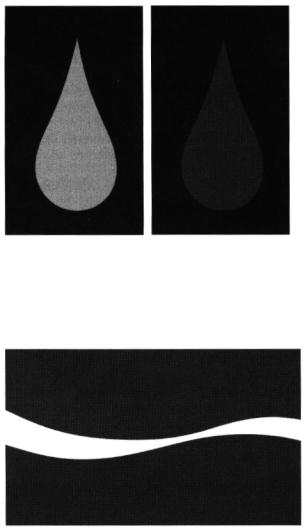
372 13 Storytelling through Lighting, a Computer Graphics Perspective
Figure 13.32 Water or blood? The same shape with different colors can evoke entirely different emotions. Color provides context for shape. See also color plate 13.32.
Figure 13.33 Does this combination of shape and color make you thirsty? See also color plate 13.33.
In Figure 13.32 (right) the context is changed by the red color. We recognize it as blood and feel differently about the shape.
The combination of shape and color can create strong visual symbols. The recognition of a symbol is based on whether it has any meaning to us. The meaning then triggers an emotional response, and sometimes even a physical one. The image in Figure 13.33 may make you feel thirsty.
373
13.6 Enhancing Mood, Atmosphere, and Drama
Lighting Motivation
The style of lighting is also affected by the motivation for the illumination in the scene. Lights are characterized as being either logical or pictorial. A light is logical if it appears to be motivated by an actual source of light (practical source) that the viewer can see or is implied, such as a window or table lamp. Logical lighting, also called naturalistic, motivated, or method lighting, generally follows the natural, logically established visible sources in a scene. On the other hand, pictorial lighting generally uses lighting directions simply because they produce a pleasing picture.
Most of the time, there is a compromise between the logic of the source and the compositional requirements of the frame. Sometimes the light direction is established by what feels natural, even if the logic of the source is slightly violated. It is the overall character of the light-its color, softness, and direction-that matters. The audience will never scrutinize the exact angle and intensity of the light as long as it is not disorienting. Purely natural or physically correct lighting is often not interesting enough to create drama and captivate the audience. Pushing the limits of reality can create magic and beauty that connects the imagination with the story being told.
Practical sources that are visible to the audience need to be well placed. If there is a visible source of light within the image frame, the viewer expects the overall light direction to emanate from the source they see, even if it originated from a different source in the previous shot.
Quality of Light
The creation of varying degrees of softness and directionality are important aspects in creating mood through lighting. In addition to considering the tonality of image, lighting style is also often defined by the quality of the lights, especially the key source. The quality of a light is composed of three characteristics: the primary one is its hardness or softness, the other two are its angle of throw and its color. A soft source is diffused, which means that it scatters light in many directions and creates very soft shadows, whereas a hard source is not diffused and casts very crisp shadows. A light source, even a soft one, will become harder as it moves farther away from the subject. The apparent size of the source becomes smaller, and as its rays become more parallel, its highlights and shadows become more crisp.
In addition to the actual hardness or softness of the sources themselves, the contrast range of the resulting image also contributes to the overall feeling of hard or soft lighting. Subjects of limited tonal range, with middle tones of gray, appear softer than subjects with deep blacks and brilliant whites.
Quantity of Lights
The number of logical sources chosen will also help determine the mood of the scene. A soft one-light scene, for instance from a candle, can feel very warm and romantic. A big bank of fluorescent lights can feel sterile, cold, and overlit. There
374 13 Storytelling through Lighting, a Computer Graphics Perspective
are many possibilities in between, but in general, the number of logical sources is usually kept relatively small to be able to establish overall direction.
The number of logical sources may be small even though the actual number of lights used to achieve a look may be many. This is true in live-action and even more so in synthetic lighting because no ambient or bounce lighting comes for free (unless of course a radiosity renderer is used). In general, a light should not be added to a scene without an intended purpose, and the temptation to use one light to serve two purposes should be avoided.
The number and quality of light sources also help determine the number and quality of shadows. In live-action situations, the placement and quality of the light determine the quality of the shadow. A hard or distant light will cast a crisp shadow. The softest light will not cast any shadow. The density of the shadow is determined by the amount of bounce and fill lights in the scene. In synthetic lighting, shadow direction, quality, color, and density controls can be independent of the light attributes, but they should still feel naturally motivated by the sources in the scene.
Light Type, Purpose, Placement, Direction, and Intensity
Types of Lights
Three basic types of lights are used for lighting: the spotlight, the floodlight, and the area light. The spotlight is usually focused into a narrow beam and used as a hard light source. It casts crisp shadows and a crisp bright highlight. The floodlight has a broader beam and is usually diffused and used as a softer source. It casts a soft shadow and a broader diffused highlight. An area light is either fully diffused through a diffusion material or is bounced off another surface such as a white card. It casts very faint shadows, if any.
The use of diffusion and focusing materials creates a wide range between a very soft scattered light and a very hard directional light. Light placement also affects the apparent hardness of the light, because even a soft light will appear harder as it moves farther away from its subject, as its rays become more parallel. These three types of studio lights are designed to emulate nature. Sunlight is an example of parallel rays that cast very crisp shadows. An overcast sky is an example of very diffused light casting soft shadows. And the shadow area under a clear blue sky is an example of a big area source that casts faint, very soft shadows.
Light Functions and Placement
The function of a light is independent of its type, its quality, and even its placement. A light's function is particularly meaningful for describing how it is used on a subject. For this reason, light function and placement are discussed here together.
Ambient (or base lighting). The overall brightness of the shadow areas is usually determined first by the use of base lighting. In live action this might be achieved
375
13.6 Enhancing Mood, Atmosphere, and Drama
by suspending a white cloth over the set and top-lighting it, bathing the entire set in a wash of light. In the computer this is accomplished by using a combination of an ambient light and diffuse lights. The ambient light adds a slight amount of light everywhere to prevent any absolute black areas but is extremely flat. The use of a few diffuse lights can add a little bit of directionality to ambient base lighting. A large area light would be even better yet. A radiosity renderer eliminates the need for adding a flat ambient light but does not necessarily eliminate the need for base lighting.
Key light (for modeling of surface and setting of mood). The key light is the main light striking a subject. It defines the brightness and shape and texture of the subject. As the dominant source, the placement, color, intensity, and textural quality of the key light are important attributes in setting the mood for a scene. But it is the placement of this light that most affects the mood and dramatic quality of the image by controlling the direction of the light as it strikes the subject. The direction of the light can vary the apparent shape and volume of the subject, by accentuating or minimizing certain features. This is referred to, in lighting terms, as surface modeling. The character of this modeling is also affected by the softness of the light and its shadows.
Although there are no hard-and-fast rules for the placement of the key light, it is conventionally placed 30-45 degrees to the side and above the subject relative to the camera axes. However, this light can be effectively placed as far back as 135 degrees from the camera as a three-quarters-back key light. Another convention is to place the key light so that it is on the opposite side of the actor's eyeline from the camera. These conventions are interesting but only serve as a loose guideline because the direction of light is usually dictated by the relationship of the subject to the motivation of the source, the chosen style of lighting, and the mood of the scene.
By controlling the direction and quality of the key light, it is possible to change the appearance of the subject as well as to suggest something about the subject's personality or dramatic situation. A beauty shot of the heroine may have a softer, more frontal key light than the key light on the villain who is chasing her.
Fill light (for subject contrast control). A fill light is a low-intensity, diffuse light used to fill in shadow areas. This light does not call attention to itself. In pure terms, it does not cast noticeable shadows, nor does it produce a noticeable or sharp specular highlight. Although a fill light can be placed almost anywhere, it is traditionally placed nearer to the camera axes than the key light. Because the fill light is often near the camera, it tends to fill in the key light shadows and reduce the surface modeling created by the key light.
The ratio of the key light plus the fill light to the fill light alone is called the lighting ratio and is one way of controlling the contrast range of the scene. In a high-key lighting situation, a lot of soft fill light is used to bring up the overall level of illumination. In low-key lighting situations, the fill light is often omitted.