


216 HOW: Visual Tools: Color My Web
A moment’s analysis will tell you that many people around the world are not online yet. That those who are online are mainly limited to slow connections over untrustworthy phone lines. That even in the major urban areas of industrialized nations, high-speed access is often hard to come by and frequently comes at a premium many cannot afford—or are not will- ing—to pay. That major Hollywood productions cost millions and can make a profit (when they do make a profit) only by charging admission. That websites generally do not charge admission, and web clients generally do not have millions of production dollars at their disposal. And finally, that most people do not seek big-budget entertainment from the Web. They seek information, services, and communities—all of which the Web can deliver with a minimum expenditure of bandwidth.
In other words, much of what you hear about how the Web works and where it is going is bunk—including, we think, the death of the web-safe color palette. Ask us again in a year or two when (hopefully) most PCs come standard with 24-bit color or higher.
A Hex on Both Your Houses
Reared on RGB and CMYK, many designers find the Web’s hexadecimal color nomenclature strange, at first. But the predictability of recurring hexadecimal pairs (00, 33, 66, 99, cc, ff) makes it easy to tell if you are using web-safe colors or not. It also makes it easy to specify web-safe background colors and text colors in HTML and CSS.
You will find, after you work with these colors, that it is possible to create pleasing combinations with them, and you will develop your own techniques for doing so.
In this quest, you will be greatly aided by Photoshop’s own tool set and by the VisiBone color palette included in Photoshop 5.5 and higher and available free online. The VisiBone palette is a superb tool for establishing visual relationships between web-safe colors. And, as you already know, visual relationships are the key to creating pleasing and effective color schemes.

Taking Your Talent to the Web |
217 |
Color relationships are essential to branding, can support navigational structures, and may greatly enhance a site’s aesthetic appeal at a minimum expenditure of bandwidth. Fill an entire page with a CSS background color, devise complementary link and text colors, and you begin to have the rudiments of an attractive design using just a few kilobytes of bandwidth.
Was Blind, but Now I See
It should be noted that a small percentage of women and a larger percentage of men suffer from various forms of color blindness. Designs that rely exclusively on color to convey essential information and relationships could therefore be inaccessible to some viewers. So, while taking color extremely seriously, you must also test your designs for accessibility— ideally by running them past test subjects who manifest different forms of color blindness. If you can’t do it that way, use the Color Blindness Simulator at www.vischeck.com. Viewing your web layouts in grayscale mode is a nice gesture but not a truly accurate means of testing how they will appear to, say, a person with red/green color deficit (deuteranopia).
From Theory to Practice
The following three exercises introduce you to the effects of dithering, describe how to set up the Photoshop Color Picker so that your color choices are always web-safe, and explain how to locate and install the VisiBone color palette. You will notice that we begin each exercise by cautioning you to set your monitor to 24or 32-bit mode before launching Photoshop. If you accidentally launch Photoshop while in 16-bit mode, all your colors will shift, and the images you design for the Web will always be mismatched from their backgrounds.
218 HOW: Visual Tools: Color My Web
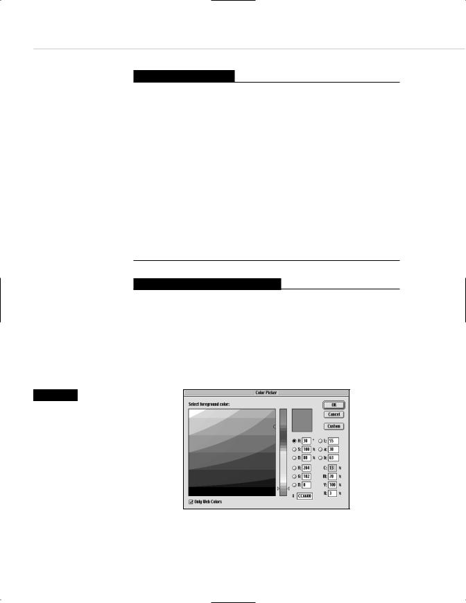
Figure 9.3
The Photoshop Color Picker provides RGB, HSB, Lab, CMYK, and hexadecimal readouts for any color you choose. The familiarity of RGB and CMYK will help acclimate you to hexadecimal nomenclature. Click the checkbox that reads Only Web Colors, and your choices will always be web-safe.
Exercise 1: In a Dither
Be certain your monitor is set to 24or 32-bit mode. Launch Photoshop 5.5 or higher.
Open a new, blank document (600 x 400 pixels) and paint in it randomly, using the Paintbrush and Airbrush tools.
Also be sure to use the Type tool to set some large type in a variety of colors.
Stop when you are satisfied.
In the Mac Finder or Windows desktop, switch your monitor to 256 colors.
Look at the image you’ve created. Those ugly dots are dithering, and that’s what millions of viewers will see if you do not learn to incorporate the websafe color palette into your work.
Close the image without saving it, quit Photoshop, and restore your monitor to its normal color settings (millions of colors).
Exercise 2: You Sure Can Pick 'em
Be certain your monitor is set to 24or 32-bit mode. Launch Photoshop 5.5 or higher.
Open a new, blank document (600 x 400 pixels).
Open Photoshop’s Color Picker (see Figure 9.3). Note the Only Web Colors checkbox and check it.

Taking Your Talent to the Web |
219 |
Watch your universe of color options shrink down to 216 choices. On the plus side, the various graphic dialogs help you see the relationships between websafe colors.
Close the Color Picker dialog.
From now on, Photoshop’s Color Picker will always be web-safe. You can also use Photoshop’s Color Picker to shift a near-web-safe color so that it is fully web-safe.
Photoshop’s web-safe Color Picker is a vast improvement over what the program used to offer in the way of support (namely, nothing).
Now that our Color Picker is web-safe, let’s do the same for our color palette dialog. Jeepers, but we are moving along quickly here.
Exercise 3: Rolling the ‘Bones
Be certain your monitor is set to 24or 32-bit mode. Launch Photoshop 5.5 or higher.
Open a new, blank document (600 x 400 pixels).
Refer to the Colors dialog. Note that there is a web-safe palette included in Photoshop. Note that the color combinations are not especially intuitive and have no meaningful relationship with the color wheel or other color theory models.
Let’s fix that.
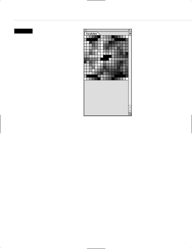
In the Swatches dialog box, choose Replace Swatches. A dialog box opens, allowing you to navigate to a new palette located on your hard drive. Steer your way to the VisiBone color palette (VisiBone1.aco), which is most likely located in Adobe Photoshop 5.5, Goodies, Color Swatches.
Handsome, isn’t it? (See Figure 9.4.)
220 HOW: Visual Tools: Color My Web
Figure 9.4
The VisiBone color palette, located in the Color Swatches folder within the Goodies folder in Photoshop 5.5 and higher, makes it easy to choose harmonious or contrasting colors from within the web-safe palette. Don’t leave home without it.
This is still the web-safe color palette. But unlike Photoshop’s built-in, default version, the VisiBone palette offers a meaningful arrangement built around the color wheel model we all learned about in school (unless we spent our time in school doodling and learned almost nothing except how to draw guitars in the margins of our textbooks). Colors move in a circle across the spectrum, and related colors are geometrically aligned with respect to one another.
The VisiBone color palette not only helps you choose web-safe colors, it helps you choose web-safe colors that relate to one another in a meaningful way, man. Harmonious and contrasting color relationships are easy to see and thus easier to create.
In other words, the VisiBone palette helps you start doing beautiful work within the limitations of the Color Cube. For instance, it helps you quickly find a web-safe approximation of a client’s logo color and begin experimenting with complementary and contrasting web-safe colors for your layouts. (It goes without saying that if original logo development is part of the project, you will design the logo using web-safe colors. It also goes without saying that your client might want you to design a logo that matches the color of their new Beetle or their favorite coffee mug, but that is where tact and client education come in.)