2003
T wo
of more droplets caught in the act of merging, usually symbolic of
convergence or union. The Cingular logo is a wonderful example. The
effect can also be used to express a technical or scientific
association. Sometimes these shapes are flat, but other designs have
highlights or shadows that give the impression of dimension.
wo
of more droplets caught in the act of merging, usually symbolic of
convergence or union. The Cingular logo is a wonderful example. The
effect can also be used to express a technical or scientific
association. Sometimes these shapes are flat, but other designs have
highlights or shadows that give the impression of dimension.
1. Proart Graphics/Gabriel Kalach for G2 Team Sales 2. Grapefriut Design for Grapefriut Design 3. Planet Propaganda for Interactive Media Solutions
Refinement
O ver
the past few years, there has been a return to simplicity in major
corporate logos, ala Chermayeff & Geismar, which has never really
strayed from this post. There are many more marks based in
geometries, mixed with the simple twist of visual phrase. Possible
reasons abound: Is this homage to the 1970s and the days of classic
logo design? A greater reliance on the computer's natural geometric
tendencies? Or is it possible that there are fewer and fewer
designers out there with the hand skills necessary to craft more
illustrative marks?
ver
the past few years, there has been a return to simplicity in major
corporate logos, ala Chermayeff & Geismar, which has never really
strayed from this post. There are many more marks based in
geometries, mixed with the simple twist of visual phrase. Possible
reasons abound: Is this homage to the 1970s and the days of classic
logo design? A greater reliance on the computer's natural geometric
tendencies? Or is it possible that there are fewer and fewer
designers out there with the hand skills necessary to craft more
illustrative marks?
1. Liska + Associates Communication Design for The Wexan Group, Ltd. 2. Chermayeff & Geismar Inc. for Multicanal 3. Prejean Loblue for 1st Intranet Bank
Pop
I n
the ongoing "Blast from the Past" tour, in which we trace a
complete circle about every 30 years, companies that cater to the
youth market as well as more boutique organizations have embraced the
pop culture language of the late 1960s and early 1970s. Period
letterforms, in particular, have enjoyed a resurgence in popularity,
possibly the result of ready availability from companies such as
House Industries and from less common sources such as rave flyers.
n
the ongoing "Blast from the Past" tour, in which we trace a
complete circle about every 30 years, companies that cater to the
youth market as well as more boutique organizations have embraced the
pop culture language of the late 1960s and early 1970s. Period
letterforms, in particular, have enjoyed a resurgence in popularity,
possibly the result of ready availability from companies such as
House Industries and from less common sources such as rave flyers.
1. Howalt Design Studio, Inc. for Work, Inc. 2. Adamsmorioka, Inc. for Nickelodeon 3. Braue; Branding & Corporate Design for Stylus Production
Natural spirals
I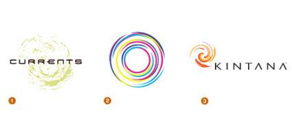 magine
a few drops of dark paint dropped into a gallon of white paint, and
then stirring just slightly. Or picture the circle of light created
by a child as he draws circle after circle against the evening sky.
These are the less-contrived vortex or spiral shapes found in nature,
not in a computer program. There is a mix of chaos and hard geometry
in these marks that suggests order and freedom at the same time.
magine
a few drops of dark paint dropped into a gallon of white paint, and
then stirring just slightly. Or picture the circle of light created
by a child as he draws circle after circle against the evening sky.
These are the less-contrived vortex or spiral shapes found in nature,
not in a computer program. There is a mix of chaos and hard geometry
in these marks that suggests order and freedom at the same time.
1. Cato Purnell Partners for Sydney Super Dome 2. Kontrapunkt A/S for Danish National Center For Development of Competence and Quality 3. Grapefruit Design forBoston Media Corporation
Animorphic
A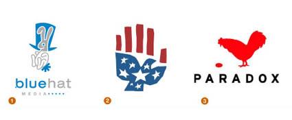 nimals
continue to be used to help companies quickly develop equity in their
identities by reflecting the particular positive attributes of an
animal back onto the company. Although this is a tactic used more by
small- to mid-sized companies, there are a few Fortune 500 companies
that rely on it, too, such as Pacific Life's whale or John Deere's
deer, recently rehoofed by Landor Design.
nimals
continue to be used to help companies quickly develop equity in their
identities by reflecting the particular positive attributes of an
animal back onto the company. Although this is a tactic used more by
small- to mid-sized companies, there are a few Fortune 500 companies
that rely on it, too, such as Pacific Life's whale or John Deere's
deer, recently rehoofed by Landor Design.
Although illustration styles vary widely, all of these logos rely on implied symbology.
1. Gardner Design for Blue Hat Media 2. Felix Sockwell for Peace 3. Alterpop for Paradox Media
Canted
H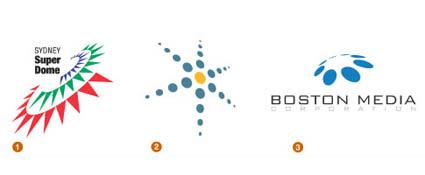 ow
can you turn an unassuming geometric and make it remarkable? Cant it
or wrap it onto a sphere, a task easily accomplished with a click of
the house-not only by you, but by many other designers as well.
Thanks to FreeHand and Illustrator, even very two-dimensional logo
solutions can live in a faux 3-D world.
ow
can you turn an unassuming geometric and make it remarkable? Cant it
or wrap it onto a sphere, a task easily accomplished with a click of
the house-not only by you, but by many other designers as well.
Thanks to FreeHand and Illustrator, even very two-dimensional logo
solutions can live in a faux 3-D world.
1. Cato Purnell Partners for Sydney Super Dome 2. Kontrapunkt A/S for Danish National Center For Development of Competence and Quality 3. Grapefruit Design forBoston Media Corporation
Alpha-face
I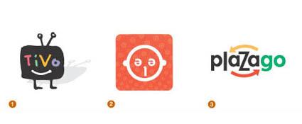 n
an effort to make a company's identity more friendly and
approachable, many a wordmark has been turned into a face or a little
person. Letterforms and their many shapes have turned into eyes,
noses, and mouths, and applied to a mark, ala Mr. Potato Head.
Although these designs have been with us to some degree for
generations, designers continue to find new and fresh iterations of
the theme.
n
an effort to make a company's identity more friendly and
approachable, many a wordmark has been turned into a face or a little
person. Letterforms and their many shapes have turned into eyes,
noses, and mouths, and applied to a mark, ala Mr. Potato Head.
Although these designs have been with us to some degree for
generations, designers continue to find new and fresh iterations of
the theme.
1. Cronan Group for Tivo 2. Willoughby Design Group for Lee Jeans 3. Gardner Design for Plazago
Shadows
B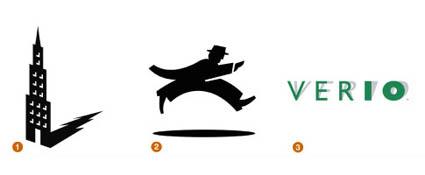 e
they hard or gentle, shadows continue to give logos a sense of place.
Sometimes shadows are used beneath a mark to give it a greater iconic
presence: A logo that defies gravity must have supernatural powers of
some sort. Other logos have used the shadow because, really, they had
no baseline and the shadow tethers them to reality.
e
they hard or gentle, shadows continue to give logos a sense of place.
Sometimes shadows are used beneath a mark to give it a greater iconic
presence: A logo that defies gravity must have supernatural powers of
some sort. Other logos have used the shadow because, really, they had
no baseline and the shadow tethers them to reality.
Illustrator Guy Billout's work has provided another, more skewed influence: His delightful way of twisting the natural phenomena of the shadow into performing contrary feats has inspired a number of designers to misshape shadows or set them off on strange trajectories.
1. Jon Flaming Design for Central & Southwest 2. Evenson Design Group for Brooks and Howard 3. Cronan Group for Verio
Transparency
L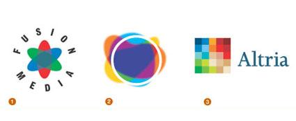 et's
face it: The old rule that dictated that any really well-designed
logo had to A) be reproducible in only one color, and B) that color
had to be solid, not screened is gone. Sure, there are still
challenges to be faced in playing fast and oo9se with these rules
when a job must actually go on press, but the internet is much more
forgiving.
et's
face it: The old rule that dictated that any really well-designed
logo had to A) be reproducible in only one color, and B) that color
had to be solid, not screened is gone. Sure, there are still
challenges to be faced in playing fast and oo9se with these rules
when a job must actually go on press, but the internet is much more
forgiving.
There are many logos today, like the MSN butterfly, that have transparent qualities that reveal themselves through multiple layers. These designs can be very compelling especially since they are still novel enough to stand out from the already crowded world of flat one, two- and three-color logos.
1. mires for Fusion Media 2. Cato Purnell Partners for Neil Henson Fashion Bytes 3. Landor Associates for Altria
Green
T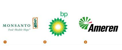 his
is a literal and metaphorical trend. The roots for this can be traced
back further, but Landor's greening of BP was a seminal effort.
Although Raymond Loewy was using green and yellow in the historic BP
logo, Landor gave it an environmental sense of place with the use of
the flower/sun. Cargill, ADM, and Monsanto-all companies that might
be likely to take an environmental hit-are all going green. It's a
trend that is a breath of fresh air in an industry that is awash with
red, white and blue. Public utilities have also picked up on this
trend. But if it is overplayed, corporate green will soon become a
tired joke to the public.
his
is a literal and metaphorical trend. The roots for this can be traced
back further, but Landor's greening of BP was a seminal effort.
Although Raymond Loewy was using green and yellow in the historic BP
logo, Landor gave it an environmental sense of place with the use of
the flower/sun. Cargill, ADM, and Monsanto-all companies that might
be likely to take an environmental hit-are all going green. It's a
trend that is a breath of fresh air in an industry that is awash with
red, white and blue. Public utilities have also picked up on this
trend. But if it is overplayed, corporate green will soon become a
tired joke to the public.
1. Enterprise IG for Monsanto Company 2. Landor Associates for BP 3. Kiku Obata & Company for Ameren Corporation
Punctuation
A t
one time, those punctuation marks at the top of the keyboard were
reserved for expressing profanity. Today, they are all smileys. There
is an entire shorthand language out there, created by youthful
internet users, that is increasingly understood by the public at
large.
t
one time, those punctuation marks at the top of the keyboard were
reserved for expressing profanity. Today, they are all smileys. There
is an entire shorthand language out there, created by youthful
internet users, that is increasingly understood by the public at
large.
The dotcoms almost played out this trend all by themselves. Every logo had an "@" in it. But as long as there are punctuation variations to explore, these marks will probably continue to be pounded out, even for logos that aren't for copywriters.
1. Thomas Vasquez for New Yourk City School District 2. Thomas Vasquez for Glue Brand Design 3. Howalt Design Studio, Inc. for Work, Inc.
Labels
T hese
are usually innocent little marks that are often simple silhouettes
of innocuous objects. Inside the object, a name will be reversed out
in a very legible font. These marks are often associated with hipper
entities. The picture says what they do and the word says who they
are. There's not much room for affectations-just a quick, painless,
dose of honesty.
hese
are usually innocent little marks that are often simple silhouettes
of innocuous objects. Inside the object, a name will be reversed out
in a very legible font. These marks are often associated with hipper
entities. The picture says what they do and the word says who they
are. There's not much room for affectations-just a quick, painless,
dose of honesty.
1. Thomas Vasquez for New York City School District 2. Thomas Vasquez for Glue Brand Design 3. Howalt Design Studio, Inc. for Work, Inc.
Photo icons
T hese
can be extremely well-done or extremely overdone. A simple photo icon
from a CD stuffed with royalty-free images is isolated on a white
background, and the name of the company is run beneath it. The
approach is decidedly more elegant when the visual is supported with
a twist of phrase, or when the phrase is supplied with a somehow
unexpected visual.
hese
can be extremely well-done or extremely overdone. A simple photo icon
from a CD stuffed with royalty-free images is isolated on a white
background, and the name of the company is run beneath it. The
approach is decidedly more elegant when the visual is supported with
a twist of phrase, or when the phrase is supplied with a somehow
unexpected visual.
1. Sanna Design Group, Inc. for Orange E-graphic 2. Chermayeff & Geismar for Turning Stone Casino 3. Propart Graphics/Gabriel Kalach forOur Special Video
Slinky
T his
is an effect that is one generation past the swoop. Instead of just
making the short stroke, these marks loop in orderly patterns often
above the company name. The curvilinear form is very reminiscent of
the fun of a Spirograph, and perhaps these accurate but flowing forms
suggest the feeling of accomplishment and satisfaction that two
plastic gears, four pins, and a ballpoint pen can provide. It's a
simple victory.
his
is an effect that is one generation past the swoop. Instead of just
making the short stroke, these marks loop in orderly patterns often
above the company name. The curvilinear form is very reminiscent of
the fun of a Spirograph, and perhaps these accurate but flowing forms
suggest the feeling of accomplishment and satisfaction that two
plastic gears, four pins, and a ballpoint pen can provide. It's a
simple victory.
Then again, the form may simply spring from osmosis, absorbed from the screensavers we all share our spaces with, especially iTunes visual space. Their ability to fill space with light and a fluid image is calculated and fresh.
1. Cato Purnell Partners for Energex Australia 2. Hornall Anderon for Okamoto Corporation 3. Enterprise IG for Delta
Wire
P ut
a pen to paper and craft an image with absolute economy and elegance
of line. Picasso and Calder were creating art this way long before
anyone embraced the form as a means of illustration or logo design.
Felix Sockwell is the master of the technique today, and others have
achieve success with it as well.
ut
a pen to paper and craft an image with absolute economy and elegance
of line. Picasso and Calder were creating art this way long before
anyone embraced the form as a means of illustration or logo design.
Felix Sockwell is the master of the technique today, and others have
achieve success with it as well.
Because of its intensely artistic nature, designers may feel the saturation of this technique before clients and the public will. But wireform logos will probably continue to appear for at least a few more years unless a behemoth of a company adopts the style and wrangles the life right out of it.
1. Tim Frame for Host Marriott 2. Howalt Design Studio for Herman Miller 3. Felix Sockwell for Hand Eye
So which of the trends are completely passe? Wings are worn out. Running men are exhausted. Swooshes should be squashed. Furthermore, water ripples, woodcut looks, and highly illustrated logos have seen their day. (A detailed woodcut of ripples would be especially tiresome.)
All this being said, it's time for back-pedaling. Even the most overused effect can be given new brilliance with the right twist. "I continue to be most captivated by solutions that break the rules but aren't blatant about it," Gardner says.
2004
M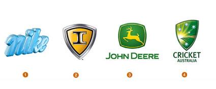 any
designers have discovered Photoshop's tools that produce a glassine
appearance. Like the recently revised UPS logo, many marks have been
crystal-capped. Also like the UPS logo, many of these same marks are
updates of older designs, and perhaps the added highlights are
intended to infuse new life or present a rehabbed logo in a new way.
any
designers have discovered Photoshop's tools that produce a glassine
appearance. Like the recently revised UPS logo, many marks have been
crystal-capped. Also like the UPS logo, many of these same marks are
updates of older designs, and perhaps the added highlights are
intended to infuse new life or present a rehabbed logo in a new way.
These designs do stand out: They have a little extra sparkle or light that was previously seen more in packaging design, either through art effects or foiled papers. Perhaps this trend is an homage to the previous generations highly airbrushed and chromed designs of 20 years ago. Or perhaps it's just the realization on the part of designers that in an RGB environment, where so many logos live today, flat art is just not necessary.
1.Design for Goldfinger C.S. Hothouse Inc. for Nike 2.Design for Duffy & Partners for IC Corporation 3.Design for Landor and Assosiates for John Deere 4.Design for Futurebrand for Cricket Australia
Bubbles
T his
year marks the first sighting for this trend. What's strange is that
bubbles are not always used in designs that might be associated with
liquids. It is a new way of representing water and motion, an
outgrowth perhaps of previous year's trend of droplets producing
ever-outward-moving rings on the water's surface. Bubbles are also
still used for their conventional implications of cleanliness and
refreshment.
his
year marks the first sighting for this trend. What's strange is that
bubbles are not always used in designs that might be associated with
liquids. It is a new way of representing water and motion, an
outgrowth perhaps of previous year's trend of droplets producing
ever-outward-moving rings on the water's surface. Bubbles are also
still used for their conventional implications of cleanliness and
refreshment.
What's interesting to note in designs using bubbles is that they often do not form a logo that has a defined shape, such as a circle or square. They are more organic and likely have the ability to better integrate into many different environments.
1.Design for Karacters Design Group for Clearly Canadian Beverage 2.Design for Dotzero Design for Dot Soda 3.Design for What? Design for Clinigen, Inc. 4.Design for Soloflight Design Studio for Ad Decastro
Dialogue Boxes
D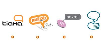 ialogue
boxes are rampant, and curiously, many times they are empty. Word
balloons and thought bubbles are popping up all over, as are designs
that are suggestive of help boxes from on-screen environments. These
devices seems to suggest communication or the exchange of ideas.
ialogue
boxes are rampant, and curiously, many times they are empty. Word
balloons and thought bubbles are popping up all over, as are designs
that are suggestive of help boxes from on-screen environments. These
devices seems to suggest communication or the exchange of ideas.
While dialogue boxes are a fresh take on communicating communication-perhaps taking over from the previous and now tired device of the arc swinging from point A to point B that was so prevalent in the past five years-it does appear to be a crutch in some cases. It's as if the client and designer couldn't decide what to say about the company in question, so they abdicate responsibility to the viewer to fill it in.
1. Segura Inc. for Tiaxa 2. Redinwtden for Scribble Toy Design 3. Howalt Design Studio, Inc. for Nextel Communications/Martin Williams 4. Dotzero Design for Hand Talk
Substitutions
S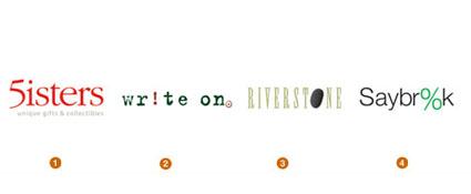 wapping
out a letter from what is essentially a wordmark and replacing it
with some other sort of device like a number or art is a tried and
true method to create a new logo. It's especially handy for designers
who aren't particularly type aficionados but who need a typographic
solution. Often the type is as is, right out of the can.
wapping
out a letter from what is essentially a wordmark and replacing it
with some other sort of device like a number or art is a tried and
true method to create a new logo. It's especially handy for designers
who aren't particularly type aficionados but who need a typographic
solution. Often the type is as is, right out of the can.
The danger with these is that they can go horribly wrong if not rendered well, particularly with the name of the company that is already somewhat mysterious. Instead of providing the viewer with an "a-ha!" moment, these designs leave him or her with confounding homework and a vague sense of failure.
1. Great Scott Design for 5 Sisters 2. The Atmosfear for Write On Inc. 3. Kern Design Group for Riverstone Design Studio 4. Glenn Sakamoto Design for Saybrook Capital
Letter Bars
T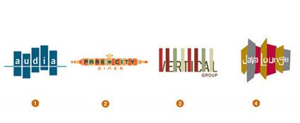 his
is another situation where the type and visual solutions have been
merged. The inspiration for these designs could be found in the
multi-color striping found in grunge or retro clothing and fashion.
his
is another situation where the type and visual solutions have been
merged. The inspiration for these designs could be found in the
multi-color striping found in grunge or retro clothing and fashion.
But what is most interesting about the letter bar designs in this year's LogoLounge collection is that they make a complete commitment to color. They completely dispense with the "it has to work in black and white" dictum. Since all primary media outlets now have reliable color available, even newspapers and the Yellow Pages, perhaps this isn't a drastic commitment.
1. Dotzero Design for Audia 2. Newbomb Design for Park City Diner 3. The Mixx for Vertical Group 4. Brian Blankenship for Java Lounge
Implied
T he
idea of giving the viewer the ability to become involved with a
design is not new, and the iterations on the theory seem to be
endless. It's the art of not showing. It's exciting to know that
clients and their customers are becoming so visually sophisticated
that they can appreciate these designs.
he
idea of giving the viewer the ability to become involved with a
design is not new, and the iterations on the theory seem to be
endless. It's the art of not showing. It's exciting to know that
clients and their customers are becoming so visually sophisticated
that they can appreciate these designs.
Even when not done particularly well, these elicit response from the viewer. But most of these designs work just fine as a logo even if the viewer does not understand it, and therein lies the secret of their continued success. The "a-ha!" moment is gravy.
1. Judson Design Associates for The Warwick Hotel 2. Gardner Design for Kroger Convenience Stores 3. McAndrew Kaps for NCAA
Universal People
T here
are more universal people out there than ever before, and they're
doing everything except what they are supposed to be doing, which is
guarding the restroom doors or showing kids where to cross the
street. The ability to take a meaningless, ubiquitous symbol and give
it personality and even hobbies is somewhat naughty, and younger
audiences especially love it.
here
are more universal people out there than ever before, and they're
doing everything except what they are supposed to be doing, which is
guarding the restroom doors or showing kids where to cross the
street. The ability to take a meaningless, ubiquitous symbol and give
it personality and even hobbies is somewhat naughty, and younger
audiences especially love it.
These designs often speak well to younger generations who are looking for ways to cause a bit of chaos and even be sacrireligious, if possible.
1. Rick Johnson & Co. for New Mexico Traffic Safety Bureau 2. TD@ for EMYCO 3. Gardner Design for The Standard 4. Tharp Did It for TDCTJHTVIPC.org
Handmade
T his
trend is an antithesis to computer-rendered design, even though some
of them are electronically rendered. With these designs, it is not
important to be symmetrical or use straight lines. Even so, these are
often strong identities that speak of the human touch and of
nurturing, both of which are attributes many corporations would like
to suggest to their customers.
his
trend is an antithesis to computer-rendered design, even though some
of them are electronically rendered. With these designs, it is not
important to be symmetrical or use straight lines. Even so, these are
often strong identities that speak of the human touch and of
nurturing, both of which are attributes many corporations would like
to suggest to their customers.
It's interesting to see this revival of a Bauhaus-like movement of hand involvement in design. Clients are discovering that they can be respected entities and still have a logo that is not hard and corporate.
1. Hand Made Group for Podere Belvedere 2. Duffy & Partners for Smartwool Socks 3. Duffy & Partners for Free Arts Minnesota 4. Kfdunn for Moro Restaurant
Arm Sight
T here
are many designs that show a person, usually of indeterminate gender
or age, throwing his/her arms up and thereby increasing his/her
sight/vision/understanding. This type of design is often used where
the client wants to suggest the human touch, but with supernatural
powers of wisdom and vision involved. Some designs also seem to
suggest praise or a sense of inclusiveness.
here
are many designs that show a person, usually of indeterminate gender
or age, throwing his/her arms up and thereby increasing his/her
sight/vision/understanding. This type of design is often used where
the client wants to suggest the human touch, but with supernatural
powers of wisdom and vision involved. Some designs also seem to
suggest praise or a sense of inclusiveness.
All of these designs are very different stylistically, but all are essentially identical. This is a trend that is also revealing itself in imagery in advertising and even packaging.
1. felixsockwell.com for None 2. Fernandez Design for Varsity Television 3. Mike Quan/Designation for Fidelis Care
Human Nature
T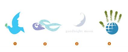 his
is an offshoot from Green, one of last year's trends. Large
corporations are taking ownership of the color in order to suggest
that they embrace human concerns and the environment
his
is an offshoot from Green, one of last year's trends. Large
corporations are taking ownership of the color in order to suggest
that they embrace human concerns and the environment
In this year's iterations, animals and natural objects are personified, or human features morph into more organic objects. Hands turn into trees, birds (especially doves) turn into people. It all reflects a renewed interest in the environment, but this technique also softens down the human element: As "stranger danger" fears become more pervasive, companies will have to work harder and harder to reassure their customers that they are the good guys.
1. Bradford Lawton Design Group for New Heights Methodist Church 2. Greteman Group for Celestial Massage 3. Capsule for Goodnight Moon 4. Dotzero Design for Human Rights
Cave Rings
T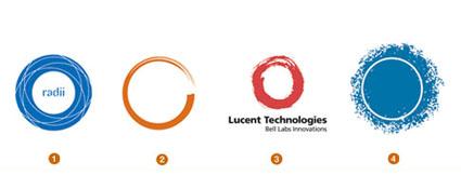 his
is an outgrowth of last year's Natural Spirals trend, even though
Lucent Technologies has been around a few years now. These designs
show controlled chaos, of taking charge of natural and sometimes
unpredictable processes. They reveal a human touch applied to
computer processes.
his
is an outgrowth of last year's Natural Spirals trend, even though
Lucent Technologies has been around a few years now. These designs
show controlled chaos, of taking charge of natural and sometimes
unpredictable processes. They reveal a human touch applied to
computer processes.
This is perhaps a natural recoil from over-exact processes, but their similitude could grow a bit tiresome: A circle is a circle, after all.
1. Futurebrand for Park Hyatt 2. Spin Design for Financial Consulting & Solutions 3. Landor and Associates for Lucent Technologies 4. Richards Brock Miller Mitchell & Associates for Dallas Museum of Nature and Science
Particle Fields
T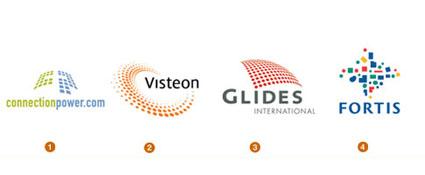 here
is an inordinate number of logos out there that contain a grid of
dots or shapes. This is an effect that is easily accomplished with
the computer, and it lends old favorites like circles and squares an
entirely new wardrobe. Usually, the treatment affords a
three-dimensional effect to the shape.
here
is an inordinate number of logos out there that contain a grid of
dots or shapes. This is an effect that is easily accomplished with
the computer, and it lends old favorites like circles and squares an
entirely new wardrobe. Usually, the treatment affords a
three-dimensional effect to the shape.
Many times, the particles are used to suggest bits of information or chaos being brought to order by the company. Strength is in the components being assembled. Or the particles have organized and taken on a fluid motion symbolizing direction of movement.
1. CDI Studios for Connection Power 2. Landor and Associates for Visteon 3. Methodologie for Glides International 4. Landor and Associates for Fortis
Prism
T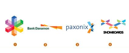 his
is a variation of Transparency, a trend that emerged last year: The
MSN butterfly is an excellent example. The concept of a prism could
suggest that people are feeling more liberal with their views. Larger
corporations, especially, are adopting a policy of greater and
greater translucency in their operations, not necessarily because
they want to, but because the public demands it.
his
is a variation of Transparency, a trend that emerged last year: The
MSN butterfly is an excellent example. The concept of a prism could
suggest that people are feeling more liberal with their views. Larger
corporations, especially, are adopting a policy of greater and
greater translucency in their operations, not necessarily because
they want to, but because the public demands it.
This is a relatively geometric solution that takes advantage of advances in color printing and reproduction. These designs have hard lines, but their palette is brilliant and playful, a definite move away from the desaturated palettes we have become accustomed to over the past decade.
1. gardner design for Vizworx Photolab 2. Landor and Associates for Bank Danamon 3. Landor and Associates for Paxonix 4. Segura Inc. for XXX Snowboards
Mezzotint
A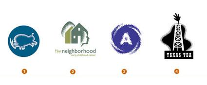 lthough
one might assume this is purely an offshoot of a computer function,
many of these designs appear to hand-rendered-even created by making
a rubbing off of a textured surface. There is a definite move toward
hand-craftedness, away from highly polished, strong edges to
something that is corporate but human.
lthough
one might assume this is purely an offshoot of a computer function,
many of these designs appear to hand-rendered-even created by making
a rubbing off of a textured surface. There is a definite move toward
hand-craftedness, away from highly polished, strong edges to
something that is corporate but human.
1. Richards Brock Miller & Associates for Blue Rino Studio 2. Dotzreo Design for The Neighborhood Daycare 3. Judson Design Associates for Harris County Water District 4. Jon Flaming Design: Objex, Inc.
Mythic
T his
is a trend that is similar to Animorphic, a trend from last year.
Designers hearken back to mythology and legend to imbue their
clients-especially brand-new companies-with an instant history. It's
the ancient equivalent of celebrity endorsement.
his
is a trend that is similar to Animorphic, a trend from last year.
Designers hearken back to mythology and legend to imbue their
clients-especially brand-new companies-with an instant history. It's
the ancient equivalent of celebrity endorsement.
Nike may have gotten things started, but not all such designs are successful for two reasons. First, not everyone may understand your reference, no matter how apt. Second, like celebrities today, gods and goddesses of yesterday may have skeletons in their rock-hewn closets that may lend less that appropriate light on a client.
1. thomasvasquez.com for The National Network 2. thomasvasquez.com for Starwood Hotel Group 3. VMA for Char-Broilfor Tactix Creative
2005
Folly Stars
T he
star has always been a foundation stone of logo design, rife with
symbology that varies from jingoistic federalism to quality and
celestial guidance. No less important today, the star has literally
taken on a life of its own as it starts to shed its strict geometry
for arms and legs and wings. The shape has had a transfusion of
personality and imperfection, so that it now rivals any human. This
generation is much more approachable, while maintaining the same
symbolic pedigree of its ancestors.
he
star has always been a foundation stone of logo design, rife with
symbology that varies from jingoistic federalism to quality and
celestial guidance. No less important today, the star has literally
taken on a life of its own as it starts to shed its strict geometry
for arms and legs and wings. The shape has had a transfusion of
personality and imperfection, so that it now rivals any human. This
generation is much more approachable, while maintaining the same
symbolic pedigree of its ancestors.
1. Goldfinger C.S. Hothouse Inc. for La Caixa 2. Desgrippes Gobé for Travelocity 3. Landor and Assosiates for Apria Healthcare 4. Wages Design for Chick-fil-A University
Amalgams
T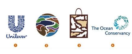 hese
assemblies of diverse elements may credit their throwback to Pierre
Bernard's logo for the Parcs Nationaux de France (French National
Parks), a seminal mark based on a Fibonacci spiral crafted from the
silhouettes of every piece of flora and fauna in the parks. Miles
Newlyn, working with Wolff Olins, has managed to build an equally
enchanting logo for Unilever. This trend bucks the notion of
assembling everything known about an organization and boiling it down
to a single image. Instead, the designer displays those ingredients
so that every element is preserved and displayed in an arrangement
that takes on an additional layer of meaning more replete than any
individual component alone. The detail of these logos can become as
addictive as a good puzzle or flavorful pasta sauce.
hese
assemblies of diverse elements may credit their throwback to Pierre
Bernard's logo for the Parcs Nationaux de France (French National
Parks), a seminal mark based on a Fibonacci spiral crafted from the
silhouettes of every piece of flora and fauna in the parks. Miles
Newlyn, working with Wolff Olins, has managed to build an equally
enchanting logo for Unilever. This trend bucks the notion of
assembling everything known about an organization and boiling it down
to a single image. Instead, the designer displays those ingredients
so that every element is preserved and displayed in an arrangement
that takes on an additional layer of meaning more replete than any
individual component alone. The detail of these logos can become as
addictive as a good puzzle or flavorful pasta sauce.
1. Wolff Olins/Miles Newlyn for Unilever 2. Chermayeff & Geismar, Inc. for Tennessee Aquarium 3. Insight Design for Richard Lynn's Shoe Market 4. MetaDesign for The Ocean Conservancy
Blow Out
I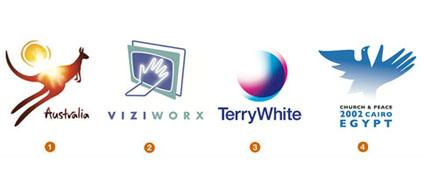 still cheer every time I see a logo successfully chip away at the
tenets of traditional logo design. This trend is one such rebel. It
stands up and proclaims, "To hell with vectored edges!"
This group is beautifully crafted. The shape is formed, but then a
5,000-watt krypton bulb blows out the mark's critical edges. The
nerve to build an implied aura in a flat world is rewarded when the
design calls for it. Melbourne's FutureBrand Australia could have
captured a continent with a bounding kangaroo and sun, but they
sealed the deal for adventurers and sun worshippers worldwide by
welding a solar flare right into the viewers mind.
still cheer every time I see a logo successfully chip away at the
tenets of traditional logo design. This trend is one such rebel. It
stands up and proclaims, "To hell with vectored edges!"
This group is beautifully crafted. The shape is formed, but then a
5,000-watt krypton bulb blows out the mark's critical edges. The
nerve to build an implied aura in a flat world is rewarded when the
design calls for it. Melbourne's FutureBrand Australia could have
captured a continent with a bounding kangaroo and sun, but they
sealed the deal for adventurers and sun worshippers worldwide by
welding a solar flare right into the viewers mind.
1. FutureBrand Australia for Brand Australia 2. Gardner Design for Viziworx Enhanced Television 3. Cato Purnell Partners for Terry White Chemists 4. Creative Development Association for Third World Mission Association
CMYK
F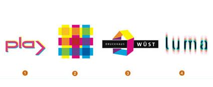 or
years, cyan, magenta, yellow and black have been designer-speak in
developing identities for printing and color houses. So when did
these primary colors of the print world enter the vocabulary of the
real world? When digital printers became cheaper than the inks you
load in them. CMYK soon became the building blocks of a visually
literate society. These base colors, spurned as long-time
restrictions by designers, suddenly became the novel darlings of
consumers. To explain a concept, knock it down to its basic elements:
Suddenly, CMYK is a fresh tool that a savvy public understands.
or
years, cyan, magenta, yellow and black have been designer-speak in
developing identities for printing and color houses. So when did
these primary colors of the print world enter the vocabulary of the
real world? When digital printers became cheaper than the inks you
load in them. CMYK soon became the building blocks of a visually
literate society. These base colors, spurned as long-time
restrictions by designers, suddenly became the novel darlings of
consumers. To explain a concept, knock it down to its basic elements:
Suddenly, CMYK is a fresh tool that a savvy public understands.
1. Wolken communica for Bellevue Art Museum 2. Cato Purnell Partners for Infratil 3. Braue; Branding & Corporate Design for Druckhaus Wüst 4. Chase Design Group for First Light
Flames
T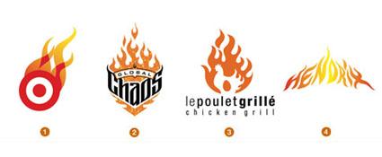 hough
tiresome to many, fire is one of the elements of nature, and flames
aren't going away soon. Want to confirm this? Turn on your TV and
count the number of custom
biker/motor/auto/monster/pimp-my-ride-shows spread across networks as
diverse as Discovery, MTV and ESPN. Customization has become an
industry, and good pin-strippers sign autographs. These guys can tell
us there are traditional flames, fast flames, California flames,
tribal flames and more. We still associate flames with heat, speed
and vanilla rebellion, and as long as there are fast bad-boy clients,
designers will be painting their licks.
hough
tiresome to many, fire is one of the elements of nature, and flames
aren't going away soon. Want to confirm this? Turn on your TV and
count the number of custom
biker/motor/auto/monster/pimp-my-ride-shows spread across networks as
diverse as Discovery, MTV and ESPN. Customization has become an
industry, and good pin-strippers sign autographs. These guys can tell
us there are traditional flames, fast flames, California flames,
tribal flames and more. We still associate flames with heat, speed
and vanilla rebellion, and as long as there are fast bad-boy clients,
designers will be painting their licks.
1. Davidson Design for Target 2. Fernandez Design for Global Chaos 3. Luce Beaulieu for Le Poulet Grillé 4. Modern Dog Communications for Experience Music Project
Wicker Balls
G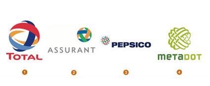 lobes
continue to be a popular solution to represent the international
affairs of a corporation, though I typically wince at a globe
solution when it's the only tale a company has to tell. These
solutions, on the other hand, can take on a degree of elegance and
often represent the strength and complexity of the organization
bonded by the woven layers. The French A & Company, for example,
was masterful at combining the flagship colors of Total, Fina and Elf
to help represent the merger of these three European petroleum
giants.
lobes
continue to be a popular solution to represent the international
affairs of a corporation, though I typically wince at a globe
solution when it's the only tale a company has to tell. These
solutions, on the other hand, can take on a degree of elegance and
often represent the strength and complexity of the organization
bonded by the woven layers. The French A & Company, for example,
was masterful at combining the flagship colors of Total, Fina and Elf
to help represent the merger of these three European petroleum
giants.
1. A & Company for Total 2. Carbone Smolan Agency for Assurant 3. Landor and Associates fopr Pepsico 4. Fernandez Design for MetaDot
Weaves
A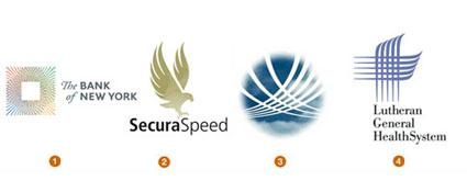 thread is just thread, but when woven together properly, the fibers
become fabric. This is not too far from the premise of these logos.
The deft weaving of linear elements brings intrinsic value and
substance to the marks, and the interlocking lines add strength. This
repetition creates rhythm which helps the eye complete the image.
There is a certain refinement conveyed by the intricacy that goes
unspoken. Lippincott Mercer takes this approach with its new identity
for The Bank of New York, cleverly adopting the fine, engraved lines
of international currency and financial documents to evoke the firm's
global services.
thread is just thread, but when woven together properly, the fibers
become fabric. This is not too far from the premise of these logos.
The deft weaving of linear elements brings intrinsic value and
substance to the marks, and the interlocking lines add strength. This
repetition creates rhythm which helps the eye complete the image.
There is a certain refinement conveyed by the intricacy that goes
unspoken. Lippincott Mercer takes this approach with its new identity
for The Bank of New York, cleverly adopting the fine, engraved lines
of international currency and financial documents to evoke the firm's
global services.
1. Lippincott Mercer for The Bank of New York Traffic Safety Bureau 2. Marcus Lee Design for Secura Speed 3. Cato Purnell Partners for Hamburg Airport 4. TCrosby Associates for Lutheran General Health System
Whips
G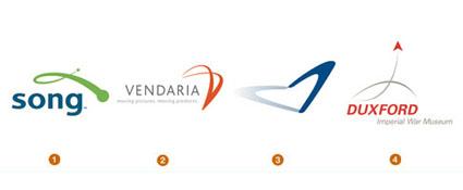 liding
through the air from point A to point B, these logos may well be a
genetic off-shoot of the dreaded "swoosh." Linear in form,
whips arc through the air with a sense of destination in mind and
seldom are they affected by gravity. Unlike the swoosh, which appears
to be in infinite orbit, these logos show a definite start and stop.
Landor's recent identity for Delta Airline's low-fare carrier Song
portrays a bit of a playful nature as well. In an industry where the
giant carriers must make a big statement, Song doesn't have to.
liding
through the air from point A to point B, these logos may well be a
genetic off-shoot of the dreaded "swoosh." Linear in form,
whips arc through the air with a sense of destination in mind and
seldom are they affected by gravity. Unlike the swoosh, which appears
to be in infinite orbit, these logos show a definite start and stop.
Landor's recent identity for Delta Airline's low-fare carrier Song
portrays a bit of a playful nature as well. In an industry where the
giant carriers must make a big statement, Song doesn't have to.
1. Landor and Associates for Song 2. Methodologie for Vendaria 3. Critheorian for Boomori 4. Trickett and Webb for Imperial War Museum
Puffies
D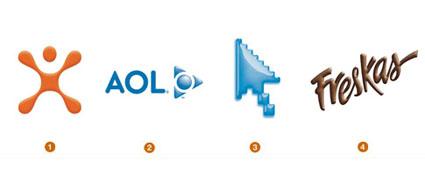 ifferent
from their crystal-capped sisters (like the new UPS logo or John
Deere), these logos have been pneumatically inflated to 33psi like
pool float toys. Yes, they break the traditional logo rules with
gradients, but, technically, we've overcome many of the production
issues that used to give shading a bad name. Much like the complete
suite of Microsoft Office logos that drift around our desktop, these
logos draw your attention regardless of your personal persuasion.
Three-dimensional logos will continue to thrive in a two-dimensional
world. The good news is you won't hurt yourself if you accidentally
fall on one.
ifferent
from their crystal-capped sisters (like the new UPS logo or John
Deere), these logos have been pneumatically inflated to 33psi like
pool float toys. Yes, they break the traditional logo rules with
gradients, but, technically, we've overcome many of the production
issues that used to give shading a bad name. Much like the complete
suite of Microsoft Office logos that drift around our desktop, these
logos draw your attention regardless of your personal persuasion.
Three-dimensional logos will continue to thrive in a two-dimensional
world. The good news is you won't hurt yourself if you accidentally
fall on one.
1. VSA Partners for Cingular 2. Desgrippes Gobé for AOL 3. Critheorian for Water.com 4. TD2, S.C. for Nestlé Chocolates
Line Dots
T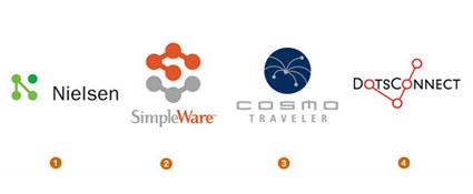 hese
seem to be everywhere, with many permutations. Often technical in
application, they remind us of molecular structure, atomic particles,
circuitry boards and dot-to-dot connectivity. It is a language that
is packed with symbolism, highly malleable, and is as adaptable as a
can of Tinker Toys. It is also quickly on the verge of saturation.
The Nielson logo by Landor was early to this trend, and it is as
succinct and economical a stroke as you can get.
hese
seem to be everywhere, with many permutations. Often technical in
application, they remind us of molecular structure, atomic particles,
circuitry boards and dot-to-dot connectivity. It is a language that
is packed with symbolism, highly malleable, and is as adaptable as a
can of Tinker Toys. It is also quickly on the verge of saturation.
The Nielson logo by Landor was early to this trend, and it is as
succinct and economical a stroke as you can get.
1. Landor and Associates for Nielsen 2. Firewheel Design for SimpleDevices 3. Design and Image for Cosmo Traveler 4. MonigleAssociates, Inc. for Total System Services
Good Drops
L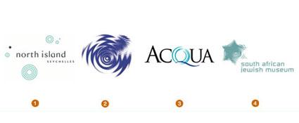 et
this serve as a notice that you can squeeze blood out of a turnip.
Logos using water ripples continue to flow like there's no shutting
off the tap. When it appears that every iteration of a concept has
been laid to rest, a clever designer somewhere pulls out an
unexpected twist on the game. Suddenly, you're found staring at a
previously unvisited solution. Cato Purnell Partners' logo for the
Australian Academy of Design @ Docklands makes an inventive use of
the pool of ripples unlike any other. Look at Budweiser beer's drop
crown. This well is deeper than it appears.
et
this serve as a notice that you can squeeze blood out of a turnip.
Logos using water ripples continue to flow like there's no shutting
off the tap. When it appears that every iteration of a concept has
been laid to rest, a clever designer somewhere pulls out an
unexpected twist on the game. Suddenly, you're found staring at a
previously unvisited solution. Cato Purnell Partners' logo for the
Australian Academy of Design @ Docklands makes an inventive use of
the pool of ripples unlike any other. Look at Budweiser beer's drop
crown. This well is deeper than it appears.
1. Enterprise IG for North Island 2. Cato Purnell Partners for Cato Purnell Partners 3. Hubbell Design Works for Hawaiian Regent Resort 4. Enterprise IG for South African Jewish Museum
Leaf Life
A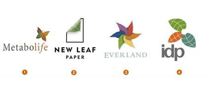 s
ecological issues remain topical, the leaf will continue to be an
iconic element in green design. Leaves are also being cast as bit
players in more visual identities. They are certainly chameleon-like,
with an incredibly broad range: A leaf can represent birth and death,
a cycle of life, natural solutions, sun and shade, food and
nutrition, beauty, growth and more. Because the physical appearance
of leaves vary dramatically, designers are able to manipulate their
form to suit their demands.
s
ecological issues remain topical, the leaf will continue to be an
iconic element in green design. Leaves are also being cast as bit
players in more visual identities. They are certainly chameleon-like,
with an incredibly broad range: A leaf can represent birth and death,
a cycle of life, natural solutions, sun and shade, food and
nutrition, beauty, growth and more. Because the physical appearance
of leaves vary dramatically, designers are able to manipulate their
form to suit their demands.
1. Landor and Associates for Metabolife 2. Elixir Design for New Leaf Paper 3. Landor and Associates for Everland 4. Cato Purnell Partners for IDP
Blur
T Again,
the logos that stand out are often those that are willing to thumb
their nose at convention. The idea of motion is certainly not new to
logos. Robert Miles Runyon spawned a world of followers with his
stars in motion logo for the Los Angeles Olympics in 1984.
Technically, our capabilities no longer force us to show cartoon
streaks to convey a concept. These logos reflect a more natural
interpretation of the concept of motion. This is done in an engaging
"made you look twice" format that demands a response.
Others in this class play with your focus: Take, for instance, the
Evolution logo, the new identities for Abbey International or the
TATE in Britain.
Again,
the logos that stand out are often those that are willing to thumb
their nose at convention. The idea of motion is certainly not new to
logos. Robert Miles Runyon spawned a world of followers with his
stars in motion logo for the Los Angeles Olympics in 1984.
Technically, our capabilities no longer force us to show cartoon
streaks to convey a concept. These logos reflect a more natural
interpretation of the concept of motion. This is done in an engaging
"made you look twice" format that demands a response.
Others in this class play with your focus: Take, for instance, the
Evolution logo, the new identities for Abbey International or the
TATE in Britain.
1. Methodologie for Vulcan 2. Cato Purnell Partners for CityRail 3. Miles Newlyn for 3 4. Landor and Associates for Corning
Swirlys
I nspired
by ornate pictorial calligraphy from the Victorian era, or perhaps
more recently by the charming illustration of Elvis Swift, designers
have become more enamored with the rhythmic flow of the pen. This
style merges Spenserian script and the humanity of the hand-drawn
line to ratchet up the elegance quotient. For the well-crafted marks
of this genre, there is a lightness that comes from more white space
than line work.
nspired
by ornate pictorial calligraphy from the Victorian era, or perhaps
more recently by the charming illustration of Elvis Swift, designers
have become more enamored with the rhythmic flow of the pen. This
style merges Spenserian script and the humanity of the hand-drawn
line to ratchet up the elegance quotient. For the well-crafted marks
of this genre, there is a lightness that comes from more white space
than line work.
1. Pennebaker for Gilbert and Bel Valdez 2. Sibley Peteet Design for O's Catering 3. Mires for Shea Homes 4. Hornall Anderson for Dayberries Bakery and Café
Hot Dogs
A disconnected group of round-tipped line segments sit, stand and roll
over to form these logos. Though you might be tempted to call these
"jimmies" or "sprinkles" - the decorations on a
tricked-out cupcake - and despite Felix Sockwell's insistence we call
this category "candied," "hot dogs" probably
rings true with more designers. These short segments can convey
self-contained individualism and, when acting together, can also show
the unity of common action. If ever the sum of the whole were greater
than the individual pieces, you are looking at it.
disconnected group of round-tipped line segments sit, stand and roll
over to form these logos. Though you might be tempted to call these
"jimmies" or "sprinkles" - the decorations on a
tricked-out cupcake - and despite Felix Sockwell's insistence we call
this category "candied," "hot dogs" probably
rings true with more designers. These short segments can convey
self-contained individualism and, when acting together, can also show
the unity of common action. If ever the sum of the whole were greater
than the individual pieces, you are looking at it.
2006
Blankets
T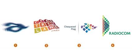 he
Aquacon logo gives every sense of the water's surface without relying
on waves, ripples or other trite visuals. These feel like an
evolutionary step forward from Microsoft Windows' logo waving in the
breeze or Bank of America's geometric landscape fashioned out by a
symbolic flag.
he
Aquacon logo gives every sense of the water's surface without relying
on waves, ripples or other trite visuals. These feel like an
evolutionary step forward from Microsoft Windows' logo waving in the
breeze or Bank of America's geometric landscape fashioned out by a
symbolic flag.
1. Chimera Design for Aquacon 2. SD Graphic Design for Crabtree Lane Studio 3. Gabi Toth for Chequered Flag Limited 4. Brandient for Radiocom
Blenders
I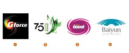 ntense
with motion and light, these logos give the appearance of a form
being swallowed by a black hole. Shapes seem to bend and warp as if
trying to defy the physics of light. The dervish nature of these
marks embody an energy quickly recognized and associated with the
product or the organization.
ntense
with motion and light, these logos give the appearance of a form
being swallowed by a black hole. Shapes seem to bend and warp as if
trying to defy the physics of light. The dervish nature of these
marks embody an energy quickly recognized and associated with the
product or the organization.
These could be an outgrowth of a trend spotted three years ago-Natural Spirals-but those forms had a much more leisurely appearance. These logos seem to be powered up with a nearly alien type of drive. It is a trend associated with any number of consumables, from over-the-counter medications and vitamins to highly caffeinated energy drinks. Who knew the Tide logo would come back to us with such vengeance?
1. Brandia for Galp Energia 2. Shift Design for BP 75 Years 3. Brandia for Ola 4. Cato Purnell Partners for Guangzhou Baiyun International Airport
Buttons
F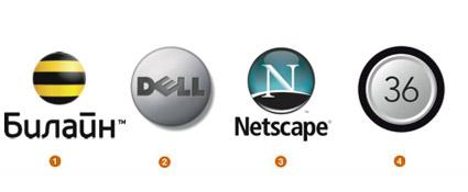 ully
dimensional buttons with radius tops, highlights, shadows, embossing,
and the occasional polymer dome seem to be everywhere. I can only
imagine consumers with obsessive-compulsive disorders straining to
avoid pressing each and every one of these. There's something about a
nicely crafted button that feels right to a consumer.
ully
dimensional buttons with radius tops, highlights, shadows, embossing,
and the occasional polymer dome seem to be everywhere. I can only
imagine consumers with obsessive-compulsive disorders straining to
avoid pressing each and every one of these. There's something about a
nicely crafted button that feels right to a consumer.
It could be that the message is one of empowerment: Typically a button is pressed to bring about a useful consequence. Press the Dell button and a computer comes to life. Press the Beeline Cellular button and instantly connect to others. No surprise that these logos are generally associated with electronics and communications.
1. Wolff Olins for Beeline 2. DDB for Dell 3. America Online Design for AOL Web Properties 4. Judson Design Associates for Level 36
Dot Fuzz
I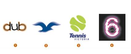 nterpreting
the idea of motion with this technique has a different set of
variables than the continuous tone Blur trend from last year's
report. Dot Fuzz logos have a better chance of accurate reproduction,
and their gritty nature may capture a double-take or two from the
consumer. Studio GT&P of Italy used the effect in an inspired
application for AJ Mobilitá Srl, a transport company. Even at close
range, their seagull logo gives the viewer a sense of looking at a
bird
nterpreting
the idea of motion with this technique has a different set of
variables than the continuous tone Blur trend from last year's
report. Dot Fuzz logos have a better chance of accurate reproduction,
and their gritty nature may capture a double-take or two from the
consumer. Studio GT&P of Italy used the effect in an inspired
application for AJ Mobilitá Srl, a transport company. Even at close
range, their seagull logo gives the viewer a sense of looking at a
bird
1. Strategy Studio for Dub Rogers Photography 2. Studio GT&P for AJ Mobilita' Srl 3. Chimera Design for Tennis Victoria 4. Chimera Design for Tabcorp
Orbs
S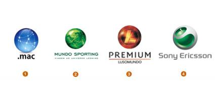 tare
into the orb, and you'll see shrouded layers, orbiting stars,
swirling liquids and other worlds packaged in a size we could drop in
our pocket. These logos convey a message to consumers that there is a
complex universe behind the product, but it is neatly captured and
contained in a simple sphere they can easily interface with. Every
effort at photographic realism is critical to maintaining the
illusion.
tare
into the orb, and you'll see shrouded layers, orbiting stars,
swirling liquids and other worlds packaged in a size we could drop in
our pocket. These logos convey a message to consumers that there is a
complex universe behind the product, but it is neatly captured and
contained in a simple sphere they can easily interface with. Every
effort at photographic realism is critical to maintaining the
illusion.
1. Apple Design for .Mac 2. Brandia for Sporting Clube de Portugal 3. Brandia for Lusomundo Premium 4. Takuya Kawagoi for Sony Ericsson
Dry Brush
O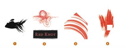 ur
attempts to avoid slick and stay on a human scale are played out with
a combination of simple brush strokes and occasionally an economic
cut-out of a geometric shape. It's a combination of a little chaos
and a little control that suggests balance. It's a challenge to be
both graphic and mortal at the same time, but this method seems to do
just that.
ur
attempts to avoid slick and stay on a human scale are played out with
a combination of simple brush strokes and occasionally an economic
cut-out of a geometric shape. It's a combination of a little chaos
and a little control that suggests balance. It's a challenge to be
both graphic and mortal at the same time, but this method seems to do
just that.
1. M3 Advertising Design for Osaka Sushi 2. Kendall Ross for Precept Brands 3. Cheri Gearhart Graphic Design for Sarah's 4. Polemic Design for Fire + Ice
Embellish
A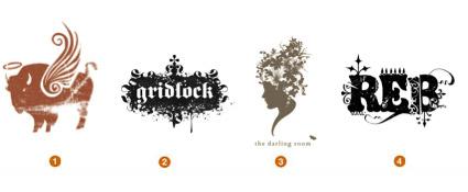 marriage of grit and finesse is responsible for the visual success of
these marks. These are typically a dichotomy of fine details and
dingbats knocked out of and assembled with a degenerated background
element. Rich with rhythm and emotion, these logos are often though
not exclusively associated with the arts.
marriage of grit and finesse is responsible for the visual success of
these marks. These are typically a dichotomy of fine details and
dingbats knocked out of and assembled with a degenerated background
element. Rich with rhythm and emotion, these logos are often though
not exclusively associated with the arts.
The human process of collecting and meticulously crafting the various components is not lost on the consumer. This genre speaks well to a younger generation and the skateboard culture. Most important, though, is the influence of the artist Ryan McGinness, who has created a hybrid of graphic design and fine art with his installations.
1. Howerton+White Interactive for Buffalo Saints 2. The Flores Shop for Gridlock Paintball Team 3. Hammerpress for The Darling Room 4. Gardner Design for REB Textiles
Splat
O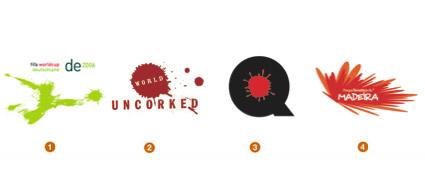 ne
of the most amazing sets of logos I've seen in years are the splotch
pictograms of soccer players created by Hesse Design of Germany for
consideration for the 2006 FIFA World Cup. What at first appears as
little more than a bug on a windshield suddenly comes to life as a
player frantically driving for a goal with a ball exploding forward
with equal force. What amazes me about this series are the subtleties
you see in each when you squint your eyes.
ne
of the most amazing sets of logos I've seen in years are the splotch
pictograms of soccer players created by Hesse Design of Germany for
consideration for the 2006 FIFA World Cup. What at first appears as
little more than a bug on a windshield suddenly comes to life as a
player frantically driving for a goal with a ball exploding forward
with equal force. What amazes me about this series are the subtleties
you see in each when you squint your eyes.
1. Hesse Design for 2006 FIFA Worldcup 2. Edward Allen for World Uncorked 3. KOESTER Design for Q ink 4. Shift Design for Parque Temático da Madeira
Glow
T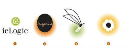 echnically,
the subtle gradation of color for a background field bucks
traditional production rules for a logo. But these are rules that
have been cast to the side with advanced technology and production
methods. The vignette also might lock the application into a
white-only background, but considering the effect, it's well worth
it.
echnically,
the subtle gradation of color for a background field bucks
traditional production rules for a logo. But these are rules that
have been cast to the side with advanced technology and production
methods. The vignette also might lock the application into a
white-only background, but considering the effect, it's well worth
it.
1. Sockeye Creative for ieLogic 2. Kaimere for Fairmont Hotels 3. Felixsockwell.com for Firefly 4. Carol Gravelle Graphic Design for Tournesol Siteworks
Transparent 3D
T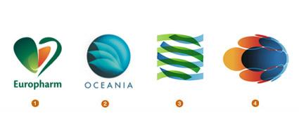 hese
logos are fabricated from transparent layers that also take on form
or gradation and highlights. Their luminous quality of light is
engaging. Soon we could anticipate seeing transparent, yet tactile
and textured surfaces.
hese
logos are fabricated from transparent layers that also take on form
or gradation and highlights. Their luminous quality of light is
engaging. Soon we could anticipate seeing transparent, yet tactile
and textured surfaces.
Transparency has become a buzzword within the corporate world as more industries see the need to open their books and their practices to the public. Using actual visual transparency in a logo is a common metaphor.
1. Brandient for Europharm 2. Strange Ideas for Oceania 3. Gardner Design for MVP Architecture 4. Shift Design for SDNM Originário
Overlays
O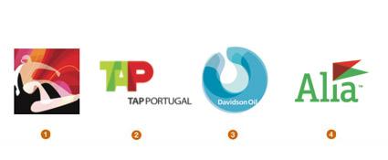 ne
of the driving factors behind the transparency trend is pure
technology. Adobe Illustrator has made the additive color process a
click away through layers with or without gradation. That means the
effects can be controlled in a vector environment which is more
conducive to experimentation than Photoshop.
ne
of the driving factors behind the transparency trend is pure
technology. Adobe Illustrator has made the additive color process a
click away through layers with or without gradation. That means the
effects can be controlled in a vector environment which is more
conducive to experimentation than Photoshop.
The designers at Iconologic may have been responsible for creating the greatest audience for this look with their groundbreaking graphic solutions for the sport icons and venue graphics at the 2006 Winter Olympics in Torino. Their system relied on flat transparency, and the beautifully drawn sport pictograms were just as stunning in one color as four.
1. Iconologic for 2006 Winter Olympic Games 2. Brandia for TAP Portugal 3. Tanagram Partners for Davidson Oil 4. Grapefruit for UCS Romania
Filigree
W hether
in a close-up detail or a complete wreath, this technique creates an
authoritative, impervious force field around the logo. It doesn't
rely on mass: Instead, it uses an airy finesse that allows it to lock
to a surface and gives the mark a sense of place. Last year's report
discussed The Bank of New York logo, developed by Lippincott Mercer,
which conveys a similar sense of beauty and security.
hether
in a close-up detail or a complete wreath, this technique creates an
authoritative, impervious force field around the logo. It doesn't
rely on mass: Instead, it uses an airy finesse that allows it to lock
to a surface and gives the mark a sense of place. Last year's report
discussed The Bank of New York logo, developed by Lippincott Mercer,
which conveys a similar sense of beauty and security.
1. Gardner Design for RelianzBank 2. UNO for Minneaplois 3. Cato Purnell Partners for Bank West 4. Sockeye Creative for Adidas
Post Apocalyptic
"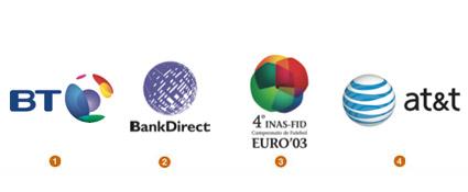 It's
the invisible sphere. The traditional globe has been vaporized and
all that is left behind is the atmosphere." I wish I had said
these words or named this trend, but all credit goes to the
incomparable designer Miles Newlyn.
It's
the invisible sphere. The traditional globe has been vaporized and
all that is left behind is the atmosphere." I wish I had said
these words or named this trend, but all credit goes to the
incomparable designer Miles Newlyn.
If you are global, the globe is not the message: It's what you bring to the globe. AT&T doesn't bring us a sphere. It brings us the connectivity to transcend geographic constraints. The same can be said of Wolff Olins' solution for BT. Watching the animation of this logo you get a sense of the world's continents and the symbolic coverage of communication. Both of these solutions take advantage of transparency to intensify the effect.
1. Wolff Olins and Rufus Leonard for BT 2. Cato Purnell Partners for Bank Direct 3. Brandia for INAS-FID 4. Interbrand for AT&T
Vivid
A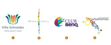 fter
a glance at this year's trends, a secondary trend stands out: color.
This is not just color, but unabashed color. Not in all sectors but
in many, the desaturated or one- and two-color palettes of the past
have been pitched to the heap. Hues are more vivid, and many logos
are represented by the full spectrum.
fter
a glance at this year's trends, a secondary trend stands out: color.
This is not just color, but unabashed color. Not in all sectors but
in many, the desaturated or one- and two-color palettes of the past
have been pitched to the heap. Hues are more vivid, and many logos
are represented by the full spectrum.
Events, destinations, and celebration lead this group, but bold application of color is showing up in more traditional fields like communications and banking, for example. Technological barriers that used to limit logo color for pure economic reasons have become less of a concern. Companies have a greater presence on the internet and TV, both of which have light-driven, luminous RGB environments at their disposal. We've simply become more accustomed to saturated color.
1. Gabi Toth for Villa Schneider 2. FutureBrand for Wines of Chile 3. Cato Purnell Partners for BenQ 4. Duffy & Partners for The Bahamas Ministry of Tourism
Scribbles
T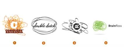 his
is a throw-back to our childhood when we didn't have to stay inside
the lines. We could create bedlam with any color crayon we damn well
pleased. These marks have a frantic nature about them that appeals to
a younger generation, but note that the logos are generally brought
back under our thumb with the addition of a formal element often
typographic.
his
is a throw-back to our childhood when we didn't have to stay inside
the lines. We could create bedlam with any color crayon we damn well
pleased. These marks have a frantic nature about them that appeals to
a younger generation, but note that the logos are generally brought
back under our thumb with the addition of a formal element often
typographic.
Here again we come back to the theme of controlled chaos. It's an opportunity for companies to show they have the ability to create an orderly freedom, a chance to escape the constraints of an organizational planet but not leave the gravitational field.
1. AKOFA Creative for Conquest Recordings 2. Planet Propaganda for Double Dutch 3. Edward Allen for Revolve Motion 4. MINE for Brainfloss
--------------------------------------------------------------------
2007
Сотрудники огромного лого-хранилища Logolounge.com каждый день смотрят на множество логотипов и не могут не замечать тенденций — эстетических, концептуальных и культурных. Поэтому кому как не им знать все новости из эволюции логотипостроения. В статье, приведенной ниже, перечислены важнейшие из них.
На
наших глазах рушатся незыблемые доныне
устои существования логотипов в цветовой
области CMYK — теперь дизайнеры все чаще
отказываются от плоских неподвижных
форм и обращаются к объемным объектам,
объектам в движении, существующим в
эфемерной области RGB.
Еще одна важная
вещь: на каждую тенденцию сейчас
существует контртенденция, и это касается
не только дизайна логотипов. Предпочтения
людей больше не вращаются вокруг
нескольких основных стилей и идей, они
рассыпаны равномерно по всему логотипному
разнообразию. Компании, которым нужны
логотипы, и дизайнеры, разрабатывающие
эти логотипы, должны это учитывать.
Теперь крайне трудно ориентироваться
только на тот или иной тренд, нужен более
широкий взгляд на вещи.
Кроме того,
нарастает тревожная тенденция:
логотипостроение становится чем-то
вроде общественного спорта. Люди начинают
привыкать к тому, что они могут
контролировать медиа — все эти множащиеся
блоги, Tivo, YouTube, Google и прочие интерактивные
сервисы дают им все больше возможностей
для индивидуализации и контроля. Поэтому
люди больше не хотят просто смотреть
на то, что им подсовывают: у них есть
свое мнение на этот счет. Так что когда
еще одна большая корпорация представлят
новый фирменный стиль, сотни сайтов
начинают шевелиться вокруг, активно
представляя мнения и комментарии по
этому поводу. Даже когда деревенская
администрация голосует за новый дизайн
наклейки для своих двух полицейских
машин, жители считают своим долгом
пройти по улицам с собственными вариантами
дизайна на плакатах и традиционными
орудиями труда для пущей убедительности.
Всеобщая вовлеченность процветает.
Отчет
за 2007 год, так же как и предыдущие,
содержит анализ основных, самых ярких
тенденций в логотипостроении, эстетических,
концептуальных и культурных. Надо
понимать, что все эти тенденции не
возникают из воздуха, они находятся в
постоянном движении, растут и разветвляются,
прямо сейчас пуская корни для новых
трендов.
Кроме этого, вы, возможно,
заметите некоторые пересечения в
обозначенных трендах. Например, Спирали
и Ленты в самом деле похожи. Но в этом
случае, как и во всех других, нас больше
интересует разница в фундаментальных
подходах. Наблюдения здесь — это просто
наблюдения, не рекомендации. И они
представлены вразброс, без какого-либо
особого порядка.
Спирали
Дезоксирибонуклеиновая
кислота — пожалуй, вещь, о которой
думаешь в последнюю очередь, когда
анализируешь тенденции дизайна. Эта
штука более знакома нам в аббревиатуре:
ДНК — основа всего живого, генетический
код, ответственный за прошлое и будущее
всех живых созданий. Эта двойная спираль
уже перестала быть чем-то исключительно
научным — теперь это достояние
поп-культуры.
Голливуд активно
эксплуатирует ДНК как символ загадочных
корпораций в научно-фантастических
декорациях. Дизайн-сообщество так часто
использует двойную спираль, что
однозначного смысла этот символ уже не
имеет: это и зародыш жизни, и здоровье
и долголетие, семейное древо, код,
загадка, или неразбиваемая последовательность
— все возможные варианты задействованы.
1.
дизайн: lwdgraphics, клиент: Chillosophy 2. дизайн:
Sumo, клиент: Science City 3. дизайн: Demasi Jones,
клиент: RCRH 4. дизайн: Gibson, клиент: Women for
Women
Резинки
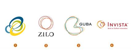 Самый
яркий представитель этой тенденции,
логотип Invista («кольца инноваций»), сделали
в 2003 году Enterprise
IG
. Invista
— один из крупнейших в мире производителей
волокон, и глядя на такой логотип, легко
составить представление о глобальности
компании и тесной взаимосвязи продуктов
и исследований — все это отражают
пересекающиеся волокнистые кольца.
Хотя для нетренированного взгляда это
может выглядеть как неупорядоченная
кучка канцелярских резинок.
Эта
тенденция напрямую связана с трендами
предыдущих лет — Природными
Спиралями
и Полыми
Кольцами
.
В целом, все эти пересекающиеся
кольцеобразные структуры стремятся
отразить концепцию общего продукта,
работников, компаний или подразделений,
работающих вместе, как более обширное
целое. А плотность расположения колец
и разница в их форме может отражать
соответствующие параметры связи частей
одного целого в компании. Цвет как
правило отражает индивидуальность
отдельных компонентов, но также помогает
понять общую идею того, что создаваемое
целое больше, чем просто сумма частей.
1.
дизайн: Koch Creative Group, клиент: MBM Study 5 2.
дизайн: Substrate, клиент: Zilo 3. дизайн:
Grafikonline, клиент: Guba 4. дизайн: Enterprise IG,
клиент: Invista
Сияние
Самый
яркий представитель этой тенденции,
логотип Invista («кольца инноваций»), сделали
в 2003 году Enterprise
IG
. Invista
— один из крупнейших в мире производителей
волокон, и глядя на такой логотип, легко
составить представление о глобальности
компании и тесной взаимосвязи продуктов
и исследований — все это отражают
пересекающиеся волокнистые кольца.
Хотя для нетренированного взгляда это
может выглядеть как неупорядоченная
кучка канцелярских резинок.
Эта
тенденция напрямую связана с трендами
предыдущих лет — Природными
Спиралями
и Полыми
Кольцами
.
В целом, все эти пересекающиеся
кольцеобразные структуры стремятся
отразить концепцию общего продукта,
работников, компаний или подразделений,
работающих вместе, как более обширное
целое. А плотность расположения колец
и разница в их форме может отражать
соответствующие параметры связи частей
одного целого в компании. Цвет как
правило отражает индивидуальность
отдельных компонентов, но также помогает
понять общую идею того, что создаваемое
целое больше, чем просто сумма частей.
1.
дизайн: Koch Creative Group, клиент: MBM Study 5 2.
дизайн: Substrate, клиент: Zilo 3. дизайн:
Grafikonline, клиент: Guba 4. дизайн: Enterprise IG,
клиент: Invista
Сияние
 Чрезвычайно
популярная тема в дизайн-индустрии:
повсеместная иллюминация. Сияющий свет
проникает повсюду, и, похоже, он нашел
новые выходы. Сияние исходит от
солнцеподобных штук, но также и от воды,
жемчужин, книг, и даже X-Box светится чем-то
инопланетным. Эффект сияния достигается
множеством способов: прозрачные
наложения, градиенты, отражения, блики
от линз или даже анимация.
Все эти
знаки несут в себе определенное тепло
и комфорт, психологически эффект сияния
сравним с эффектом света в конце тоннеля.
Такой свет начинает превалировать,
когда мы стараемся передать оптимизм,
чистоту, тепло или избавление от чего-то
негативного. Но опорной позицией для
светящихся логотипов остается символ
ведущего за собой света или источника
знаний.
1. дизайн: Cato Purnell Partners, клиент:
Skywest Airlines 2. дизайн: Gardner Design, клиент: The
Center 3. дизайн: LandDesign, клиент: Sunhaven 4. дизайн:
Siegel+Gale, клиент: SunTrust
Экология
Чрезвычайно
популярная тема в дизайн-индустрии:
повсеместная иллюминация. Сияющий свет
проникает повсюду, и, похоже, он нашел
новые выходы. Сияние исходит от
солнцеподобных штук, но также и от воды,
жемчужин, книг, и даже X-Box светится чем-то
инопланетным. Эффект сияния достигается
множеством способов: прозрачные
наложения, градиенты, отражения, блики
от линз или даже анимация.
Все эти
знаки несут в себе определенное тепло
и комфорт, психологически эффект сияния
сравним с эффектом света в конце тоннеля.
Такой свет начинает превалировать,
когда мы стараемся передать оптимизм,
чистоту, тепло или избавление от чего-то
негативного. Но опорной позицией для
светящихся логотипов остается символ
ведущего за собой света или источника
знаний.
1. дизайн: Cato Purnell Partners, клиент:
Skywest Airlines 2. дизайн: Gardner Design, клиент: The
Center 3. дизайн: LandDesign, клиент: Sunhaven 4. дизайн:
Siegel+Gale, клиент: SunTrust
Экология
 Главной
вещью, за которой приходится поспевать
всему корпоративному миру, остается
соответствие нормативам, связанным с
поддержанием окружающей среды. В той
или иной форме экологический тренд
появляется во всех отчетах LogoLounge. Но
теперь логотипы в эко-стиле становятся
элегантнее. Деревья и листочки никуда
не делись, но применяются более грациозно.
Возможно, некоторые из предыдущих
поклонников эко-темы просто играли на
публику. Теперь это не просто использование
зеленого цвета. Теперь логотипы учитывают
среду и этику, более чувствительны к
окружению. Они выросли, поумнели и
рассказывают свои истории вполголоса,
а не выкрикивают их.
1. дизайн: Gardner
Design, клиент: Dandurand 2. дизайн: Ulrichpinciotti
Design Group, клиент: Resources for Healthy Living 3. дизайн:
Eggnerd, клиент: Greenhill Academy 4. дизайн: Steve’s
Portfolio, клиент: Small Planet
Подсветка
Главной
вещью, за которой приходится поспевать
всему корпоративному миру, остается
соответствие нормативам, связанным с
поддержанием окружающей среды. В той
или иной форме экологический тренд
появляется во всех отчетах LogoLounge. Но
теперь логотипы в эко-стиле становятся
элегантнее. Деревья и листочки никуда
не делись, но применяются более грациозно.
Возможно, некоторые из предыдущих
поклонников эко-темы просто играли на
публику. Теперь это не просто использование
зеленого цвета. Теперь логотипы учитывают
среду и этику, более чувствительны к
окружению. Они выросли, поумнели и
рассказывают свои истории вполголоса,
а не выкрикивают их.
1. дизайн: Gardner
Design, клиент: Dandurand 2. дизайн: Ulrichpinciotti
Design Group, клиент: Resources for Healthy Living 3. дизайн:
Eggnerd, клиент: Greenhill Academy 4. дизайн: Steve’s
Portfolio, клиент: Small Planet
Подсветка
 Дизайнеры
продолжают безжалостно рушить правила,
согласно которым уже целую эпоху
создаются логотипы. Больше нет печатных
ограничений, границы цветности преодолены.
К тому же, многие дизайнеры и их клиенты
сошлись на том, что они совершенно точно
никогда в жизни не станут печатать свои
логотипы в Желтых Страницах, так что
отпадает и необходимость в разработке
хотя бы одной версии плоского и
одноцветного логотипа.
За последние
несколько лет мы наблюдали логотипы,
усыпанные кристаллами, освещенные
лучами света или будто бы надутые
изнутри. Концепция одна и та же — добиться
той степени реалистичности, которая
приподнимет логотип от плоскости листа.
Эта трехмерность позволяет логотипу
выбиться из массы плоских и однотонных
коллег. Не особенно элегантно, зато
эффективно.
Еще один способ придать
логотипу визуальный объем — эффект
мощного освещения. Логотипы выходят в
лучи света, как актеры под театральные
прожекторы. Но здесь есть хитрость:
практически все эти логотипы плоские
сами по себе, объем им придает иллюзия
правильного освещения. Это недооцененный
прием, который тем не менее хорошо
срабатывает и притягивает внимание
потребителей.
1. дизайн: Zed+Zed+Eye
Creative Communications, клиент: Ebert Pool Construction 2.
дизайн: FutureBrand, клиент: Pure Tasmania 3. дизайн:
Sebastiany Branding, клиент: Café ao Lar 4. дизайн: Cato
Purnell Partners, клиент: Flower
Factory
Псевдо-гербы
Дизайнеры
продолжают безжалостно рушить правила,
согласно которым уже целую эпоху
создаются логотипы. Больше нет печатных
ограничений, границы цветности преодолены.
К тому же, многие дизайнеры и их клиенты
сошлись на том, что они совершенно точно
никогда в жизни не станут печатать свои
логотипы в Желтых Страницах, так что
отпадает и необходимость в разработке
хотя бы одной версии плоского и
одноцветного логотипа.
За последние
несколько лет мы наблюдали логотипы,
усыпанные кристаллами, освещенные
лучами света или будто бы надутые
изнутри. Концепция одна и та же — добиться
той степени реалистичности, которая
приподнимет логотип от плоскости листа.
Эта трехмерность позволяет логотипу
выбиться из массы плоских и однотонных
коллег. Не особенно элегантно, зато
эффективно.
Еще один способ придать
логотипу визуальный объем — эффект
мощного освещения. Логотипы выходят в
лучи света, как актеры под театральные
прожекторы. Но здесь есть хитрость:
практически все эти логотипы плоские
сами по себе, объем им придает иллюзия
правильного освещения. Это недооцененный
прием, который тем не менее хорошо
срабатывает и притягивает внимание
потребителей.
1. дизайн: Zed+Zed+Eye
Creative Communications, клиент: Ebert Pool Construction 2.
дизайн: FutureBrand, клиент: Pure Tasmania 3. дизайн:
Sebastiany Branding, клиент: Café ao Lar 4. дизайн: Cato
Purnell Partners, клиент: Flower
Factory
Псевдо-гербы
 Смешайте
немного стильных завитушек, единорога
и розу, наложите корону и пару неизвестных
науке птиц — и получите что-то подходящее
под определение Псевдо-герба. Это
несерьезные гербы, разумеется, чистой
воды фан, но с множеством хитрых деталей.
Как, например, первый из ряда — отличный
пример, сделан в студии Джейсона Шульта
(Jason Schulte), Office
, для Target.
На первый взгляд логотипы
этой категории выглядят как нечто из
книги 101 геральдический знак, что-то в
этом роде. Но только до тех пор, пока вы
не начнете вглядываться в композиционные
элементы: там вы найдете скрещенные
гитары, пингвинов, ботинки, сотовые
телефоны и все эти невероятные вещи,
которые уж точно не из эпохи Камелота.
Это удел молодежи; дизайнеры выбрали
этот стиль для сферы моды и музыкальной
индустрии. На самом деле это та модная
тендеция, которую можно увидеть сейчас
практически везде, несмотря на такие
запутанные геральдические и викторианские
корни.
1. дизайн: Office, клиент: Independent
Studies/Target 2. дизайн: Reaves Design, клиент: JCPenny
Nation 3. дизайн: Miles Design, клиент: 12 Gauge
Wakeskates 4. дизайн: Launchpad Creative, клиент:
Astonish Entertainment
Виниловые игрушки
Смешайте
немного стильных завитушек, единорога
и розу, наложите корону и пару неизвестных
науке птиц — и получите что-то подходящее
под определение Псевдо-герба. Это
несерьезные гербы, разумеется, чистой
воды фан, но с множеством хитрых деталей.
Как, например, первый из ряда — отличный
пример, сделан в студии Джейсона Шульта
(Jason Schulte), Office
, для Target.
На первый взгляд логотипы
этой категории выглядят как нечто из
книги 101 геральдический знак, что-то в
этом роде. Но только до тех пор, пока вы
не начнете вглядываться в композиционные
элементы: там вы найдете скрещенные
гитары, пингвинов, ботинки, сотовые
телефоны и все эти невероятные вещи,
которые уж точно не из эпохи Камелота.
Это удел молодежи; дизайнеры выбрали
этот стиль для сферы моды и музыкальной
индустрии. На самом деле это та модная
тендеция, которую можно увидеть сейчас
практически везде, несмотря на такие
запутанные геральдические и викторианские
корни.
1. дизайн: Office, клиент: Independent
Studies/Target 2. дизайн: Reaves Design, клиент: JCPenny
Nation 3. дизайн: Miles Design, клиент: 12 Gauge
Wakeskates 4. дизайн: Launchpad Creative, клиент:
Astonish Entertainment
Виниловые игрушки
 Речь
о рекламных персонажах, которые находятся
на тонкой черте между логотипами и
талисманами. Это субкультура отлитых
из винила фигурок, которая начинает
пробираться в логотипостроение. Почти
у каждого дизайнера на столе найдется
пара этих забавных мини-скульптур.
Виниловые
дизайнерские игрушки стали впервые
популярными в Гонгконге в 90-х благодаря
Майклу Лау ( Michael
Lau
). Теперь же они стали предметом
коллекционирования, и у них есть
собственные магазины, такие как KidRobot
, и журналы вроде Super
7
, полностью посвященные виниловым
фигуркам. Это может быть что угодно —
от огнедышащих драконов до циклопов
инопланетного вида. Разумеется, среди
логотипов компаний, входящих в Fortune 500,
вряд ли найдутся подобные, но эти забавные
виниловые штуки уже прочно освоились
в поп-культуре и все чаще появляются в
двухмерном логотипном виде.
1. дизайн:
San Markos, клиент: webpublica 2. дизайн: Innfusion
Studios, клиент: Innfusor 3. дизайн: Glitschka Studios,
клиент: Fire Squad 4. дизайн: Tactix Creative, клиент:
Cyclops
Оси
Речь
о рекламных персонажах, которые находятся
на тонкой черте между логотипами и
талисманами. Это субкультура отлитых
из винила фигурок, которая начинает
пробираться в логотипостроение. Почти
у каждого дизайнера на столе найдется
пара этих забавных мини-скульптур.
Виниловые
дизайнерские игрушки стали впервые
популярными в Гонгконге в 90-х благодаря
Майклу Лау ( Michael
Lau
). Теперь же они стали предметом
коллекционирования, и у них есть
собственные магазины, такие как KidRobot
, и журналы вроде Super
7
, полностью посвященные виниловым
фигуркам. Это может быть что угодно —
от огнедышащих драконов до циклопов
инопланетного вида. Разумеется, среди
логотипов компаний, входящих в Fortune 500,
вряд ли найдутся подобные, но эти забавные
виниловые штуки уже прочно освоились
в поп-культуре и все чаще появляются в
двухмерном логотипном виде.
1. дизайн:
San Markos, клиент: webpublica 2. дизайн: Innfusion
Studios, клиент: Innfusor 3. дизайн: Glitschka Studios,
клиент: Fire Squad 4. дизайн: Tactix Creative, клиент:
Cyclops
Оси
 В
прошлом году Апурба Сен (Apurba Sen) из Индии
собрал собственную коллекцию из
нескольких сотен веб-два-нольных
логотипов и выделил в ней несколько
трендов. Практически все они совпадали
с перечисленными в отчетах LogoLounge
предыдущих лет, кроме одной. Это логотипы,
состоящие из центрального, осевого
элемента и множества «спутников»,
расположенных как правило симметрично
по кругу вокруг центра.
Такие знакие
могут служить моделью структуры
коммуникаций любого онлайн-сообщества.
Есть центральная ось, которая служит
источником информации. Без этой оси
спутники теряют возможность контактировать
друг с другом. Так что вне зависимости
от того, являются эти логотипы инструментом
коммуникации или нет, расхождение из
центральной точки — основная их
концепция. И еще один смысл, который
можно вложить в такое графическое
решение, — взаимодействие отдельных
элементов единой структуры для достижения
общего блага.
1. дизайн: Ardoise Design,
клиент: Raymond Engineering 2. дизайн: Aron Creative,
клиент: Springboard 3. дизайн: Glitschka Studios, клиент:
Windows Gaming 4. дизайн: Brand Bird, клиент: Arby’s
Franchise Association
Расходящиеся точки
В
прошлом году Апурба Сен (Apurba Sen) из Индии
собрал собственную коллекцию из
нескольких сотен веб-два-нольных
логотипов и выделил в ней несколько
трендов. Практически все они совпадали
с перечисленными в отчетах LogoLounge
предыдущих лет, кроме одной. Это логотипы,
состоящие из центрального, осевого
элемента и множества «спутников»,
расположенных как правило симметрично
по кругу вокруг центра.
Такие знакие
могут служить моделью структуры
коммуникаций любого онлайн-сообщества.
Есть центральная ось, которая служит
источником информации. Без этой оси
спутники теряют возможность контактировать
друг с другом. Так что вне зависимости
от того, являются эти логотипы инструментом
коммуникации или нет, расхождение из
центральной точки — основная их
концепция. И еще один смысл, который
можно вложить в такое графическое
решение, — взаимодействие отдельных
элементов единой структуры для достижения
общего блага.
1. дизайн: Ardoise Design,
клиент: Raymond Engineering 2. дизайн: Aron Creative,
клиент: Springboard 3. дизайн: Glitschka Studios, клиент:
Windows Gaming 4. дизайн: Brand Bird, клиент: Arby’s
Franchise Association
Расходящиеся точки
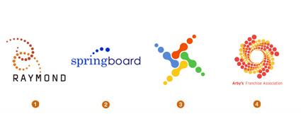 Как
только вы начинаете отслеживать эту
тенденцию, сразу начинаете замечать ее
повсюду — в том числе и в других трендах,
описанных в этом отчете. За очень
небольшим исключением, эти логотипы
состоят из серии точек, увеличивающихся
или уменьшающихся в четкой математической
последовательности. Большинство из
этих знаков стремятся отразить движение,
чтобы лучше донести свой смысл. Можно
назвать это застывшей анимацией. Каждая
картинка — остановленное движение, с
элементами разного калибра или цветовой
интенсивности в зависимости от времени
их выхода к зрителю.
Мы склонны
определять концепты, предполагающие
движение, как отдельную ветвь в логотипной
моде. В предыдущих отчетах мы рассматривали
другие способы передать движение в
статике — Размытие, Шумящие и Выдувание.
Расходящиеся точки полагаются на
направленную, как бы нанизанную на
вектор графику для достижения своего
эффекта, как это было у Роберта Майлса
Раньона (Robert Miles Runyon) в логотипе Олимпийских
игр в Лос-Анджелесе в 1984 году
. Итогом стала целая декада полосатых
логотипов, громко заявляющих «Я
двигаюсь».
1. дизайн: Ardoise Design, клиент:
Raymond Engineering 2. дизайн: Aron Creative, клиент:
Springboard 3. дизайн: Glitschka Studios, клиент: Windows
Gaming 4. дизайн: Brand Bird, клиент: Arby’s Franchise
Association
Флора
Как
только вы начинаете отслеживать эту
тенденцию, сразу начинаете замечать ее
повсюду — в том числе и в других трендах,
описанных в этом отчете. За очень
небольшим исключением, эти логотипы
состоят из серии точек, увеличивающихся
или уменьшающихся в четкой математической
последовательности. Большинство из
этих знаков стремятся отразить движение,
чтобы лучше донести свой смысл. Можно
назвать это застывшей анимацией. Каждая
картинка — остановленное движение, с
элементами разного калибра или цветовой
интенсивности в зависимости от времени
их выхода к зрителю.
Мы склонны
определять концепты, предполагающие
движение, как отдельную ветвь в логотипной
моде. В предыдущих отчетах мы рассматривали
другие способы передать движение в
статике — Размытие, Шумящие и Выдувание.
Расходящиеся точки полагаются на
направленную, как бы нанизанную на
вектор графику для достижения своего
эффекта, как это было у Роберта Майлса
Раньона (Robert Miles Runyon) в логотипе Олимпийских
игр в Лос-Анджелесе в 1984 году
. Итогом стала целая декада полосатых
логотипов, громко заявляющих «Я
двигаюсь».
1. дизайн: Ardoise Design, клиент:
Raymond Engineering 2. дизайн: Aron Creative, клиент:
Springboard 3. дизайн: Glitschka Studios, клиент: Windows
Gaming 4. дизайн: Brand Bird, клиент: Arby’s Franchise
Association
Флора
 Давайте
предположим, что если обеспечить логотипу
обильный полив и хорошее освещение, он
начнет прорастать ритмичными ростками,
веточками, цветами и прочими ботаническими
фантазиями. Это может быть эволюцией
прошлогодней
Завитушечной тендеции, или частью более
глобального тренда, объединяющего их.
Того самого тренда, который заимствует
остатки узорчатой Викторианской эпохи,
чтобы придать чуть больше тонкой теплой
человечности твердой скорлупе более
мудрых стерильных логотипов. Это
привлекает потребителя к визуальному
участию в неконфронтационном модном
течении.
Многие дизайнеры используют
этот визуальный язык, но первая
флористическая слава принадлежит
голландцу Торду Бунтье ( Tord
Boontje
). Торд сделал невероятно деликатные
материалы для праздничной презентации
в Target в 2006 году. Это ботаническое кружево
повлияло на айдентику в целом, особенно
применительно к разным розничным
штукам.
1. дизайн: Shift Design, клиент:
Charme 2. дизайн: Doug Beatty, клиент: Art for Aid 3.
дизайн: Gardner Design, клиент: Holly Root Massage 4.
дизайн: Entermotion Design Studio, клиент: Marshmallow
Kisses
Половинки
Давайте
предположим, что если обеспечить логотипу
обильный полив и хорошее освещение, он
начнет прорастать ритмичными ростками,
веточками, цветами и прочими ботаническими
фантазиями. Это может быть эволюцией
прошлогодней
Завитушечной тендеции, или частью более
глобального тренда, объединяющего их.
Того самого тренда, который заимствует
остатки узорчатой Викторианской эпохи,
чтобы придать чуть больше тонкой теплой
человечности твердой скорлупе более
мудрых стерильных логотипов. Это
привлекает потребителя к визуальному
участию в неконфронтационном модном
течении.
Многие дизайнеры используют
этот визуальный язык, но первая
флористическая слава принадлежит
голландцу Торду Бунтье ( Tord
Boontje
). Торд сделал невероятно деликатные
материалы для праздничной презентации
в Target в 2006 году. Это ботаническое кружево
повлияло на айдентику в целом, особенно
применительно к разным розничным
штукам.
1. дизайн: Shift Design, клиент:
Charme 2. дизайн: Doug Beatty, клиент: Art for Aid 3.
дизайн: Gardner Design, клиент: Holly Root Massage 4.
дизайн: Entermotion Design Studio, клиент: Marshmallow
Kisses
Половинки
 Если
смотреть на эти логотипы с точки зрения
оптимиста, они наполовину полные.
Приглашение зрителю поучаствовать,
самостоятельно достроить логотип —
сильный метод привлечения внимания.
Тот самый момент, когда — «Ага!» —
информация проявляется через смесь
императива и интерактива — это и есть
момент участия. Секрет в данном случае
в том, чтобы отрезать ровно столько,
чтобы не ввести зрителя в раздумья
слишком надолго. Тогда отсутствующая
часть логотипа легко расскажет свою
историю.
Где вторая половина и
почему? Была ли она отрезана, вылезает
за пределы чего-то, погружается она или
наоборот всплывает? Простая игра слов,
или в некоторых случаях изображений,
позволяет покупателю ассоциировать
продукт с действием. В некоторых случаях
отрезанная часть картинки — что-то
вроде вызова зрителю: прекрасная цифра
или буква разрезана пополам — это уже
сродни ереси! Буквы для покупателей
святы: можно их как угодно менять, но
совсем убирать часть — это то, что
заставляет людей смотреть.
1. дизайн:
Fresh Oil, клиент: Spats Logo Concept 2. дизайн: Thomas
Manss & Company, клиент: Cutcost.com 3. дизайн: Meme
Design, клиент: Edge 4. дизайн: Miles Design, клиент:
Urban Forward
Внахлест
Если
смотреть на эти логотипы с точки зрения
оптимиста, они наполовину полные.
Приглашение зрителю поучаствовать,
самостоятельно достроить логотип —
сильный метод привлечения внимания.
Тот самый момент, когда — «Ага!» —
информация проявляется через смесь
императива и интерактива — это и есть
момент участия. Секрет в данном случае
в том, чтобы отрезать ровно столько,
чтобы не ввести зрителя в раздумья
слишком надолго. Тогда отсутствующая
часть логотипа легко расскажет свою
историю.
Где вторая половина и
почему? Была ли она отрезана, вылезает
за пределы чего-то, погружается она или
наоборот всплывает? Простая игра слов,
или в некоторых случаях изображений,
позволяет покупателю ассоциировать
продукт с действием. В некоторых случаях
отрезанная часть картинки — что-то
вроде вызова зрителю: прекрасная цифра
или буква разрезана пополам — это уже
сродни ереси! Буквы для покупателей
святы: можно их как угодно менять, но
совсем убирать часть — это то, что
заставляет людей смотреть.
1. дизайн:
Fresh Oil, клиент: Spats Logo Concept 2. дизайн: Thomas
Manss & Company, клиент: Cutcost.com 3. дизайн: Meme
Design, клиент: Edge 4. дизайн: Miles Design, клиент:
Urban Forward
Внахлест
 В
некотором смысле это эволюция прошлогодней
тенденции, названной Наложениями. И
конечно уж это один из подвидов мощного
мульти-тренда Прозрачностей. Визуально
эта тенденция все еще опирается на
относительно плоские наложения цветов,
но концептуально это уже в большей
степени взаимосвязь между элементами.
Наложенные друг на друга кусочки этих
логотипов — буквальная аналогия
связанных между собой частей внутри
корпорации. Здесь нужно подчеркнуть,
что прозрачность — очень сильное
маркетинговое понятие в корпоративном
мире: необходимость в финансовой и
управленческой прозрачности — большая
часть имиджа компании.
Элементы,
собранные вместе, которым при этом
нечего прятать — символ четко выстроенной,
диверсифицированной и при этом прозрачной
структуры. Перекрывающиеся элементы
могут рассказать историю о компании
или объяснить ее архитектуру. С развитием
дизайнерского программного обеспечения
создание картинок с прозрачностями
стало простым и удобным — можно сразу
увидеть результат тех или иных цветовых
наложений и легко их регулировать.
1.
дизайн: Fitting Group, клиент: i-Squared 2. дизайн:
Cacao Design, клиент: Renza Morello 3. дизайн: Matthew
Schwart Design Studio, клиент: Agency Access 4. дизайн:
Gillen’s Army, клиент: The Electric Company
3D
В
некотором смысле это эволюция прошлогодней
тенденции, названной Наложениями. И
конечно уж это один из подвидов мощного
мульти-тренда Прозрачностей. Визуально
эта тенденция все еще опирается на
относительно плоские наложения цветов,
но концептуально это уже в большей
степени взаимосвязь между элементами.
Наложенные друг на друга кусочки этих
логотипов — буквальная аналогия
связанных между собой частей внутри
корпорации. Здесь нужно подчеркнуть,
что прозрачность — очень сильное
маркетинговое понятие в корпоративном
мире: необходимость в финансовой и
управленческой прозрачности — большая
часть имиджа компании.
Элементы,
собранные вместе, которым при этом
нечего прятать — символ четко выстроенной,
диверсифицированной и при этом прозрачной
структуры. Перекрывающиеся элементы
могут рассказать историю о компании
или объяснить ее архитектуру. С развитием
дизайнерского программного обеспечения
создание картинок с прозрачностями
стало простым и удобным — можно сразу
увидеть результат тех или иных цветовых
наложений и легко их регулировать.
1.
дизайн: Fitting Group, клиент: i-Squared 2. дизайн:
Cacao Design, клиент: Renza Morello 3. дизайн: Matthew
Schwart Design Studio, клиент: Agency Access 4. дизайн:
Gillen’s Army, клиент: The Electric Company
3D
 Годами
логотипы стремились к объему, и находили
для этого разные пути: становились
пухлыми, или отражающими свет, или
стеклянными. Но в общем-то все эти
преобразования скорее затрагивали
поверхность, а не объем в целом. Как
только логотип становится полноценно
объемным, начинают возникать неожиданные
вопросы. Если повернуть его на четверть,
это все еще будет моим логотипом? А если
посмотреть на него с другого угла? А
если подсветить его снизу? И смогу ли я
зарегистрировать его в таком виде, как
регистрируют обычные торговые
марки?
Майлс Ньюлин ( Miles
Newlyn
) из Лондона предложил сложный объемный
логотип крупной телекоммуникационной
компании, B
. Майлс вообще один из тех дизайнеров,
к которому нужно обращаться, если вам
нужна какая-нибудь невероятная концепция,
что-то, чего еще никто не делал. Еще одна
его концепция объемного логотипа —
орнамент леопардового меха, узнаваемый
моментально с любого угла. Проблема с
использованием 3D-логотипов состоит в
том, что компания должна обладать
достаточными медиа-ресурсами, чтобы
передавать свою айдентику в полном
объеме. Именно поэтому многие 3D-логотипы
только имитируют объем, но не обладают
им в полной мере.
1. дизайн: Wolff Olins,
клиент: djuice 2. дизайн: Miles Newlyn, клиент: B
3. дизайн: GrafikOnline, клиент: Aramova 4. дизайн:
Substrate, клиент: Palio
Оптические
иллюзии
Годами
логотипы стремились к объему, и находили
для этого разные пути: становились
пухлыми, или отражающими свет, или
стеклянными. Но в общем-то все эти
преобразования скорее затрагивали
поверхность, а не объем в целом. Как
только логотип становится полноценно
объемным, начинают возникать неожиданные
вопросы. Если повернуть его на четверть,
это все еще будет моим логотипом? А если
посмотреть на него с другого угла? А
если подсветить его снизу? И смогу ли я
зарегистрировать его в таком виде, как
регистрируют обычные торговые
марки?
Майлс Ньюлин ( Miles
Newlyn
) из Лондона предложил сложный объемный
логотип крупной телекоммуникационной
компании, B
. Майлс вообще один из тех дизайнеров,
к которому нужно обращаться, если вам
нужна какая-нибудь невероятная концепция,
что-то, чего еще никто не делал. Еще одна
его концепция объемного логотипа —
орнамент леопардового меха, узнаваемый
моментально с любого угла. Проблема с
использованием 3D-логотипов состоит в
том, что компания должна обладать
достаточными медиа-ресурсами, чтобы
передавать свою айдентику в полном
объеме. Именно поэтому многие 3D-логотипы
только имитируют объем, но не обладают
им в полной мере.
1. дизайн: Wolff Olins,
клиент: djuice 2. дизайн: Miles Newlyn, клиент: B
3. дизайн: GrafikOnline, клиент: Aramova 4. дизайн:
Substrate, клиент: Palio
Оптические
иллюзии
 Кто
не задержит взгляд, увидев оптическую
иллюзию? Мы чувствуем невольную
необходимость взглянуть еще раз и
оценить, что не так, в чем обман. И не
важно, смотрим мы на картинку как на
вызов или на развлечение, необходимый
эффект уже достигнут: мы задержали
взгляд на достаточное время. Чаще всего
это линейные картинки в стиле Эшера,
подрывающие законы физики. Но бывают и
совершенно невинные на первый взгляд,
которые открывают свою иллюзорную
сущность только когда мы смотрим на них
еще раз, с новой перспективой.
Идея
возможности невозможного — так
характеризуют дизайнеры привлекательность
подобных логотипов для своих заказчиков.
Визуальная суть иллюзии в этом случае
— что-то вроде утверждения «Мы делаем
то, что не могут другие, мы знаем особые
обходные пути». Часто в этой категории
логотипов рисуют инициалы, заглавные
буквы названия компании. За счет эффекта
объемности такие знаки нередки среди
архитектурных компаний или тех, кто
предлагает взгляд на что-то с новой
точки зрения.
1. дизайн: MINE, клиент:
Paradox 2. дизайн: Face, клиент: Institute of Cancer
Therapeutics 3. дизайн: JDK Design, клиент: Zune 4.
дизайн: Elixer Design, клиент: Perspecta,
Inc.
Ленты
Кто
не задержит взгляд, увидев оптическую
иллюзию? Мы чувствуем невольную
необходимость взглянуть еще раз и
оценить, что не так, в чем обман. И не
важно, смотрим мы на картинку как на
вызов или на развлечение, необходимый
эффект уже достигнут: мы задержали
взгляд на достаточное время. Чаще всего
это линейные картинки в стиле Эшера,
подрывающие законы физики. Но бывают и
совершенно невинные на первый взгляд,
которые открывают свою иллюзорную
сущность только когда мы смотрим на них
еще раз, с новой перспективой.
Идея
возможности невозможного — так
характеризуют дизайнеры привлекательность
подобных логотипов для своих заказчиков.
Визуальная суть иллюзии в этом случае
— что-то вроде утверждения «Мы делаем
то, что не могут другие, мы знаем особые
обходные пути». Часто в этой категории
логотипов рисуют инициалы, заглавные
буквы названия компании. За счет эффекта
объемности такие знаки нередки среди
архитектурных компаний или тех, кто
предлагает взгляд на что-то с новой
точки зрения.
1. дизайн: MINE, клиент:
Paradox 2. дизайн: Face, клиент: Institute of Cancer
Therapeutics 3. дизайн: JDK Design, клиент: Zune 4.
дизайн: Elixer Design, клиент: Perspecta,
Inc.
Ленты
 Наверняка
в Китае целые города живут за счет
производства этих ленточек, которые
надевают в знак принадлежности к
сочувствующим той или иной общественной
проблеме. Налицо перепроизводство. Да,
мы хотим показать, что сочувствуем и
желаем помогать, но целая радуга этих
разноцветных ленточек ставит самую их
суть, их душу на грань вымирания. Мы
слишком рьяно взялись за эти ленточки
и тем самым обесценили их общественный
смысл.
К счастью, есть дизайнеры,
готовые предложить альтернативу уже
намозолившему глаза ленточному символу.
Многие из лучших ленточных логотипов
были созданы в самом начале тренда. И
сейчас все еще есть пространство для
других идей с лентами, просто их меньше
и они дальше друг от друга. Будет интересно
посмотреть на то, как экологический
тренд схлестнется с этим, ленточным.
Тогда придется разрабатывать глобальный
план по утилизации всех этих магнитных
ленточных значков, которыми мы уже
завалены.
1. дизайн: Seamer Design, клиент:
Motek Trading 2. дизайн: Ty Wilkins, клиент: Tulsa AIDS
Walk 3. дизайн: Square One, клиент: Cinema Fighting
Cancer 4. дизайн: Felix Sockwell, клиент: AIDS National
Quality Center
Другие тенденции , которые
уже возникли и развиваются:
Наверняка
в Китае целые города живут за счет
производства этих ленточек, которые
надевают в знак принадлежности к
сочувствующим той или иной общественной
проблеме. Налицо перепроизводство. Да,
мы хотим показать, что сочувствуем и
желаем помогать, но целая радуга этих
разноцветных ленточек ставит самую их
суть, их душу на грань вымирания. Мы
слишком рьяно взялись за эти ленточки
и тем самым обесценили их общественный
смысл.
К счастью, есть дизайнеры,
готовые предложить альтернативу уже
намозолившему глаза ленточному символу.
Многие из лучших ленточных логотипов
были созданы в самом начале тренда. И
сейчас все еще есть пространство для
других идей с лентами, просто их меньше
и они дальше друг от друга. Будет интересно
посмотреть на то, как экологический
тренд схлестнется с этим, ленточным.
Тогда придется разрабатывать глобальный
план по утилизации всех этих магнитных
ленточных значков, которыми мы уже
завалены.
1. дизайн: Seamer Design, клиент:
Motek Trading 2. дизайн: Ty Wilkins, клиент: Tulsa AIDS
Walk 3. дизайн: Square One, клиент: Cinema Fighting
Cancer 4. дизайн: Felix Sockwell, клиент: AIDS National
Quality Center
Другие тенденции , которые
уже возникли и развиваются:
Анимированное движение: уже отмеченные в начале статьи, эти логотипы сделаны уже находящимися в движении, в отличие от тех, что изначально нарисованы плоскими и заанимированы впоследствии.
Венки: множество элементов, иногда настолько тонких, что раньше они не считались бы частью дизайна логотипа, собранные в узорчатое целое.
Радуги: тренд, возможно рожденный из популярной концепции «все в одном», поддерживаемый лояльностью клиентов к ярким цветам, но вскормленный определенно вседозволенностью RGB.
Цифры: замена букв на похожие по виду или фонетически заменяющие часть слова цифры — да здравствует компьютерное общение.
Дырки: дизайнеры играют с поверхностью бумаги, загоняя логотипы под разрезы или давая им выглядывать из всевозможных отверстий.
Драконы: множество, множество драконов.
Большие тангирные точки: очень крупные планы на тангирной сетке, точки размываются и перекрывают друг друга.
Картуши: все больше и больше логотипов поддерживаются орнаментальными рамками.
-----------------------------------------------------------------------------------------------------------------------------
Главный
редактор влиятельного каталога Logolounge
Билл Гарднер ( Bill
Gardner
) обнародовал 2008
Logo Design Trends List
, традиционный ежегодный обзор трендов
в создании логотипов на 2008 г.
Главным
трендом наступающего года Гарднер
считает отсутствие единой тенденции:
дизайн логотипов становится все более
локально разнообразным, что с одной
сторны затрудняет классификацию и
каталогизацию логотипов, а с другой не
может не радовать. Но все же по результатам
анализа 27 тысяч логотипов можно сказат
следующее.
Цвета становятся
ярче.
Наблюдается отчетливая
тенденция к четкости и чистоте в шрифтах,
в линиях, в цветах, месседж логотипов
стремится к лаконичности и законченности.
Все это свидетелсьвует о возрастании
понимания важности брендинга.
Общий
минус: меньше каллиграфических изысков,
фотошопных трюков и прочих искусных
ухищрений.
Что касается тенденций,
то Гарднер выделил 15 многообещающих
трендов-образов.
Сверхновая
(Supernova)
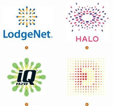 1.
Jerry
Kuyper for LodgeNet
2. Gabi Toth for Halo Consulting
3. Crave
Inc. for IQ Beverage Group
4. Mirko
Ilic Corp. for Dr. Zoran Djindjic Fund
Невыходящий
из моды прием, когда создается иллюзия
движения из одной точки. Такие логотипы
просты в конструкции и так многовариантны
в воплощении, что им практически не
грозят проблемы юридического
характера.
Тонкая
линия
(Fine Line)
1.
Jerry
Kuyper for LodgeNet
2. Gabi Toth for Halo Consulting
3. Crave
Inc. for IQ Beverage Group
4. Mirko
Ilic Corp. for Dr. Zoran Djindjic Fund
Невыходящий
из моды прием, когда создается иллюзия
движения из одной точки. Такие логотипы
просты в конструкции и так многовариантны
в воплощении, что им практически не
грозят проблемы юридического
характера.
Тонкая
линия
(Fine Line)
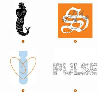 1.
Louis Fili for The Mermaid Inn
2. Hula + Hula for Cartoon Network
Lainamerica
3. Unit for Artists for Peace
4. Point
Blank Collection for Pulse
Главный фокус этого
приема — соблюсти пропорции между весом
линии (ее толщиной и плотностью) и
удобочитаемостью. Большинство логотипов
этого типа двухуровневы, когда тонкая
линия накладывается на более массивное
изображение, придавая последнему
интеллектуальность и изысканность.
На
изгибе
(FoldOver)
1.
Louis Fili for The Mermaid Inn
2. Hula + Hula for Cartoon Network
Lainamerica
3. Unit for Artists for Peace
4. Point
Blank Collection for Pulse
Главный фокус этого
приема — соблюсти пропорции между весом
линии (ее толщиной и плотностью) и
удобочитаемостью. Большинство логотипов
этого типа двухуровневы, когда тонкая
линия накладывается на более массивное
изображение, придавая последнему
интеллектуальность и изысканность.
На
изгибе
(FoldOver)
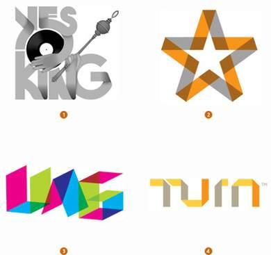 1.
PMKFA for Yes King
2. Gardner Design for Liberty Capital
3. A3
Design for Urban Architectural Group
4. Addis Creson for
Turn
Этовсе
равно,
что
создавать
логотип
из
листа
бумаги.
Секрет
этого квази-оригами стиля в чувстве
пространственности на плоской поверхности.
Материалом для таких квази-оригами
логотипв могут выступать различные
прозрачные пленки, металл, бумага.
Противоположные стороны отличаются
либо по цвету, либо по плотности, что
привносит в образ логотип эффект
головоломки, интеллектуальной
игры.
Глобальная
экспансия
(Global Expansion)
1.
PMKFA for Yes King
2. Gardner Design for Liberty Capital
3. A3
Design for Urban Architectural Group
4. Addis Creson for
Turn
Этовсе
равно,
что
создавать
логотип
из
листа
бумаги.
Секрет
этого квази-оригами стиля в чувстве
пространственности на плоской поверхности.
Материалом для таких квази-оригами
логотипв могут выступать различные
прозрачные пленки, металл, бумага.
Противоположные стороны отличаются
либо по цвету, либо по плотности, что
привносит в образ логотип эффект
головоломки, интеллектуальной
игры.
Глобальная
экспансия
(Global Expansion)
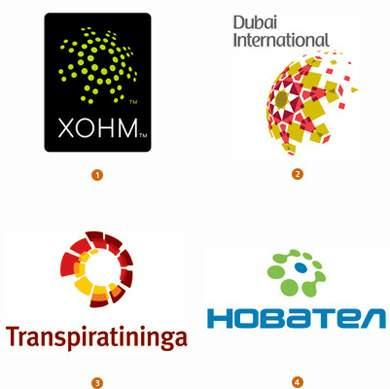 1.
Lippincott for XOHM
2. Cato Purnell Partners for Dubai
International
3. Futurebrand
BC&H for Transpiratininga
4. FIRON for Novatel
Символические
решения идеи расширения сферы влияния
бизнеса по-прежнему популярны, особенно
на развивающихся рынках и у молодых
агрессивных компаний.
Петли
(Loops)
1.
Lippincott for XOHM
2. Cato Purnell Partners for Dubai
International
3. Futurebrand
BC&H for Transpiratininga
4. FIRON for Novatel
Символические
решения идеи расширения сферы влияния
бизнеса по-прежнему популярны, особенно
на развивающихся рынках и у молодых
агрессивных компаний.
Петли
(Loops)
 1.
Lippincott for IBM & Freescale
2. Angelini Design for Peugeot
International
3. Miriello
Grafico, Inc. for Qualcomm
4. Double Brand for Long term car
rent
Для этого стиля обязательное
условие — непрерывность, при этом совсем
не обязательно перерабатывать ленту
Мебиуса и опрокинутую восьмерку. Важно
добиться ощущения не замкнутости, а
бесконечности изменений и
совершествования.
Ассорти
(Jawbreakers)
1.
Lippincott for IBM & Freescale
2. Angelini Design for Peugeot
International
3. Miriello
Grafico, Inc. for Qualcomm
4. Double Brand for Long term car
rent
Для этого стиля обязательное
условие — непрерывность, при этом совсем
не обязательно перерабатывать ленту
Мебиуса и опрокинутую восьмерку. Важно
добиться ощущения не замкнутости, а
бесконечности изменений и
совершествования.
Ассорти
(Jawbreakers)
 1.
Form for Dazed & Confused/Topshop
2. MacLaren McCann Calgary
for Telphonic
3. Volatile
for Antidote
4. Volatile for Pod
Концентрические
радуги хороши тем, что практически
всегда вызывают улыбку. Импонирует и
то, что многообразие вариантов сечений
и цветовых сочетаний дают безграничную
юридическую свободу. Перед созданием
таких логотипов не мешает просмотреть
подборку работ художников, работавших
в 70-х в стиле оп-арта.
Стробоскопия
(Strobe)
1.
Form for Dazed & Confused/Topshop
2. MacLaren McCann Calgary
for Telphonic
3. Volatile
for Antidote
4. Volatile for Pod
Концентрические
радуги хороши тем, что практически
всегда вызывают улыбку. Импонирует и
то, что многообразие вариантов сечений
и цветовых сочетаний дают безграничную
юридическую свободу. Перед созданием
таких логотипов не мешает просмотреть
подборку работ художников, работавших
в 70-х в стиле оп-арта.
Стробоскопия
(Strobe)
 1.
Interbrand for Nikon
2. Moving Brands for Nokia Siemens
Networks
3. Lippincott
for UMW
4. Lippincott for Sprint
Ощутимое движение
в условиях печатной статики — сложная
задача, с которой неплохо справляется
прием стробоскопирования деталей
изображения. Маленькая хитрость —
траектория движения должна быть «мягкой»,
жидко-образной.
Нимб
(Nimbus)
1.
Interbrand for Nikon
2. Moving Brands for Nokia Siemens
Networks
3. Lippincott
for UMW
4. Lippincott for Sprint
Ощутимое движение
в условиях печатной статики — сложная
задача, с которой неплохо справляется
прием стробоскопирования деталей
изображения. Маленькая хитрость —
траектория движения должна быть «мягкой»,
жидко-образной.
Нимб
(Nimbus)
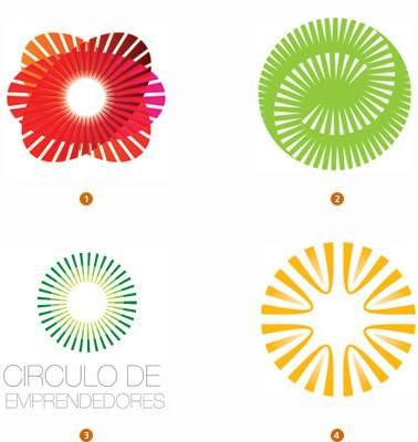 1.
Gardner
Design for Catalyst
2. Glitschka Studios for Proctor &
Gamble
3. Circulodiseño, SC fr New Venturees
4. Chris Herron
Design for Marimon Inc. & Kelly Swofford Roy
Берегите
глаза!
Для
этих логотипов характерна чрезмерная
яркость, что придает изображению
дополнительную дозу излучения.
Шовчик
(Stitch)
1.
Gardner
Design for Catalyst
2. Glitschka Studios for Proctor &
Gamble
3. Circulodiseño, SC fr New Venturees
4. Chris Herron
Design for Marimon Inc. & Kelly Swofford Roy
Берегите
глаза!
Для
этих логотипов характерна чрезмерная
яркость, что придает изображению
дополнительную дозу излучения.
Шовчик
(Stitch)
 1.
The Woodbine Agency for Lamp
2. tenn_do_ten for chico
3. The
Pink Pear Design Company for Rummage
4. Hammerpress for Natasha’s
Mulberry & Mott
В
поисках
вдохновения
разработчики
этого
стиля
вдоволь
покопались
в
бабушкиной
корзинке
с
рукоделием.
Фишка
даже не в прямом заимствовании текстильных
узоров, а в использовании винтажных
текстильных элементов — зигзаг, бахрома,
сеточка, вышивка крестиком и мережка.
Понятно, что в основном используется
при создании логотипов компаний,
ориентированных на женскую
аудиторию.
Дальтоника
(Colorblind)
1.
The Woodbine Agency for Lamp
2. tenn_do_ten for chico
3. The
Pink Pear Design Company for Rummage
4. Hammerpress for Natasha’s
Mulberry & Mott
В
поисках
вдохновения
разработчики
этого
стиля
вдоволь
покопались
в
бабушкиной
корзинке
с
рукоделием.
Фишка
даже не в прямом заимствовании текстильных
узоров, а в использовании винтажных
текстильных элементов — зигзаг, бахрома,
сеточка, вышивка крестиком и мережка.
Понятно, что в основном используется
при создании логотипов компаний,
ориентированных на женскую
аудиторию.
Дальтоника
(Colorblind)
 1.
Colorblind Chameleon — Self Promotion
2. Range for Dennis
Murphy
3. Pearpod for Razoo
4. Cricket Design Works for Creme
Café
Очевидный,
хот
и
самый
непонятный
тренд.
Можно
только восхищаться отвагой клиентов,
утверждающих логотипы, которые как
минимум 7% мужского населения и 0,4% женщин
не смогут даже адекватно увидеть.
Амеба
(Amoeba)
1.
Colorblind Chameleon — Self Promotion
2. Range for Dennis
Murphy
3. Pearpod for Razoo
4. Cricket Design Works for Creme
Café
Очевидный,
хот
и
самый
непонятный
тренд.
Можно
только восхищаться отвагой клиентов,
утверждающих логотипы, которые как
минимум 7% мужского населения и 0,4% женщин
не смогут даже адекватно увидеть.
Амеба
(Amoeba)
 1.
Tactix Creative for DJ Eddie Amador
2. Double Brand for Poza
Showroom
3. Mola
for EDP
4. Yaroslav Zheleznyakov for Promotion
Amoeba
происходит от греческого слова amoibe —
перемены, и в этом такой стиль логотипов
очень созвучен нашему стремительно
меняющемуся времени, а также ориентации
на природо-соразмерность. Главная
трудность — сохранить ощущение связности
элементов, т.е. структурировать
неструктурированное и оформить аморфное.
Хитрость в том, чтобы ощутить логотип
как живой организм.
Супермногогранность
(Facets)
1.
Tactix Creative for DJ Eddie Amador
2. Double Brand for Poza
Showroom
3. Mola
for EDP
4. Yaroslav Zheleznyakov for Promotion
Amoeba
происходит от греческого слова amoibe —
перемены, и в этом такой стиль логотипов
очень созвучен нашему стремительно
меняющемуся времени, а также ориентации
на природо-соразмерность. Главная
трудность — сохранить ощущение связности
элементов, т.е. структурировать
неструктурированное и оформить аморфное.
Хитрость в том, чтобы ощутить логотип
как живой организм.
Супермногогранность
(Facets)
 1.
Kitsh
for Clay Saphire
2. Thomas Manss & Company for VCC Perfect
Pictures
3. Gardner Design for Lavish
4. BFive for Solo
Company
Что
отразит
многогранность
бизнеса,
чем
многогранные
логотипы?
Может
быть не самое тонкое и глубокое решение,
но определенно яркое и сверкающее.
Каракули
или Простачком написано (Doodles)
1.
Kitsh
for Clay Saphire
2. Thomas Manss & Company for VCC Perfect
Pictures
3. Gardner Design for Lavish
4. BFive for Solo
Company
Что
отразит
многогранность
бизнеса,
чем
многогранные
логотипы?
Может
быть не самое тонкое и глубокое решение,
но определенно яркое и сверкающее.
Каракули
или Простачком написано (Doodles)
 1.
Steve’s Portfolio for www.thehurricaneposterproject.com
2.
Stubborn Sideburns for Hipposchemes
3. Fifth Letter for Shawn
Lynch
4. Studio Oscar for Levi Strauss
Непосредственность
и незамутненная компьютерным дизайном
честность выгодно отличают такие
логотипы на фоне остальных. Подходит
не для всех, но незаменим такм, где
требуется показать «между Мною и Вами
нет посредников».
Зацветание
(Flourish)
1.
Steve’s Portfolio for www.thehurricaneposterproject.com
2.
Stubborn Sideburns for Hipposchemes
3. Fifth Letter for Shawn
Lynch
4. Studio Oscar for Levi Strauss
Непосредственность
и незамутненная компьютерным дизайном
честность выгодно отличают такие
логотипы на фоне остальных. Подходит
не для всех, но незаменим такм, где
требуется показать «между Мною и Вами
нет посредников».
Зацветание
(Flourish)
 1.
Lucero Design for Project 240 Apparel
2. United* for Bar Carrera
NY
3. Team Manila Graphic Design Studio for Neu Media
4.
Distrubancy Graphic Treatment for Eclipse Streetwear
Возьмите
простенький
шрифт,
полейте
его
историей
типографики
и
посыпьте
пыльцой
декоративности
и
вы
получите
образец
этого
направления.
Смотрится
немного дико, но симпатично. Близко к
модерновой флореальности, но не так
декоративно. При должном чувстве меры
и линии можно получить неплохие
образцы.
Волокнизация
(Fibrous)
1.
Lucero Design for Project 240 Apparel
2. United* for Bar Carrera
NY
3. Team Manila Graphic Design Studio for Neu Media
4.
Distrubancy Graphic Treatment for Eclipse Streetwear
Возьмите
простенький
шрифт,
полейте
его
историей
типографики
и
посыпьте
пыльцой
декоративности
и
вы
получите
образец
этого
направления.
Смотрится
немного дико, но симпатично. Близко к
модерновой флореальности, но не так
декоративно. При должном чувстве меры
и линии можно получить неплохие
образцы.
Волокнизация
(Fibrous)
 1.
Guillermo Brea & Associates for Argentina
2. Najlon for Town
RIJEKA
3. Mattson Creative for The Collective
4. AtomicasStudio
for 2 excite
Единство
независимостей
— так
кратко
можно
охарактеризовать
это
направление.
Чем
разнообразнее волокна, тем сильнее
ощущении уважение к индивидуальности
и уникальности. Чем однообразнее, тем
сильнее ощущение коллективности
действий.
1.
Guillermo Brea & Associates for Argentina
2. Najlon for Town
RIJEKA
3. Mattson Creative for The Collective
4. AtomicasStudio
for 2 excite
Единство
независимостей
— так
кратко
можно
охарактеризовать
это
направление.
Чем
разнообразнее волокна, тем сильнее
ощущении уважение к индивидуальности
и уникальности. Чем однообразнее, тем
сильнее ощущение коллективности
действий.
------------------------------------------------------------------------------------
Главный редактор влиятельного каталога и лого-хранилища Logolounge.com Билл Гарднер обнародовал свой традиционный ежегодный обзор трендов в создании логотипов на 2009 год.
Все логотипы в 2009 объединяет несколько общих направлений развития: возрастающая роль текста, которого в логотипах становиться все больше и больше, и который несет уже не просто общую информацию о бренде, а узко-специализированную, а также смелое использование ярких цветов даже в логотипах крупных серьезных клиентов.
Билл Гарднер (Bill Gardner) также обращает внимание на запуск в начале этого года значка favicon Google размером 15Х15 пикселей, называя его предвестником больших перемен в логостроении. Он предсказывает, что в скором будущем успех логотипа будет зависет и от того, как он будет выглядеть в формате favicon.
Билл Гарднер традиционно выделяет 15 многообещающих трендов-образов и еще несколько не столь значительных направлений развития логотипов.
Смотрите также:
Тренды в дизайне логотипов 2008
Тренды в дизайне логотипов 2007
ФОТОНАПОЛНЕНИЕ/PhotoFill
Использование не только и не столько векторных элементов с жестко заданными цветами, а фотографий или элементов фотографического качества.