

The lattice package |
3 |
In trellis graphs, a separate panel is created for each level of the conditioning variable. If more than one conditioning variable is specified, a panel is created for each combination of factor levels. The panels are arranged into an array to facilitate comparisons. A label is provided for each panel in an area called the strip. As you’ll see, the user has control over the graph displayed in each panel, the format and placement of the strip, the arrangement of the panels, the placement and content of legends, and many other graphic features.
The lattice package provides a wide variety of functions for producing univariate (dot plots, kernel density plots, histograms, bar charts, box plots), bivariate (scatter plots, strip plots, parallel box plots), and multivariate (3D plots, scatter plot matrices) graphs.
Each high-level graphing function follows the format
graph_function(formula, data=, options)
where
■graph_function is one of the functions listed in the second column of table 23.1.
■formula specifies the variable(s) to display and any conditioning variables.
■data= specifies a data frame.
■options are comma-separated parameters used to modify the content, arrangement, and annotation of the graph. See table 23.2 for a description of common options.
Let lowercase letters represent numeric variables and uppercase letters represent categorical variables (factors). The formula in a high-level graphing function typically takes the form
y ~ x | A * B
where variables on the left side of the vertical bar are called the primary variables and variables on the right are the conditioning variables. Primary variables map variables to the axes in each panel. Here, y~x describes the variables to place on the vertical and horizontal axes, respectively. For single-variable plots, replace y~x with ~x. For 3D plots, replace y~x with z~x*y. Finally, for multivariate plots (scatter-plot matrix or par- allel-coordinates plot), replace y~x with a data frame. Note that conditioning variables are always optional.
Following this logic, ~x|A displays numeric variable x for each level of factor A. y~x|A*B displays the relationship between numeric variables y and x separately for every combination of factor A and B levels. A~x displays categorical variable A on the vertical axis and numeric variable x on the horizontal axis. ~x displays numeric variable x alone. Other examples are shown in table 23.1.
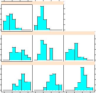
To gain a quick overview of lattice graphs, try running the code in listing 23.1. The graphs are based on the automotive data (mileage, weight, number of gears, number of cylinders, and so on) included in the mtcars data frame. You may want to vary the formulas and view the results. (The resulting output has been omitted to save space.)

4 |
BONUS CHAPTER 23 |
Advanced graphics with the lattice package |
|
|
Table 23.1 Graph types and corresponding functions in the lattice package |
||
|
|
|
|
|
Graph type |
Function |
Formula examples |
|
|
|
|
|
3D contour plot |
contourplot() |
z~x*y |
|
3D level plot |
levelplot() |
z~y*x |
|
3D scatter plot |
cloud() |
z~x*y|A |
|
3D wireframe graph |
wireframe() |
z~y*x |
|
Bar chart |
barchart() |
x~A or A~x |
|
Box plot |
bwplot() |
x~A or A~x |
|
Dot plot |
dotplot() |
~x|A |
|
Histogram |
histogram() |
~x |
|
Kernel-density plot |
densityplot() |
~x|A*B |
|
Parallel-coordinates plot |
parallelplot() |
dataframe |
|
Scatter plot |
xyplot() |
y~x|A |
|
Scatter-plot matrix |
splom() |
dataframe |
|
Strip plots |
stripplot() |
A~x or x~A |
|
|
|
|
Note: In these formulas, lowercase letters represent numeric variables and uppercase letters represent categorical variables.
Listing 23.1 Lattice plot examples
library(lattice)
attach(mtcars)
gear <- factor(gear, levels=c(3, 4, 5),
labels=c("3 gears", "4 gears", "5 gears")) cyl <- factor(cyl, levels=c(4, 6, 8),
labels=c("4 cylinders", "6 cylinders", "8 cylinders"))
densityplot(~mpg,
main="Density Plot", xlab="Miles per Gallon")
densityplot(~mpg | cyl,
main="Density Plot by Number of Cylinders", xlab="Miles per Gallon")
bwplot(cyl ~ mpg | gear,
main="Box Plots by Cylinders and Gears", xlab="Miles per Gallon", ylab="Cylinders")
xyplot(mpg ~ wt | cyl * gear,
main="Scatter Plots by Cylinders and Gears", xlab="Car Weight", ylab="Miles per Gallon")
cloud(mpg ~ wt * qsec | cyl,
main="3D Scatter Plots by Cylinders")
|
|
|
The lattice package |
5 |
dotplot(cyl ~ mpg |
| |
gear, |
|
|
main="Dot |
Plots |
by Number of Gears and Cylinders", |
|
|
xlab="Miles |
Per |
Gallon") |
|
|
splom(mtcars[c(1, |
3, 4, |
5, 6)], |
|
|
main="Scatter |
Plot Matrix for mtcars Data") |
|
||
detach(mtcars)
High-level plotting functions in the lattice package produce graphic objects that can be saved and manipulated. For example,
library(lattice)
mygraph <- densityplot(~height|voice.part, data=singer)
creates a trellis density plot and saves it as object mygraph. But no graph is displayed. Issuing the statement plot(mygraph) (or simply mygraph) will display the graph.
It’s easy to modify lattice graphs through the use of options. Common options are given in table 23.2. You’ll see examples of many of these later in the chapter.
Table 23.2 Common options for lattice high-level graphing functions
Options |
Description |
|
|
aspect |
A number specifying the aspect ratio (height/width) for the graph in each panel. |
col, pch, lty, lwd |
Vectors specifying the colors, symbols, line types, and line widths to be used in |
|
plotting, respectively. |
group |
Grouping variable (factor). |
index.cond |
List specifying the display order of the panels. |
key (or auto.key) |
Function used to supply legend(s) for grouping variable(s). |
layout |
Two-element numeric vector specifying the arrangement of the panels (number |
|
of columns, number of rows). If desired, a third element can be added to indi- |
|
cate the number of pages. |
main, sub |
Character vectors specifying the main title and subtitle. |
panel |
Function used to generate the graph in each panel. |
scales |
List providing axis annotation information. |
strip |
Function used to customize panel strips. |
split, position |
Numeric vectors used to place more than one graph on a page. |
type |
Character vector specifying one or more plotting options for scatter plots (p = |
|
points, l = lines, r = regression line, smooth = loess fit, g = grid, and so on). |
xlab, ylab |
Character vectors specifying horizontal and vertical axis labels. |
xlim, ylim |
Two-element numeric vectors giving the minimum and maximum values for the |
|
horizontal and vertical axes, respectively. |
|
|