

Robert I. Kabacoff - R in action
.pdf186 |
|
|
CHAPTER 8 |
Regression |
|
||
Residuals: |
|
|
|
|
|
|
|
Min |
1Q |
Median |
3Q |
|
Max |
|
|
-4.7960 -1.6495 -0.0811 |
1.4815 |
7.6210 |
|
|
|||
Coefficients: |
|
|
|
|
|
|
|
|
Estimate Std. Error t value Pr(>|t|) |
|
|||||
(Intercept) |
1.23e+00 |
3.87e+00 |
|
0.32 |
0.751 |
|
|
Population |
2.24e-04 |
9.05e-05 |
|
2.47 |
0.017 |
* |
|
Illiteracy |
4.14e+00 |
8.74e-01 |
|
4.74 |
2.2e-05 |
*** |
|
Income |
6.44e-05 |
6.84e-04 |
|
0.09 |
0.925 |
|
|
Frost |
5.81e-04 |
1.01e-02 |
|
0.06 |
0.954 |
|
|
--- |
|
|
|
|
|
|
|
Signif. codes: |
0 '***' 0.001 '**' |
0.01 |
'*' 0.05 |
'.v 0.1 'v' 1 |
|||
Residual standard error: 2.5 on 45 degrees of freedom
Multiple R-squared: 0.567, Adjusted R-squared: 0.528
F-statistic: 14.7 on 4 and 45 DF, p-value: 9.13e-08
When there’s more than one predictor variable, the regression coefficients indicate the increase in the dependent variable for a unit change in a predictor variable, holding all other predictor variables constant. For example, the regression coefficient for Illiteracy is 4.14, suggesting that an increase of 1 percent in illiteracy is associated with a 4.14 percent increase in the murder rate, controlling for population, income, and temperature. The coefficient is significantly different from zero at the p < .0001 level. On the other hand, the coefficient for Frost isn’t significantly different from zero (p = 0.954) suggesting that Frost and Murder aren’t linearly related when controlling for the other predictor variables. Taken together, the predictor variables account for 57 percent of the variance in murder rates across states.
Up to this point, we’ve assumed that the predictor variables don’t interact. In the next section, we’ll consider a case in which they do.
8.2.5Multiple linear regression with interactions
Some of the most interesting research findings are those involving interactions among predictor variables. Consider the automobile data in the mtcars data frame. Let’s say that you’re interested in the impact of automobile weight and horse power on mileage. You could fit a regression model that includes both predictors, along with their interaction, as shown in the next listing.
Listing 8.5 Multiple linear regression with a significant interaction term
>fit <- lm(mpg ~ hp + wt + hp:wt, data=mtcars)
>summary(fit)
Call:
lm(formula=mpg ~ hp + wt + hp:wt, data=mtcars)
Residuals:
Min 1Q Median 3Q Max -3.063 -1.649 -0.736 1.421 4.551
|
|
OLS regression |
|
187 |
|
Coefficients: |
|
|
|
|
|
|
Estimate Std. Error t value Pr(>|t|) |
|
|||
(Intercept) |
49.80842 |
3.60516 |
13.82 |
5.0e-14 |
*** |
hp |
-0.12010 |
0.02470 |
-4.86 |
4.0e-05 |
*** |
wt |
-8.21662 |
1.26971 |
-6.47 |
5.2e-07 |
*** |
hp:wt |
0.02785 |
0.00742 |
3.75 |
0.00081 |
*** |
--- |
|
|
|
|
|
Signif. codes: 0 ‘***’ |
0.001 ‘**’ 0.01 ‘*’ 0.05 |
‘.’ 0.1 ‘ ‘ 1 |
|||
Residual standard error: 2.1 on 28 degrees of freedom
Multiple R-squared: 0.885, Adjusted R-squared: 0.872
F-statistic: 71.7 on 3 and 28 DF, p-value: 2.98e-13
You can see from the Pr(>|t|) column that the interaction between horse power and car weight is significant. What does this mean? A significant interaction between two predictor variables tells you that the relationship between one predictor and the response variable depends on the level of the other predictor. Here it means that the relationship between miles per gallon and horse power varies by car weight.
Our model for predicting mpg is mpg = 49.81 – 0.12 × hp – 8.22 × wt + 0.03 × hp × wt. To interpret the interaction, you can plug in various values of wt and simplify the equation. For example, you can try the mean of wt (3.2) and one standard deviation below and above the mean (2.2 and 4.2, respectively). For wt=2.2, the equation simplifies to mpg = 49.81 – 0.12 ×hp – 8.22 ×(2.2) + 0.03 ×hp ×(2.2) = 31.41 – 0.06 ×hp. For wt=3.2, this becomes mpg = 23.37 – 0.03 × hp. Finally, for wt=4.2 the equation becomes mpg = 15.33 – 0.003 × hp. You see that as weight increases (2.2, 3.2, 4.2), the expected change in mpg from a unit increase in hp decreases (0.06, 0.03, 0.003).
You can visualize interactions using the effect() function in the effects package. The format is
plot(effect(term, mod, xlevels), multiline=TRUE)
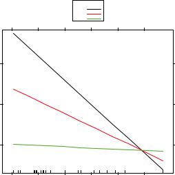
where term is the quoted model term to plot, mod is the fitted model returned by lm(), and xlevels is a list specifying the variables to be set to constant values and the values to employ. The multiline=TRUE option superimposes the lines being plotted. For the previous model, this becomes
library(effects) plot(effect("hp:wt", fit,
list(wt=c(2.2,3.2,4.2))),
multiline=TRUE)
|
25 |
|
|
|
|
|
mpg |
20 |
|
|
|
|
|
|
15 |
|
|
|
|
|
|
50 |
100 |
150 |
200 |
250 |
300 |
|
|
|
|
hp |
|
|
The resulting graph is displayed in figure 8.5.
Figure 8.5 Interaction plot for hp*wt. This plot displays the relationship between mpg and hp at 3 values of wt.
188 |
CHAPTER 8 Regression |
You can see from this graph that as the weight of the car increases, the relationship between horse power and miles per gallon weakens. For wt=4.2, the line is almost horizontal, indicating that as hp increases, mpg doesn’t change.
Unfortunately, fitting the model is only the first step in the analysis. Once you fit a regression model, you need to evaluate whether you’ve met the statistical assumptions underlying your approach before you can have confidence in the inferences you draw. This is the topic of the next section.
8.3Regression diagnostics
In the previous section, you used the lm() function to fit an OLS regression model and the summary() function to obtain the model parameters and summary statistics. Unfortunately, there’s nothing in this printout that tells you if the model you have fit is appropriate. Your confidence in inferences about regression parameters depends on the degree to which you’ve met the statistical assumptions of the OLS model. Although the summary() function in listing 8.4 describes the model, it provides no information concerning the degree to which you’ve satisfied the statistical assumptions underlying the model.
Why is this important? Irregularities in the data or misspecifications of the relationships between the predictors and the response variable can lead you to settle on a model that’s wildly inaccurate. On the one hand, you may conclude that a predictor and response variable are unrelated when, in fact, they are. On the other hand, you may conclude that a predictor and response variable are related when, in fact, they aren’t! You may also end up with a model that makes poor predictions when applied in real-world settings, with significant and unnecessary error.
Let’s look at the output from the confint() function applied to the states multiple regression problem in section 8.2.4.
>fit <- lm(Murder ~ Population + Illiteracy + Income + Frost, data=states)
>confint(fit)
2.5% 97.5 %
(Intercept) -6.55e+00 9.021318
Population |
4.14e-05 |
0.000406 |
Illiteracy |
2.38e+00 |
5.903874 |
Income |
-1.31e-03 |
0.001441 |
Frost |
-1.97e-02 |
0.020830 |
The results suggest that you can be 95 percent confident that the interval [2.38, 5.90] contains the true change in murder rate for a 1 percent change in illiteracy rate. Additionally, because the confidence interval for Frost contains 0, you can conclude that a change in temperature is unrelated to murder rate, holding the other variables constant. But your faith in these results is only as strong as the evidence that you have that your data satisfies the statistical assumptions underlying the model.
A set of techniques called regression diagnostics provides you with the necessary tools for evaluating the appropriateness of the regression model and can help you to uncover and correct problems. First, we’ll start with a standard approach that uses

Regression diagnostics |
189 |
functions that come with R’s base installation. Then we’ll look at newer, improved methods available through the car package.
8.3.1A typical approach
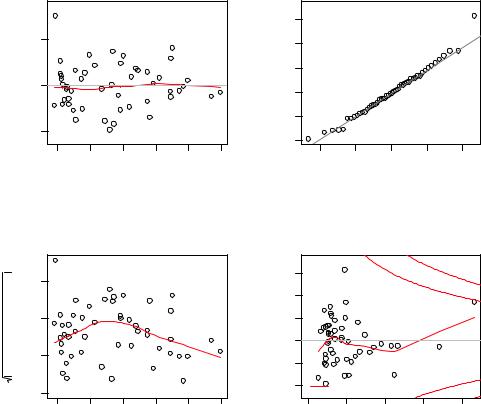
R’s base installation provides numerous methods for evaluating the statistical assumptions in a regression analysis. The most common approach is to apply the plot() function to the object returned by the lm(). Doing so produces four graphs that are useful for evaluating the model fit. Applying this approach to the simple linear regression example
fit <- lm(weight ~ height, data=women) par(mfrow=c(2,2))
plot(fit)
produces the graphs shown in figure 8.6. The par(mfrow=c(2,2)) statement is used to combine the four plots produced by the plot() function into one large 2x2 graph. The par() function is described in chapter 3.
Residuals vs Fitted
|
Nevada |
|
|
|
s |
3 |
|
|
|
|
|
|
|
||
Residuals |
5 0 5 |
Massachusetts |
|
|
|
Standardized residual |
−1 0 1 2 |
|
− |
Rhode Island |
|
|
|
|
2 |
|
|
|
|
|
|
|
− |
|
4 |
6 |
8 |
10 |
12 |
14 |
|
Normal Q−Q
Nevada
Alaska
Rhode Island
−2 |
−1 |
0 |
1 |
2 |
Fitted values |
Theoretical Quantiles |
Scale−Location
|
Nevada |
|
|
|
|
|
|
Standardized residuals |
0.5 1.0 1.5 |
Rhode Island |
|
|
|
Standardized residuals |
−1 0 1 2 3 |
Alaska |
|
|
|||||
|
|
|
|
||||
|
0 |
|
|
|
|
|
−2 |
|
0. |
|
|
|
|
|
|
|
4 |
6 |
8 |
10 |
12 |
14 |
|
Fitted values
Residuals vs Leverage
|
Nevada |
|
|
|
|
|
|
|
|
|
1 |
|
|
|
|
Alaska |
0.5 |
|
|
Hawaii |
|
0.5 |
|
|
Cook’s distance |
|
|
||
|
|
|
1 |
||
|
|
|
|
|
|
0.0 |
0.1 |
0.2 |
0.3 |
0.4 |
|
|
|
Leverage |
|
|
|
Figure 8.6 Diagnostic plots for the regression of weight on height
190 |
CHAPTER 8 Regression |
To understand these graphs, consider the assumptions of OLS regression:
Normality —If the dependent variable is normally distributed for a fixed set of predictor values, then the residual values should be normally distributed with a mean of 0. The Normal Q-Q plot (upper right) is a probability plot of the standardized residuals against the values that would be expected under normality. If you’ve met the normality assumption, the points on this graph should fall on the straight 45-degree line. Because they don’t, you’ve clearly violated the normality assumption.
Independence —You can’t tell if the dependent variable values are independent from these plots. You have to use your understanding of how the data were collected. There’s no a priori reason to believe that one woman’s weight influences another woman’s weight. If you found out that the data were sampled from families, you may have to adjust your assumption of independence.
Linearity —If the dependent variable is linearly related to the independent variables, there should be no systematic relationship between the residuals and the predicted (that is, fitted) values. In other words, the model should capture all the systematic variance present in the data, leaving nothing but random noise. In the Residuals versus Fitted graph (upper left), you see clear evidence of a curved relationship, which suggests that you may want to add a quadratic term to the regression.
Homoscedasticity —If you’ve met the constant variance assumption, the points in the Scale-Location graph (bottom left) should be a random band around a horizontal line. You seem to meet this assumption.
Finally, the Residual versus Leverage graph (bottom right) provides information on individual observations that you may wish to attend to. The graph identifies outliers, high-leverage points, and influential observations. Specifically:
An outlier is an observation that isn’t predicted well by the fitted regression model (that is, has a large positive or negative residual).
An observation with a high leverage value has an unusual combination of predictor values. That is, it’s an outlier in the predictor space. The dependent variable value isn’t used to calculate an observation’s leverage.
An influential observation is an observation that has a disproportionate impact on the determination of the model parameters. Influential observations are identified using a statistic called Cook’s distance, or Cook’s D.
To be honest, I find the Residual versus Leverage plot difficult to read and not useful. You’ll see better representations of this information in later sections.
To complete this section, let’s look at the diagnostic plots for the quadratic fit. The necessary code is
fit2 <- lm(weight ~ height + I(height^2), data=women) par(mfrow=c(2,2))
plot(fit2)
and the resulting graph is provided in figure 8.7.

Regression diagnostics |
191 |
Residuals vs Fitted
|
0.6 |
|
|
|
|
15 |
2 |
|
|
|
|
|
s |
||
Residuals |
−0.2 0.2 |
2 |
|
|
|
Standardized residual |
−1 0 1 |
|
−0.6 |
|
|
13 |
|
|
|
|
|
|
|
|
|
||
|
|
|
|
|
|
|
|
|
|
120 |
130 |
140 |
150 |
160 |
|
Fitted values
|
1.5 |
Scale−Location |
15 |
|
||
|
|
|
|
|
||
residuals |
2 |
|
|
13 |
residuals |
1 2 |
1.0 |
|
|
|
|||
Standardized |
0.5 |
|
|
|
Standardized |
−1 0 |
|
0.0 |
|
|
|
|
|
|
120 |
130 |
140 |
150 |
160 |
|
|
|
Fitted values |
|
|
|
|
Normal Q−Q
15
13 2
−1 |
0 |
1 |
Theoretical Quantiles
Residuals vs Leverage
|
|
|
|
15 |
|
|
|
|
1 |
|
|
|
|
0.5 |
|
|
13 |
2 |
0.5 |
|
Cook’s distance |
1 |
||
|
|
|
|
|
0.0 |
0.1 |
0.2 |
0.3 |
0.4 |
|
|
Leverage |
|
|
Figure 8.7 Diagnostic plots for the regression of weight on height and height-squared
This second set of plots suggests that the polynomial regression provides a better fit with regard to the linearity assumption, normality of residuals (except for observation 13), and homoscedasticity (constant residual variance). Observation 15 appears to be influential (based on a large Cook’s D value), and deleting it has an impact on the parameter estimates. In fact, dropping both observation 13 and 15 produces a better model fit. To see this, try
newfit <- lm(weight~ height + I(height^2), data=women[-c(13,15),])
for yourself. But you need to be careful when deleting data. Your models should fit your data, not the other way around!
Finally, let’s apply the basic approach to the states multiple regression problem:
fit <- lm(Murder ~ Population + Illiteracy + Income + Frost, data=states) par(mfrow=c(2,2))
plot(fit)
192 |
CHAPTER 8 Regression |
Residuals vs Fitted
|
Nevada |
|
|
|
s |
3 |
|
|
|
|
|
|
|
||
Residuals |
5 0 5 |
Massachusetts |
|
|
|
Standardized residual |
−1 0 1 2 |
|
− |
Rhode Island |
|
|
|
|
2 |
|
|
|
|
|
|
|
− |
|
4 |
6 |
8 |
10 |
12 |
14 |
|
Normal Q−Q
Nevada
Alaska
Rhode Island
−2 |
−1 |
0 |
1 |
2 |
Fitted values |
Theoretical Quantiles |
Scale−Location
|
Nevada |
|
|
|
|
|
|
Standardized residuals |
0.5 1.0 1.5 |
Rhode Island |
|
|
|
Standardized residuals |
−1 0 1 2 3 |
Alaska |
|
|
|||||
|
|
|
|
||||
|
0 |
|
|
|
|
|
−2 |
|
0. |
|
|
|
|
|
|
|
4 |
6 |
8 |
10 |
12 |
14 |
|
Fitted values
Residuals vs Leverage
|
Nevada |
|
|
|
|
|
|
|
|
|
1 |
|
|
|
|
Alaska |
0.5 |
|
|
Hawaii |
|
0.5 |
|
|
Cook’s distance |
|
|
||
|
|
|
1 |
||
|
|
|
|
|
|
0.0 |
0.1 |
0.2 |
0.3 |
0.4 |
|
|
|
Leverage |
|
|
|
Figure 8.8 Diagnostic plots for the regression of murder rate on state characteristics
The results are displayed in figure 8.8. As you can see from the graph, the model assumptions appear to be well satisfied, with the exception that Nevada is an outlier.
Although these standard diagnostic plots are helpful, better tools are now available in R and I recommend their use over the plot(fit) approach.
8.3.2An enhanced approach
The car package provides a number of functions that significantly enhance your ability to fit and evaluate regression models (see table 8.4).

Regression diagnostics |
193 |
Table 8.4 Useful functions for regression diagnostics (car package)
Function |
Purpose |
|
|
qqPlot() |
Quantile comparisons plot |
durbinWatsonTest() |
Durbin–Watson test for autocorrelated errors |
crPlots() |
Component plus residual plots |
ncvTest() |
Score test for nonconstant error variance |
spreadLevelPlot() |
Spread-level plot |
outlierTest() |
Bonferroni outlier test |
avPlots() |
Added variable plots |
influencePlot() |
Regression influence plot |
scatterplot() |
Enhanced scatter plot |
scatterplotMatrix() |
Enhanced scatter plot matrix |
vif() |
Variance inflation factors |
|
|
It’s important to note that there are many changes between version 1.x and version 2.x of the car package, including changes in function names and behavior. This chapter is based on version 2.
In addition, the gvlma package provides a global test for linear model assumptions. Let’s look at each in turn, by applying them to our multiple regression example.
NORMALITY
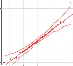
The qqPlot() function provides a more accurate method of assessing the normality assumption than provided by the plot() function in the base package. It plots the studentized residuals (also called studentized deleted residuals or jackknifed residuals) against a t distribution with n-p-1 degrees of freedom, where n is the sample size and p is the number of regression parameters (including the intercept). The code follows:
library(car)
fit <- lm(Murder ~ Population + Illiteracy + Income + Frost, data=states) qqPlot(fit, labels=row.names(states), id.method="identify",
simulate=TRUE, main="Q-Q Plot")
The qqPlot() function generates the probability plot displayed in figure 8.9. The option id.method="identify" makes the plot interactive—after the graph is drawn, mouse clicks on points within the graph will label them with values specified in the labels option of the function. Hitting the Esc key, selecting Stop from the graph’s drop-down menu, or right-clicking on the graph will turn off this interactive mode. Here, I identified Nevada. When simulate=TRUE, a 95 percent confidence envelope is produced using a parametric bootstrap. (Bootstrap methods are considered in chapter 12. )
194 |
CHAPTER 8 Regression |
|
|
|
Q Q Plot |
|
|
|
|
|
|
|
Nevada |
|
3 |
|
|
|
|
|
2 |
|
|
|
|
Residuals(fit) |
1 |
|
|
|
|
Studentized |
0 |
|
|
|
|
|
1 |
|
|
|
|
|
2 |
|
|
|
|
|
2 |
1 |
0 |
1 |
2 |
t Quantiles
Figure 8.9 Q-Q plot for studentized residuals
With the exception of Nevada, all the points fall close to the line and are within the confidence envelope, suggesting that you’ve met the normality assumption fairly well. But you should definitely look at Nevada. It has a large positive residual (actual-predicted), indicating that the model underestimates the murder rate in this state. Specifically:
> states["Nevada",]
Murder |
Population |
Illiteracy |
Income |
Frost |
Nevada 11.5 |
590 |
0.5 |
5149 |
188 |
> fitted(fit)["Nevada"]
Nevada 3.878958
> residuals(fit)["Nevada"]
Nevada 7.621042
> rstudent(fit)["Nevada"]
Nevada 3.542929
Here you see that the murder rate is 11.5 percent, but the model predicts a 3.9 percent murder rate.
The question that you need to ask is, “Why does Nevada have a higher murder rate than predicted from population, income, illiteracy, and temperature?” Anyone (who hasn’t see Goodfellas) want to guess?
Regression diagnostics |
195 |
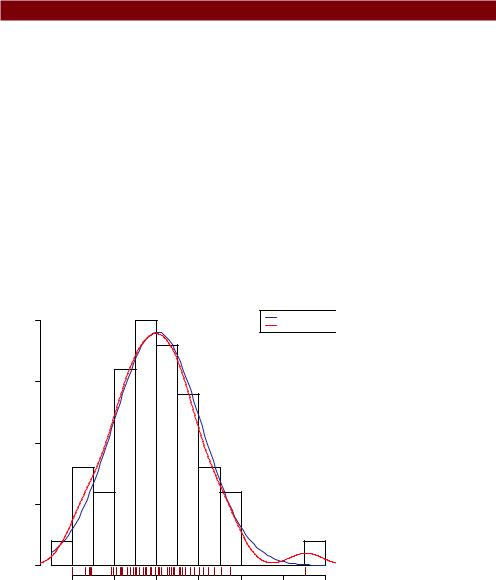
For completeness, here’s another way of visualizing errors. Take a look at the code in the next listing. The residplot() function generates a histogram of the studentized residuals and superimposes a normal curve, kernel density curve, and rug plot. It doesn’t require the car package.
Listing 8.6 Function for plotting studentized residuals
residplot <- function(fit, nbreaks=10) { z <- rstudent(fit)
hist(z, breaks=nbreaks, freq=FALSE, xlab="Studentized Residual", main="Distribution of Errors") rug(jitter(z), col="brown") curve(dnorm(x, mean=mean(z), sd=sd(z)),
add=TRUE, col="blue", lwd=2) lines(density(z)$x, density(z)$y,
col="red", lwd=2, lty=2) legend("topright",
legend = c( "Normal Curve", "Kernel Density Curve"), lty=1:2, col=c("blue","red"), cex=.7)
}
residplot(fit)
The results are displayed in figure 8.10.
|
|
|
Distribution of Errors |
|
|
|
|
|
0.4 |
|
|
|
|
Normal Curve |
|
|
|
|
|
|
Kernel Density Curve |
||
|
|
|
|
|
|
||
|
0.3 |
|
|
|
|
|
|
Density |
0.2 |
|
|
|
|
|
|
|
0.1 |
|
|
|
|
|
|
|
0.0 |
|
|
|
|
|
|
|
−2 |
−1 |
0 |
1 |
2 |
3 |
4 |
Studentized Residual
Figure 8.10 Distribution of studentized residuals using the residplot() function